The Meaning of the Color Blue: Psychology, Symbolism & Use
What does blue mean? Color psychology, cultural symbolism, branding examples, and design use cases — a complete guide to the meaning of the color blue.
Staring at a blank canvas? Whether you're building a blockbuster game world or shaping an iconic global brand, the colour blue offers a universe of creative possibilities. But it's more than just a pretty hue; the blue meaning of colour runs deep, tapping into psychological and cultural cues that signal trust, stability, and calm. When you understand this, you can move from just choosing a colour to telling a deliberate and powerful visual story.
Ready to see what blue can do for your ideas? The Creative AI OS is the perfect place to bring them to life. If you haven't generated anything already, you can try it for free and start mastering the art of colour together.
Lock your brand palette into every AI-generated visual with Virtuall — the Creative AI OS for on-brand color governance.
Mastering Blue in Your Creative Projects

Blue is a cornerstone of any creative professional's toolkit. It’s one of the three primary colours—alongside red and yellow—that serve as the building blocks for every other shade imaginable. You can’t mix anything to get blue; it’s a fundamental pillar of colour theory.
This guide will take you beyond the textbook definitions to give you a real strategic advantage. We’ll dig into how blue’s profound symbolism can help you build trust with an audience, set a specific atmosphere, and steer user perception, all in a safe and responsible way. This is essential knowledge for any professional working on visual creative work, including:
- 3D designers crafting immersive worlds.
- Game developers setting an emotional tone.
- Marketers building a trustworthy brand identity.
- Art directors ensuring visual consistency across a project.
Why Blue Deserves a Deeper Look
Blue has a fascinating and unique history. It was actually one of the last colours to get a name in many ancient languages, mostly because it's surprisingly rare in the natural world. This scarcity once made blue pigments, like ultramarine, even more valuable than gold, reserved for depictions of royalty and the divine in classical art.
Today, its meaning has shifted from exclusivity to reliability. Blue is the colour of the constant sky and the deep ocean, making it a symbol of dependability and steadfastness—qualities that are priceless in visual communication, especially for enterprise-level projects.
This deep psychological connection makes blue an incredibly potent tool for storytelling. To get your own ideas flowing, you might want to explore some innovative techniques to spark creativity in your work. When you combine a solid grasp of colour theory with fresh ideation methods, you can make sure every single asset you create lands with its intended impact.
The Psychological Spectrum of Blue
Ever notice how many tech giants and financial institutions wrap their entire brand identity in the colour blue? It's not a coincidence. Blue taps into a deep, psychological well of trust, stability, and calm, making it a seriously powerful tool for any visual creator. Getting a handle on these associations is the first step to creating work that truly connects.
When we see blue, our minds often drift to the most dependable and vast elements of the natural world—the deep, unending ocean or the clear, open sky. These constants trigger feelings of security and serenity. This isn't just a feeling, either; it can physically lower our blood pressure and heart rate.
This calming effect is why a blue logo or UI element can act as a quiet promise of reliability. It’s the go-to choice for any business that needs to communicate safety and professionalism without saying a word.
Building Trust Through Colour
Trust is the foundation of any successful brand, especially in the corporate world. Blue is exceptional at laying this groundwork because we see it as non-threatening and sincere. Unlike an aggressive colour like red, which can set off alarm bells, blue encourages a sense of order and peace.
For creative teams, this has practical implications every single day:
- Branding: A deep navy logo instantly suggests authority and dependability.
- UI/UX Design: Light blue buttons or links guide users gently, creating a smooth and reassuring experience.
- Game Environments: A calm blue sky or a tranquil body of water can establish a safe zone for players to relax and regroup.
This link between blue and reliability is so strong it can directly influence customer behaviour. In Denmark, for instance, consumers have an incredibly positive view of blue. Studies showed a 25% higher favourability rating for the colour, which gave a significant boost to brand loyalty. The same research revealed that blue logos improved brand attitudes by 18% and purchase intention by 22% among Danes, thanks to blue’s cultural association with intelligence and harmony.
The Duality of Blue Emotion
But the psychological impact of blue isn't a one-way street. The colour has a duality that every creative professional needs to understand. Just as blue can represent calm and stability, it can also signify coldness, detachment, or sadness—it's where we get the phrase "feeling blue."
This complexity is precisely what makes the colour so versatile. An artist might use a muted, greyish-blue to evoke a sense of melancholy in a scene, while a 3D modeller could use a sterile, icy blue to design a futuristic, impersonal environment. The specific shade, saturation, and context change everything.
The power of blue lies in its spectrum. From the unwavering loyalty of navy to the introspective quiet of indigo, each shade tells a slightly different story. Mastering these nuances allows you to craft visuals that resonate with your intended audience on a precise emotional frequency.
Grasping the emotional weight of blue is vital, and you can dive deeper into the psychology of color choices in design for more insight. Whether you're building a brand identity with VirtuallPRO or designing an immersive game world, using the right psychological cues is essential for creating visuals that don't just look good, but feel right.
A Colour Forged by Culture and History
While the psychology of blue gives us a fascinating starting point, the colour’s true power comes alive when you look at its journey through history. A colour’s meaning is never set in stone; it’s a story told by artists, empires, and entire civilisations. Tapping into this rich heritage is how you create visuals that feel authentic and deeply resonant.
Long before blue became the go-to colour for corporate reliability, it was the colour of divinity, royalty, and unimaginable wealth. Think of the Renaissance, where the pigment ultramarine—painstakingly ground from the semi-precious stone lapis lazuli—was literally more valuable than gold. Its breathtaking vibrancy and rarity meant it was reserved for the most sacred subjects, most famously the robes of the Virgin Mary. This forever tied blue to holiness and power in the Western world.
This backstory is a goldmine for any modern creator. A game designer crafting a fantasy realm can use a deep, ultramarine-like blue to signal a divinely ordained royal family. A 3D artist texturing an ancient artefact can give it a lapis lazuli finish to instantly suggest it holds immense power.
Denmark’s Legacy in Blue
Perhaps nowhere is blue more deeply woven into a national identity than in Denmark. The iconic porcelain from Royal Copenhagen is a masterclass in how a single shade can come to represent national pride, artistic excellence, and a commitment to tradition. For centuries, this specific cobalt blue hasn't just been a colour—it's been a signature of Danish heritage.
This legacy stretches back to the 18th century, with artisans spending four gruelling years just to master the art of underglaze painting. It’s an incredibly difficult technique where intricate cobalt blue designs are painted onto raw porcelain before it’s fired at a blistering 1,300°C. Each finished piece is a testament to this incredible skill, marked with the painter's own signature alongside three blue waves symbolising Denmark's great straits.
By 2023, the factory had produced over 10 million of its famous Blue Fluted pieces, with blue being the star hue in a staggering 85% of its collections. This unwavering tradition has baked the colour blue right into the Danish cultural psyche, linking it with artistry, secrecy, and uncompromising quality.
What we can learn from this is how to build meaning. It shows that the consistent, masterful use of a single colour can forge a legacy that outlasts generations, creating an immediate and powerful brand association that needs no explanation.
Putting Cultural Narratives to Work
These historical and cultural stories aren't just fun facts; they are practical tools for any creative professional. When you know why a colour connects with an audience, you can make work that speaks to them on a much deeper, more intuitive level.
Here’s how you could apply this to your own visual creative work:
- Game Art: Imagine you’re designing an in-game faction with roots in historical Danish culture. Using Royal Copenhagen’s specific shade of blue on their banners or armour instantly adds a layer of authenticity, hinting at qualities like discipline, heritage, and artistry.
- 3D Product Visualisation: Working on a render for a high-end digital product? A touch of ultramarine or a similar deep blue can subtly communicate luxury, quality, and exclusivity, calling back to its Renaissance symbolism.
- Branding for Global Markets: If your project is aimed at a Danish or Scandinavian audience, using blue can tap into positive cultural associations. But knowing its specific link to craftsmanship allows you to fine-tune your visual message for maximum impact.
By drawing on these rich traditions within the Creative AI OS, you can get past generic colour choices. You can start building worlds, designing products, and shaping brand identities that feel grounded and powerful, making sure every visual you create tells a more compelling story.
A Practical Guide to Shades of Blue
It's easy to say "blue," but which one do you mean? In any creative field, the chasm between a commanding navy and an energetic cyan is vast enough to completely change the story your visuals tell. Getting this right is fundamental, whether you’re designing a logo, building an immersive game world, or bringing a new product to life.
Think of this as a hands-on guide to the blue family. We'll break down the most common shades, exploring their unique emotional pull and where they fit best. It’s about moving beyond the general blue meaning of colour and learning to speak the specific dialect of each individual hue. My goal is to give you the confidence to pick the perfect blue for any project, every time.
As this fantastic map shows, the value we place on blue isn't new. It’s deeply tied to history, from the rare pigments used by Renaissance masters to the iconic porcelain of Denmark.
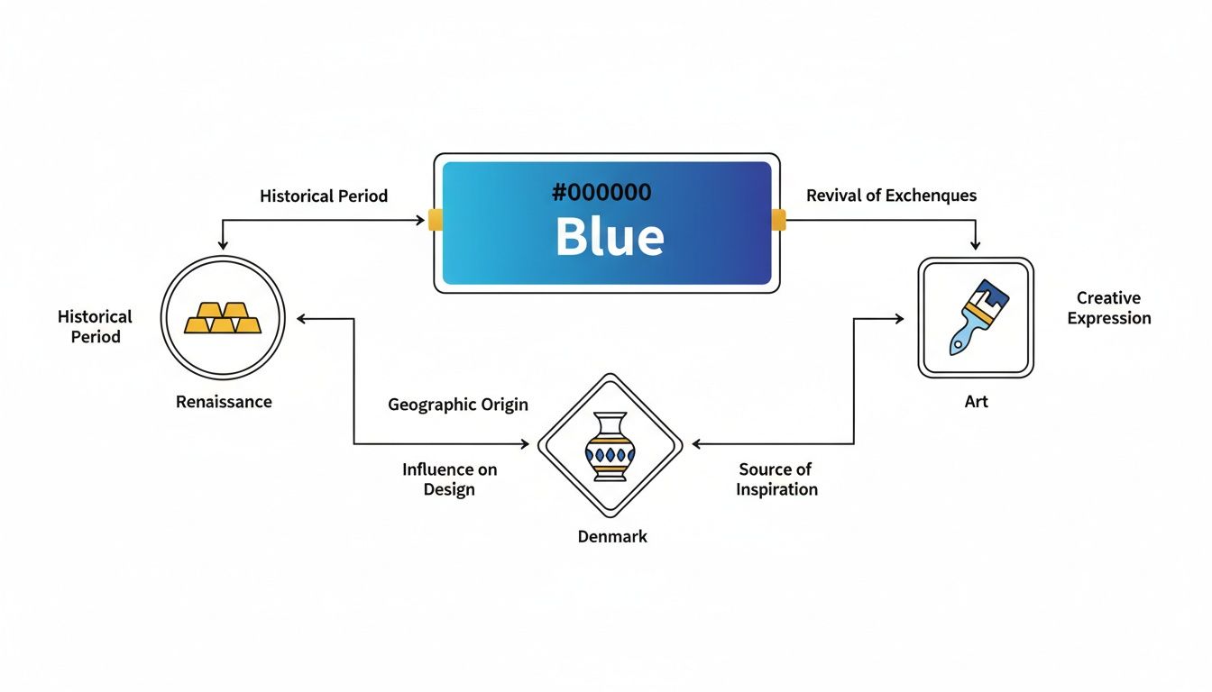
This rich history is exactly why blue often carries a sense of mastery and value—it was once incredibly difficult and expensive to create.
Distinguishing the Blues
Every shade of blue carries its own psychological weight, making it better suited for some jobs than others. Let's look at a few of the most versatile blues in a designer's toolkit and see how their personalities stack up.
Navy Blue: Deep and dark, navy is the colour of authority, stability, and corporate confidence. It feels serious and grounded, which is why you see it so often with financial institutions and big enterprises that need to project absolute reliability. There's no fluff here, just pure professionalism.
Sky Blue: Light, airy, and instantly calming. Sky blue brings to mind openness, freedom, and a deep sense of peace. It's a natural fit for healthcare and wellness brands aiming to create a tranquil atmosphere. In UI design, it can make an interface feel uncluttered and far more approachable.
Cyan (or Electric Blue): This is blue with a shot of adrenaline. Vibrant and buzzing with energy, cyan has become the colour of technology and modern innovation. It feels futuristic and dynamic, perfect for tech startups and digital brands that want to signal they're ahead of the curve. It grabs your attention without the alarm-bell intensity of red or orange.
Teal: A sophisticated blend of blue and green, teal walks a fine line between balance, creativity, and clarity. It feels a bit more unique than a standard blue, suggesting a personality that’s both creative and trustworthy. For more ideas on pairing blue with other rich colours, check out our guide on the meaning of the colour gold and its hex codes.
The Spectrum of Blue Shades and Their Creative Applications
To really make these distinctions stick, it helps to see how each shade serves a different purpose across various creative domains. Choosing the right one always comes back to the story you want to tell and the feeling you want your audience to walk away with.
The following table is a quick-reference guide I've put together to help you and your team select the ideal blue for any project, taking the guesswork out of the equation.
| Shade of Blue | Psychological Meaning | Best For Branding | Ideal for UI/UX | Game/3D Art Application |
|---|---|---|---|---|
| Navy | Authority, Trust, Stability | Corporate, Finance, Legal | Primary text, Headers | Official uniforms, Night skies, Deep space |
| Sky Blue | Calm, Openness, Serenity | Healthcare, Wellness, Travel | Backgrounds, Banners | Clear skies, Peaceful water |
| Cyan | Energy, Technology, Innovation | Tech startups, Digital media | Call-to-action buttons, Icons | Sci-fi interfaces, Magical effects |
| Teal | Creativity, Balance, Clarity | Creative agencies, Lifestyle | Accent colours, Infographics | Unique gems, Stylised water |
Ultimately, choosing a shade is a strategic decision, not just an aesthetic one. The subtle shift from a calming sky blue to a dependable navy can completely change how a user perceives a brand, interacts with an interface, or feels inside a virtual world.
Putting Blue into Practice with VirtuallPRO
Alright, we’ve explored the theory behind blue, from its deep psychological roots to its practical applications in design. Now for the fun part: turning all that knowledge into actual, tangible assets. This is where the real creative work happens, whether you’re designing a calming corporate space or building a mysterious, otherworldly game level.
To get this right, you need precision and consistency. And that’s where an AI tool built for professionals, like our Creative AI OS, VirtuallPRO, comes into play. It helps your team generate high-quality, compliant, and perfectly on-brand visuals, time and time again.
Ready to jump from concept to creation? If you haven't used it yet, you can try VirtuallPRO for free. It’s a single, secure workspace that gives your team direct access to several of the best AI engines out there.
Blueprinting Prompts for Flawless Consistency
In any professional creative project, consistency is everything. A brand’s signature navy blue can’t suddenly look different from one marketing asset to the next. The atmospheric lighting in a game needs to feel the same from one scene to another.
To nail this, we use a technique called “blueprinting” prompts within VirtuallPRO. Think of a blueprint as a master recipe—a highly structured, detailed prompt that your entire team can use to get repeatable, high-quality results.
Instead of just vaguely asking for "a blue room," a blueprint lays out the exact ingredients: the specific shade of blue, the lighting style, the textures of the materials, and the overall mood you’re aiming for. This removes all the guesswork and makes sure every asset created aligns with the project’s core vision.
For instance, a blueprint for an architectural visualisation could look something like this:
Prompt Blueprint: Photorealistic architectural render of a serene corporate office meeting room, featuring navy blue (Hex #000080) upholstered chairs and one accent wall. Natural light from large floor-to-ceiling windows, soft shadows, minimalist oak wood furniture, polished concrete floor. Professional, calm, and focused atmosphere.
This level of detail leaves no room for error. Every designer on the team can use it to produce visuals that are perfectly in sync. If you’re curious to see how different platforms handle prompts, take a look at our guide on the 12 best free AI image generators.
Tailoring Prompts for Different Creative Fields
Of course, different creative fields speak different visual languages. The meaning of the colour blue can be expressed in countless ways, and your prompts need to reflect that nuance. VirtuallPRO is flexible enough to let you tailor your requests for any project, whether it's for game development, 3D modelling, or marketing campaigns.
Here are a few examples of how you can adapt prompts for specific needs right inside the VirtuallPRO workspace:
For Game Asset Creation: "Concept art of bioluminescent cyan flora for a dark fantasy forest. Glowing mushrooms and ethereal vines in shades of cyan (#00FFFF) and teal (#008080), emitting a soft, magical light against a dark, misty background. High detail, atmospheric, mysterious mood."
For 3D Product Visualisation: "High-fidelity 3D model of a sleek, futuristic sports headphone in cobalt blue (#0047AB) with matte and glossy finishes. Studio lighting, clean white background, highlighting reflective surfaces and material texture. Modern, premium, innovative."
For Marketing and Branding: "Lifestyle photograph of a diverse team collaborating in a modern office. The company’s branding is subtly integrated through sky blue (#87CEEB) accents on laptop screens and wall art. Bright, optimistic, and trustworthy tone."
A Central Hub for Seamless Teamwork
Generating the assets is just one piece of the puzzle. The whole creative pipeline needs to run smoothly, and VirtuallPRO helps by bringing generation, management, and collaboration into one place. This is especially vital when you’re working with specific colour palettes, as it keeps everyone on the same page from start to finish.
Inside our Creative AI OS, your team can:
- Annotate Directly on Assets: An art director can literally circle a part of a 3D model and leave a comment like, "Let's shift this shade closer to Royal Copenhagen blue," giving clear, visual feedback.
- Manage Asset Libraries: Keep all your blue-themed assets—from early-stage concepts to final renders—organised in a central, version-controlled library. No more hunting for the latest file.
- Oversee the Entire Pipeline: Producers get a bird’s-eye view of everything. They can track asset progress from a single dashboard, making sure deadlines are hit and quality standards are met.
By integrating all these functions, VirtuallPRO acts as the operating system for your creative production. It makes sure your team can not only generate incredible blue-themed visuals but also manage the entire process in a compliant, secure, and incredibly efficient way.
Using Blue Effectively in Digital Media
Bringing a creative vision to life with the colour blue is about so much more than just picking a favourite shade. It’s a technical craft. In digital design, this is especially true, where things like accessibility and material rendering can make or break the final product. A stunning user interface is useless if it’s unreadable, just like a 3D asset with flat lighting loses all its power.
First things first: making sure your blue-themed designs work for everyone is simply part of being a responsible creator. The Web Content Accessibility Guidelines (WCAG) give us a solid framework for this, and a huge part of that comes down to colour contrast.
For example, putting pure blue text on a black background is a classic mistake—it almost always fails contrast checks, making it a nightmare for users with visual impairments. That's why running your colours through a contrast-checking tool isn't just a good idea; it's an essential step to make sure your work is clear for all.
Balancing Aesthetics and Accessibility
The good news is that designing for inclusivity doesn’t mean you have to compromise on beautiful aesthetics. It’s all about making smart, informed choices that work for every single user.
Here are a few practical tips to keep in mind:
- Make Contrast Your Priority: If you're using blue for text or key UI elements like buttons, always check it against the background. Aim for at least a WCAG AA standard.
- Don't Rely on Colour Alone: Never use blue as the only way to signal something important. A link, for instance, shouldn't just be blue—it needs an underline or another visual cue.
- Experiment with Different Shades: Lighter blues can pop beautifully on dark backgrounds, while darker, more desaturated blues often provide fantastic contrast on lighter canvases.
This kind of thoughtful execution is critical everywhere. Take Denmark, a country with a strong cultural connection to blue. It boasts a 52% approval rating in cultural polls, yet that popularity exists right alongside the nation's "black syndrome," where 70% of respondents see black clothing as a mark of good taste. You can dive deeper into this fascinating dynamic in an interview with the editors of Sindroms magazine.
Lighting and Materials in 3D and VR
When you step out of 2D design and into 3D, AR, and VR, the relationship between light and material becomes everything. You never really see a colour in isolation; its appearance is completely defined by how light hits its surface. A muted, matte blue on a 3D model can instantly become a glossy, reflective one just by tweaking the lighting rig or adjusting the material's roughness.
In virtual environments, blue can set the entire mood. A scene drenched in cool, blue-toned ambient light feels worlds apart from the same scene lit with warm, yellow light, even if none of the assets have changed.
This is where a collaborative platform like VirtuallPRO really shines. It allows your team to manage colour palettes and lighting setups consistently across every project. This ensures the specific blue meaning of colour you're aiming for stays true, from the first 2D sketch to the final rendered 3D asset. And for those creating social media content, that consistency is just as vital; our guide on getting your Instagram post size right can help you maintain that visual polish.
A Few Common Questions About Using Blue
Working with the psychology of blue often throws up a few practical questions. Let's tackle some of the common hurdles that designers, artists, and brand managers face, so you can move forward with confidence.
Which Shade of Blue Best Conveys Both Trust and Innovation?
This is a classic challenge: you want stability, but you don't want to look dated. A fantastic approach is to pair a deep, grounding navy with a spark of bright cyan.
Think of navy as your foundation—it’s the colour of professionalism and reliability, which is why you see it everywhere in finance and big tech. Then, you bring in cyan as an accent. It adds that burst of energy and a modern, digital feel, instantly telling people you're looking toward the future.
You can actually build and test this kind of dual-palette in minutes with VirtuallPRO. It lets you see exactly how the two colours play off each other on your assets, so you can find that perfect balance for your audience.
How Do I Stop a Blue-Heavy Game Environment from Feeling Cold?
It all comes down to balance. Blue can definitely feel chilly on its own, but you can easily warm it up by adding pops of contrasting colours. Think about weaving in warm tones like orange, gold, or a soft yellow. These work beautifully when integrated into light sources—like the glow from a campfire, a flickering lantern, or a magical spell effect.
Don't forget about texture, either. A rough, blue-painted wooden shield feels entirely different from a sleek, metallic blue spaceship hull. Soft fabrics, worn leather, and other tactile materials can make a blue space feel much more inviting. You can experiment with both lighting setups and material PBRs inside VirtuallPRO to see what creates the most immersive atmosphere.
What Are the Main Accessibility Concerns When Using Blue in UI Design?
The biggest one, by far, is colour contrast. Some blues, particularly the pure, highly saturated ones, have notoriously poor contrast against white or black backgrounds. This can make text a real struggle to read for anyone with a visual impairment.
Always, always run your colour combinations through a contrast-checking tool. Your goal should be to meet the WCAG AA standard at a minimum. And just as importantly, never rely on colour alone to communicate something. If a link is blue, it should also have an underline or some other visual indicator.
How Can I Keep My Blue Colour Palette Consistent Across All My Assets?
The first step is to establish a core brand palette. Pin down the exact hex or RGB codes for your specific shades of blue and make them official.
Inside VirtuallPRO's Creative AI OS, you can save this palette directly into your brand guidelines. This means every single prompt you use—whether you’re generating a 3D model, a promotional image, or a social media graphic—will reference those exact colours.
This simple workflow ensures every asset that comes out of the system is perfectly on-brand. Plus, with everything stored in a central library, it's easy to review and manage all your files, keeping your entire project pipeline beautifully consistent.
Ready to take these ideas and create something amazing? Explore the Virtuall Creative AI OS to see how you and your team can generate, manage, and collaborate on incredible, blue-themed assets faster than ever. Give it a try for free.