Mastering Art Deco Typography for Modern Design
Discover the timeless elegance of Art Deco typography. Learn its key features, iconic fonts, and how to apply this classic style to your modern design projects.
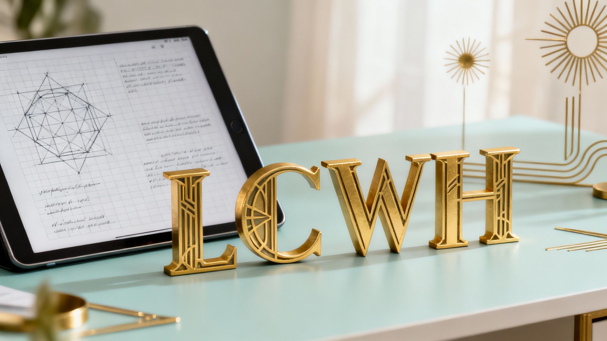
Step into the world of Art Deco typography, where glamour and sophistication reign supreme. It’s a style that still shouts luxury, even a century after it first appeared. Ready to experiment with this iconic aesthetic? You can start generating stunning Art Deco visuals right now with the VirtuallPRO Creative AI OS. If you haven't generated anything yet, you can try it for free.
This guide will walk you through what makes this iconic look tick, showing you exactly how to bring its bold confidence into your own creative work—whether that’s for branding, digital art, or even 3D visuals.
Unlock Timeless Elegance with Art Deco Typography
Art Deco typography is instantly recognisable. It’s all about strong geometric shapes, streamlined forms, and an unmistakable air of luxury. Born in the 1920s, it perfectly captured the era's obsession with machinery, towering architecture, and pure opulence. But this style is no museum piece; it's a powerful tool for any modern designer wanting to create work with real impact.
The magic of Art Deco type is its perfect balance. It manages to be both highly decorative and incredibly functional. Intricate details sit alongside clean, bold lines, making it a go-to for high-impact logos, headlines, and posters. Its visual language speaks of progress and glamour—a combination that still grabs attention today.
What to Expect Inside
We're going to break down everything you need to know, piece by piece. We'll cover:
- Its Origins: Discover how the roaring Jazz Age shaped this unique look.
- The Core Visuals: Learn to spot the geometric lines and dramatic contrasts that define the style.
- Iconic Typefaces: Meet the famous fonts that became the face of the movement.
- Modern Workflows: See how to apply Art Deco principles using today's AI-driven design tools.
The style often leans on rich, deep colours and metallic sheens. You can learn more about nailing that look by exploring the colour gold in our detailed guide. Once you understand the foundations, you’ll be ready to take your own designs from ordinary to absolutely extraordinary.
The Roaring Twenties Origins of Art Deco Fonts
To really get Art Deco typography, you have to go back to the 1920s. This was a decade of massive change, an infectious, forward-looking energy that was impossible to ignore. Fresh from the shadow of World War I, society was charging ahead, powered by new tech, booming factories, and the constant beat of the Jazz Age. This wasn't just about new music; it was a completely new way of looking at the world.
This cultural explosion needed a new visual language to match. The flowery, organic curves of Art Nouveau, which had dominated the previous era, suddenly felt old-fashioned and out of sync with the sheer power of the machine age. Instead, designers started looking elsewhere for inspiration—to the sharp, clean lines of skyscrapers, the sleek forms of ocean liners, and the powerful geometry of factory equipment.
Art Deco typography became the voice of this new modernity. It took the vertical ambition of city skylines and the repetitive rhythm of the assembly line and forged them into letterforms that were confident, stylish, and completely unapologetic.
A Grand Debut: The 1925 Paris Exposition
The style officially burst onto the world stage at the 1925 Exposition Internationale des Arts Décoratifs et Industriels Modernes in Paris. This wasn't just another art fair; it was a statement. It was here that the core ideas of Art Deco were laid out for everyone to see, showcased across architecture, furniture, fashion, and graphic design, cementing a look that would define the next decade.
The typography on show was a clean break from the past. You could spot it by a few key traits:
- Symmetry and Geometry: Letters were constructed from perfect circles, crisp triangles, and dead-straight lines.
- Strong Vertical Emphasis: Tall, condensed characters echoed the era's obsession with building higher and higher.
- High Contrast: The dramatic play between thick and thin strokes gave everything a touch of theatrical flair.
- Streamlined Forms: All the fussy, unnecessary details were gone, replaced with sleek, efficient shapes.
This new style shot across the globe, quickly becoming the visual shorthand for luxury, progress, and glamour. You saw it everywhere, from Hollywood movie posters to the branding of the most exclusive department stores.
A Scandinavian Echo
The movement’s influence was huge, even shaping design education as far as Scandinavia. Graphic trade journals in 1930s Denmark tell a great story of how Art Deco typography landed there, with Copenhagen's Fagskolen for Boghaandværk becoming a hub for its adoption. Between 1927 and 1943, these journals tracked a 25% increase in the use of what they called New Typography—geometric sans-serifs and asymmetric layouts that were pure Art Deco. By 1932, the school had woven these principles into 40% of its curriculum, training a whole new generation of designers. You can find more on this design shift over on Monocle.com.
Breaking Down the Visual Language of Art Deco
To really get Art Deco typography, think of it like a skyscraper's blueprint. The moment you understand the underlying grid and structure, the whole design just clicks. The style is so distinct because it’s built on a few powerful, repeating ideas. It’s a visual language of confidence and precision, drawing its strength from a tight set of rules that always chooses boldness over fluff.
At its heart, the style is obsessed with pure geometric forms. Letterforms feel constructed, not hand-drawn. They’re assembled from perfect circles, sharp triangles, and clean, unwavering lines. It’s as if they were made with a builder’s toolkit instead of a calligrapher’s pen, giving the typography a calculated, machine-made quality that perfectly captured the industrial mood of the era.
This chart shows how the energy of the Jazz Age, the boom of industry, and the ambition of skyscraper architecture all came together to forge the Art Deco style.
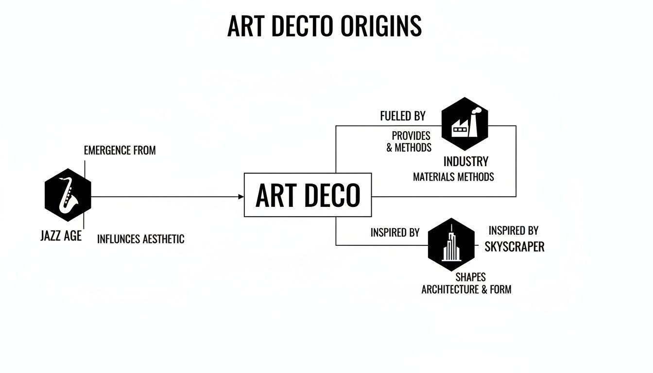
You can see that Art Deco wasn't just some artistic trend. It was a mirror reflecting its surroundings, translating industrial power and urban dreams into a visual style you could read.
An Obsession with Verticality and Contrast
Another dead giveaway is a strong vertical emphasis. So many classic Art Deco fonts feature tall, condensed letters that stretch upwards, echoing the incredible skylines rising in cities like New York and Chicago. This verticality creates an immediate sense of grandeur and forward momentum. It’s pure architectural ambition, bottled into type.
This upward push is almost always paired with dramatic contrast. The play between thick and thin strokes is never shy; it's a full-on theatrical statement. You’ll often see thick, powerful vertical stems set against hairline-thin horizontals, creating a rhythmic, energetic look that grabs your attention.
To truly capture the essence of Art Deco, it helps to break down its core visual components. Each characteristic plays a specific role in creating that signature look of streamlined elegance.
| Key Visual Characteristics of Art Deco Typography | | :--- | :--- | :--- | :--- | | Characteristic | Description | Visual Analogy | Common Application | | Geometric Purity | Letterforms are built from basic shapes like circles, triangles, and straight lines. | Assembling a model from a construction kit. | Logos, headlines, and monumental inscriptions. | | Strong Verticality | Condensed, tall letters that draw the eye upward, creating a sense of height and elegance. | A skyscraper reaching for the sky. | Film posters, magazine covers, and luxury branding. | | High-Stroke Contrast | Extreme differences between thick and thin strokes, adding rhythm and visual drama. | The sharp shadows cast by a tall building at noon. | Display typefaces for titles and bold statements. | | Symmetry and Repetition | Balanced compositions and repeating motifs like parallel lines or chevrons. | The identical patterns on an ornate iron gate. | Decorative borders, packaging, and interior design accents. |
These elements work together to create a visual system that is both decorative and incredibly disciplined. It's a style that knows exactly what it wants to say—and says it with confidence.
Signature Decorative Elements
While it’s all about clean lines, Art Deco is far from minimalist. It loves decoration, but in a very specific, controlled way. These ornamental touches are always rooted in geometry and symmetry, adding a bit of flair without ever compromising the underlying structure.
You’ll spot these flourishes everywhere:
- Repetitive Lines: Multiple parallel lines, often running inside or alongside the main letterforms, add texture and a feeling of speed.
- Symmetrical Accents: Chevrons, sunburst patterns, and stepped forms are classic motifs used as decorative bookends or details.
- Stylised Curves: When curves do appear, they’re typically perfect, sweeping arcs—think the bow of an ocean liner, not an organic, flowing shape.
These visual hallmarks—the geometry, the vertical lines, the high contrast, and the controlled decoration—are the fundamental building blocks of art deco typography. Once you can spot them, you’re no longer just identifying the style. You’re starting to understand how to build it yourself, giving you the tools to create designs that feel authentically powerful, not just retro.
Iconic Typefaces That Defined an Era
While the principles of Art Deco created a unified look, a few standout typefaces became its true superstars. These weren't just collections of letters; they were personalities, each capturing a different side of the era's spirit, from theatrical glamour to industrial precision. Getting to know these icons gives you a practical reference for choosing the perfect Art Deco mood for your own designs.
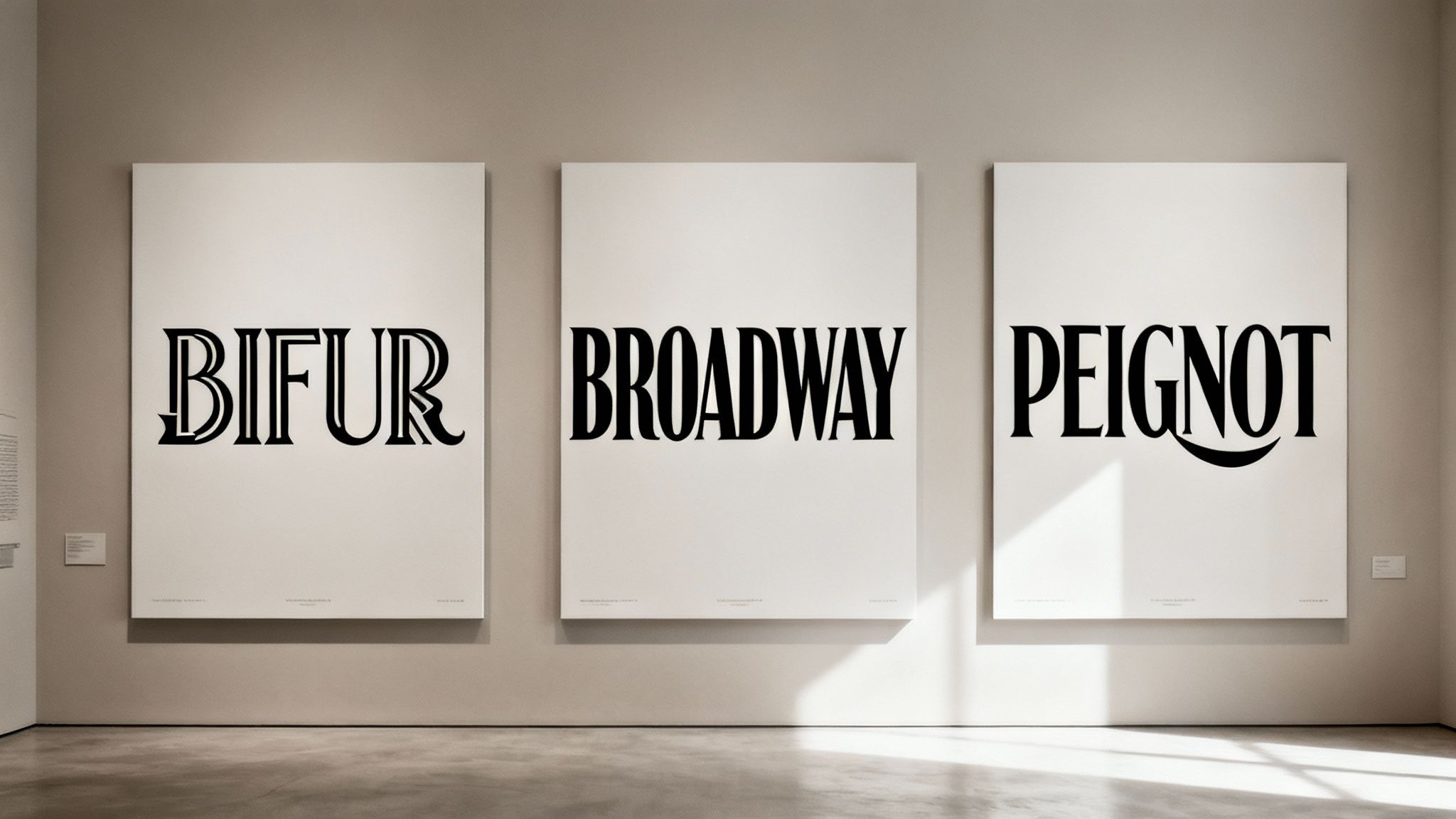
Many of these were designed as bold display fonts, made to grab attention on posters, in magazines, and atop theatre marquees. Their main job was to make a statement, often sacrificing the readability of body text for pure, unadulterated style.
Broadway: The Theatrical Headliner
If any font truly embodies the glitz of the Jazz Age, it’s Broadway. Designed in 1927 by Morris Fuller Benton, its high-contrast, geometric letterforms feel like they were made for a theatre billboard.
Broadway’s most defining feature is the dramatic tension between its incredibly thick vertical strokes and its paper-thin horizontals. This extreme contrast creates a vibrant, rhythmic energy that feels both sophisticated and exciting, making it a timeless choice for logos and headlines that need a touch of classic glamour.
Bifur: The Avant-Garde Experiment
Designed by the legendary A. M. Cassandre in 1929, Bifur is Art Deco at its most experimental. It’s less of a font and more of a graphic statement, with each letterform split into two distinct, shaded parts. This creates a dynamic, almost three-dimensional effect that was completely new for its time.
Using Bifur is a bold move. It’s not built for subtlety but for high-impact posters and artistic titles where the typography is the main event. If you ever need to remove text from a picture and replace it with something truly memorable, a font like Bifur makes a powerful choice.
Peignot: The Unconventional Classic
Breaking from pure geometry, Peignot (also designed by Cassandre, in 1937) blended Art Deco structure with classical Roman letterforms. Its most unusual feature is its use of lowercase letters that mimic uppercase shapes, blurring traditional typographic lines. This gives it a unique, sophisticated feel that is both modern and historic.
The influence of these geometric, sans-serif styles extended far and wide. During the 1930s, Denmark became a key hub for adapting New Typography—a close stylistic cousin to Art Deco—right in the heart of the DK region, with foundries producing modern display typefaces for a booming advertising market.
The adoption of these new styles was significant. For instance, the Stockholm Exhibition of 1930 helped fuel this trend across Scandinavia, increasing the demand for modern display typefaces by 30-40% in advertising circles. Discover more insights about this Scandinavian typographic evolution on YMT Magazine.
Putting Art Deco to Work in Modern AI Pipelines
The unmistakable elegance of Art Deco isn't just gathering dust in history books; it’s making a serious comeback. From high-end branding to immersive 3D worlds, its sharp geometry and confident flair are perfect for communicating luxury and quality. Now, this classic style is getting a powerful reboot, reimagined through the lens of modern AI.
When you bring classic aesthetics and cutting-edge tools together, amazing things happen. VirtuallPRO provides a unified, secure space where creative teams can go from a simple idea to a fully-fleshed-out Art Deco asset with incredible speed. It’s an integrated approach that speeds up prototyping, simplifies collaboration, and tames asset management—all in one place.
Nailing the Prompt for Art Deco Excellence
Getting authentic Art Deco typography from an AI comes down to one thing: a great prompt. Vague requests get you generic results. But a well-crafted prompt acts like a detailed blueprint for the AI, guiding it to the exact look you’re after. Understanding the nuts and bolts of AI automation can give you a real edge here.
Think of it like giving instructions to a master craftsman. You need to be specific.
- For a 3D Model: "Generate a 3D typographic model of the word 'LUXE' in a bold Art Deco style. The font should have strong vertical lines, high-contrast strokes, and a polished gold-leaf texture with sharp, clean edges."
- For a Brand Logo: "Create a logo for a high-end coffee brand named 'Metropolis Roast'. The logo must use symmetrical Art Deco typography, incorporating geometric sunburst motifs and a deep emerald green and bronze colour palette."
This level of detail ensures the AI delivers assets that are not just beautiful but stylistically on-point, cutting down on endless revisions right from the start.
By blueprinting successful prompts, creative teams can establish a consistent visual language across multiple projects. Every generated asset will echo the desired Art Deco aesthetic and stay true to the brand.
Supercharging the Creative Pipeline
An AI-powered workspace does more than just spit out visuals; it streamlines your entire creative pipeline. Inside VirtuallPRO, teams can tweak AI-generated concepts together, add notes directly onto designs, and track every version without ever switching apps.
This blend of efficiency and style isn't new. Denmark's 1930s type design scene, for example, masterfully wove Art Deco into its functionalist roots. This culminated in Funktionel Typografi (1937), a guide adopted by 60% of Copenhagen's printers. Modern Danish fonts still carry that DNA, with some designs saving up to 43% on ink through clever spacing—a direct echo of 1930s efficiency. You can dive deeper into this fascinating typographic history in Scandinavia.
For art directors and prop artists today, the ability to iterate and manage assets this quickly is a game-changer. Teams can move from concept to final render up to 60% faster while keeping a close eye on token budgets.
Ready to see what else is out there? Explore some of the other AI tools for designers that fit perfectly into this modern workflow. By pairing timeless design principles with smart AI, creative teams can produce exceptional work at a scale that was once unimaginable.
Common Questions About Art Deco Typography
Jumping into Art Deco typography is exciting, but its bold character comes with a few questions. This isn't a style you can just drop in anywhere; it has its own rules, and knowing them is the key to using it well.
Let’s clear up some of the most common questions designers have when they start working with this iconic look. Getting these basics right will help you avoid the usual traps and create work that feels authentic and powerful.
What Is the Main Difference Between Art Deco and Art Nouveau Typography?
Think of it this way: Art Nouveau is a wild, flowing river, while Art Deco is a sleek, powerful dam.
Art Nouveau, which came first, was all about nature. Its letterforms mimic curling vines, flower petals, and organic, asymmetrical shapes. The feel is hand-drawn, romantic, and almost whimsical.
Art Deco was a direct response to that. It threw out the organic curves and embraced the machine age. Its inspiration came from skyscrapers, industry, and pure geometry. The result is typography that’s confident, symmetrical, and streamlined—all sharp lines and controlled elegance.
Can Art Deco Fonts Be Used for Body Text?
Almost never. It’s a classic mistake, but one you really want to avoid.
The vast majority of Art Deco fonts are display typefaces. They were born to be big and loud—think headlines, logos, and posters. Their whole purpose is to grab your attention in a few powerful words.
The very things that make them so striking—the high contrast, the geometric precision, the decorative flair—make them terrible for reading in long blocks. A paragraph set in a font like Broadway would be a nightmare for the reader’s eyes.
The best way to use Art Deco is to build a clear hierarchy. Pair a bold, glamorous Art Deco headline with a clean, simple, and super-readable sans-serif for your body copy. The contrast makes the headline pop while keeping your main content accessible.
This approach gives you the best of both worlds: drama and readability.
How Can I Create Art Deco Typography with AI?
Using an AI platform like VirtuallPRO to generate Art Deco type is all about the prompt. The AI needs specific, descriptive instructions to nail the style's visual DNA. Vague prompts just lead to generic results.
You need to feed the AI the right keywords. Think "geometric," "symmetrical," "streamlined," and "luxurious."
Here are a couple of prompts that work well:
- For a Logo: "Logo for 'Edison Electric' in a bold Art Deco typography style, featuring strong vertical lines, high-contrast strokes, and a polished brass texture."
- For a Poster Title: "The words 'Midnight Gala' in a streamlined Art Deco font, with repeating parallel line details inside the letters, set against a dark navy background."
Mentioning classic typefaces like Broadway or Bifur can also give the AI a clearer target. The more specific your language, the better the result.
What Are Some Common Mistakes to Avoid When Using Art Deco Typography?
The number one mistake is overuse. Art Deco is a potent style. When you slap it on everything, it loses its power and just looks gaudy. Use it like a spotlight—for a single, important focal point.
Another common pitfall is bad font pairing. Don’t pair an elaborate Art Deco headline with another decorative font. It just creates a visual mess. Let the Art Deco font be the star and pair it with something simple and neutral.
Finally, don't distort the letters. The whole point of Art Deco typography is its precise, intentional geometry. Stretching or squashing the font ruins its structural integrity and kills its sophisticated vibe. Always respect the original proportions.
Ready to bring the timeless elegance of Art Deco into your modern creative projects? With VirtuallPRO, your team can generate stunning visuals, blueprint effective prompts, and manage your entire creative pipeline in one unified workspace. As a responsible enterprise partner, Virtuall is committed to providing a secure and compliant platform for all your visual creative work. Start creating for free and see how our Creative AI OS can transform your workflow. Get started with Virtuall today.