Mastering drawing of lightning: A Complete Guide to Dramatic Lightning Effects
Master the techniques to create dramatic drawing of lightning for digital art and animation, from quick sketches to photorealistic storms.
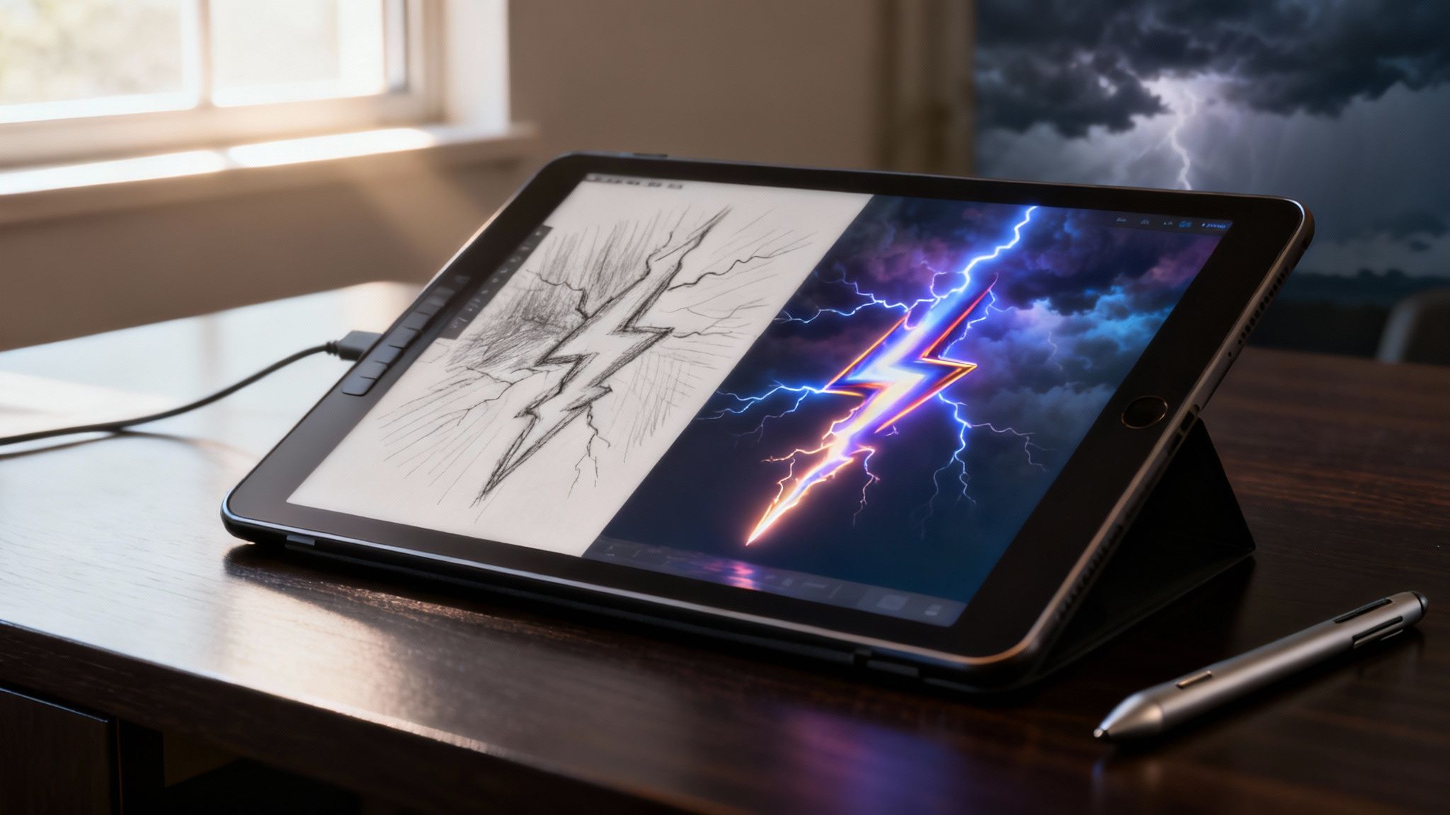
Welcome! If you're looking to create a genuinely dynamic and powerful drawing of lightning, you've come to the right place. Creating stunning visual assets is our specialty here at Virtuall. Whether it's a quick sketch or a complex visual effect, this guide will cover everything you need.
Before we dive in, we encourage you to try our Creative AI OS, VirtuallPRO. It’s designed for professionals who need to generate high-quality visual content responsibly and efficiently. If you haven't generated anything with us yet, you can try it for free and see how it can safely accelerate your creative process.
Capturing The Storm: Drawing Lightning With Confidence
Maybe you're crafting key art for a game set on a stormy Danish coast, or perhaps you're visualising a dramatic moment for a brand. Whatever the project, having a solid concept is what separates a good drawing from a great one.
If you find yourself staring at a blank page, it helps to explore proven strategies for overcoming creative blocks—they can be a real roadblock to artistic progress. This guide will break down the entire process for you, from understanding the anatomy of a lightning bolt to truly mastering colour and light. And if you feel like you need to brush up on the basics first, you can always learn how to sketch with our other guides.
This is where a tool like VirtuallPRO can really make a difference. It's a complete Creative AI OS that lets you generate initial concepts, refine them into detailed 2D assets, and even build entire 3D scenes, all in one seamless workspace. Virtuall is committed to providing a secure and compliant platform for all your creative needs.
Understanding The Anatomy Of A Lightning Bolt
To really nail a drawing of lightning, you have to forget the simple zigzag you see on warning signs. Real lightning is a raw, chaotic burst of energy that spiders across the sky in a fractal-like pattern. It’s far more complex and beautiful than that simplified symbol.
A single bolt isn't just one flash. It’s a super-fast sequence of electrical events, and each one looks slightly different. Once you get your head around these components, your art will have a sense of realism and power that a simple jagged line just can’t capture. I find it helps to think of it less like a line and more like a glowing tree, with roots in the clouds and branches reaching for the earth. High-speed cameras show us this intricate structure, and we can use that insight to build our own.
The Core Components
The part of a lightning strike that really burns into your vision is the return stroke. This is the main, intensely bright channel that shoots up from the ground to the cloud, moving at almost a third of the speed of light. It's what we see as the flash, so it absolutely has to be the brightest element in your drawing.
But before that main event, you have the stepped leaders. These are much fainter, thinner branches of charged air that creep down from the cloud, feeling out a path to the ground. They're what give lightning its classic forked look.
- Primary Channel (Return Stroke): This is the visual anchor of your bolt. Make it the thickest and brightest part of the strike.
- Branches (Leaders): These should be thinner and less intense than the main channel. They should fork off at sharp, energetic angles, not gentle curves.
- Impact Flash: Where the bolt hits the ground, there's often an explosive burst of light. This is a great opportunity to illuminate the ground and the base of the bolt itself.
I see this all the time: artists make the entire bolt equally bright. In reality, the return stroke can be up to 100 times brighter than the leaders. This creates a powerful visual hierarchy you can use to direct the viewer’s eye right to the point of impact.
Different Types Of Lightning
Not all lightning is created equal, and knowing the different types can add some incredible variety to your scenes. The one we all know is cloud-to-ground lightning—the classic bolt striking the earth.
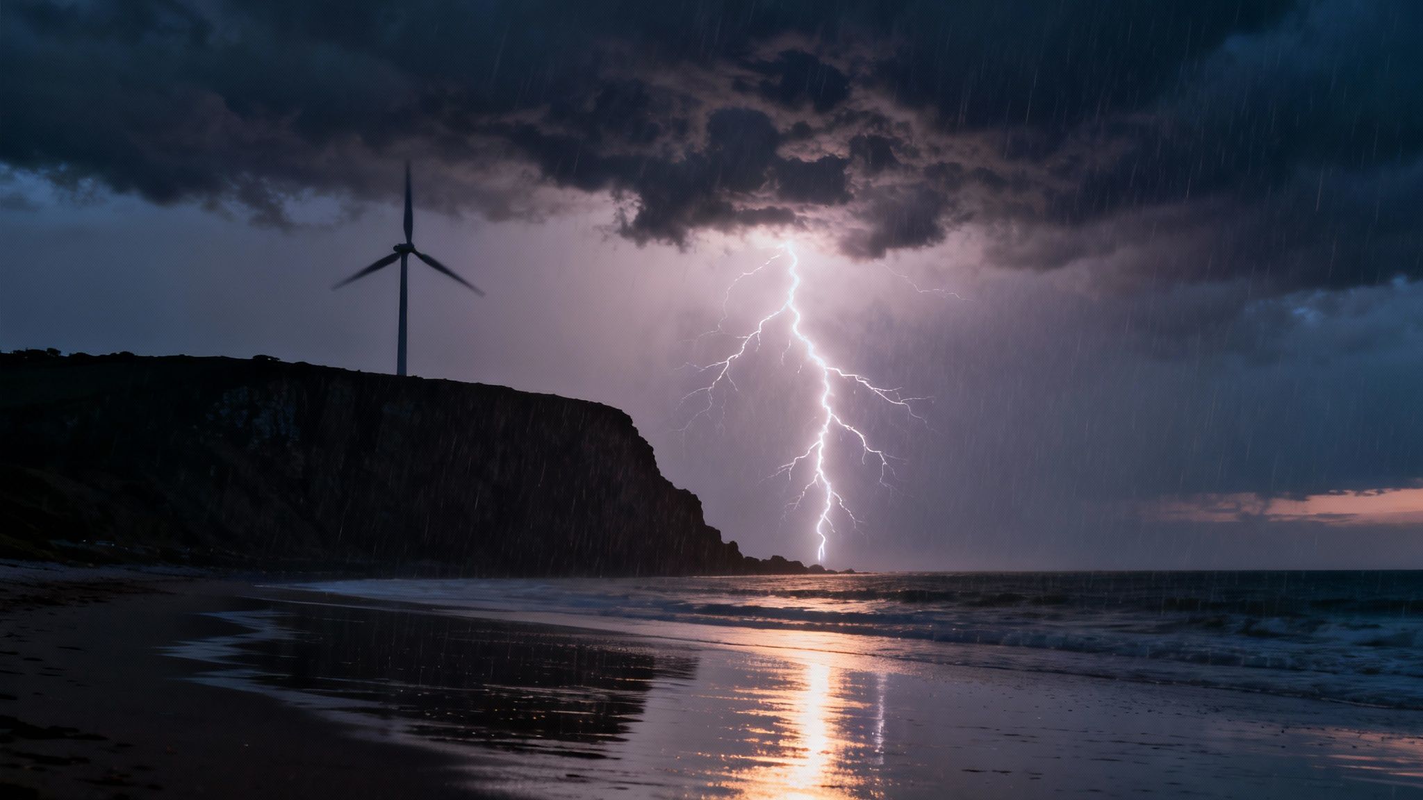
But what you might not know is that cloud-to-cloud (or intra-cloud) lightning is way more common. This is when the flash happens inside or between clouds, lighting them up from within like a massive, ethereal lantern. It creates a beautiful, diffused glow without a single visible bolt. Then you have the really rare stuff, like the visually stunning upward lightning, which actually starts from a tall object on the ground—like a skyscraper or wind turbine—and travels up to the clouds. Each type gives you a completely different artistic tool to play with, letting you set a unique mood for your storm scenes.
A Practical Guide to Drawing Realistic Lightning
Drawing lightning that feels real isn't about tracing a jagged line. It's about capturing a moment of pure, chaotic energy. The trick is to think of it less as an object and more as an event unfolding across your canvas.
To get started, you need a strong focal point. Where do you want the viewer's eye to go? Usually, it’s the point of impact or the brightest, thickest part of the main bolt. Sketch this main channel first. It needs to look like it’s tearing through the air, finding the path of least resistance. That means no perfectly straight or evenly thick lines. Let it vary, make it thicker and brighter at its core, and a little softer on the edges.
This main channel is the spine of your entire image. Get that right, and everything else you add will just build on that initial burst of power.
Building The Bolt and Its Glow
With the main channel in place, it’s time to add the smaller, secondary branches. A common mistake I see is making these branches too gentle or curvy. Real lightning forks at sharp, aggressive angles, which is what gives it that violent, energetic feel. Keep these smaller forks thinner and less intense than the main channel they’re branching off from.
Now for the part that really sells the effect: the atmospheric glow. This isn’t a single, simple halo. It’s actually two distinct layers of light, and if you’re working digitally, using separate layers is the best way to handle them.
- The Corona: Think of this as the superheated air clinging right to the bolt. It’s an intense, bright aura that’s tightly wrapped around the core channel.
- The Glow: This is the much softer, wider light that spills out and illuminates the surrounding clouds and atmosphere. It’s diffuse and doesn't have a hard edge.
My go-to method in digital software is to put the core bolt on its own layer, add another layer for the tight corona, and a third for that broad, atmospheric glow. Playing with blending modes like ‘Screen’ or ‘Add (Linear Dodge)’ is key here; they create that brilliant, high-energy luminosity that looks so natural. I’ll often use custom brushes that mimic electrical tendrils for the bolt and a soft airbrush for the glow.
The most important thing to remember is that lightning is ridiculously bright—it's almost always the brightest light source in your entire scene. That means it’s going to cast very sharp, well-defined shadows and create a brilliant, silvery rim light on the edges of any nearby clouds.
To get a better sense of how a bolt actually forms, from the initial leaders to the final strike, this diagram breaks it down beautifully.
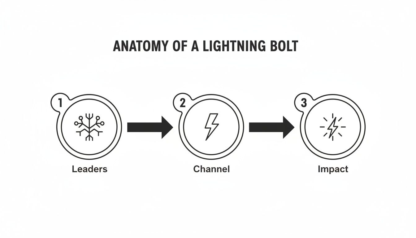
You can see how the faint leaders scout out a path before the main, blindingly bright channel opens up, leading to that final, powerful impact.
Shading The Environment
A lightning bolt just floating in space will never look right. The real magic happens when you show how it interacts with the world around it. The easiest way to think about it is to imagine a giant camera flash going off in a pitch-black room.
Any surface directly facing the bolt—the tops of trees, the side of a building, the bellies of clouds—is going to be blasted with incredibly bright, almost blown-out highlights. Use bright, hard-edged light here.
In contrast, everything else gets thrown into deep, dark shadow. These aren't soft, gentle shadows; they're stark and dramatic. It's this extreme contrast that truly conveys the immense power of the strike and gives your scene that dynamic, cinematic quality. Don't be afraid to push your values to their absolute limits.
Drawing Stylized Lightning For Games And Animation
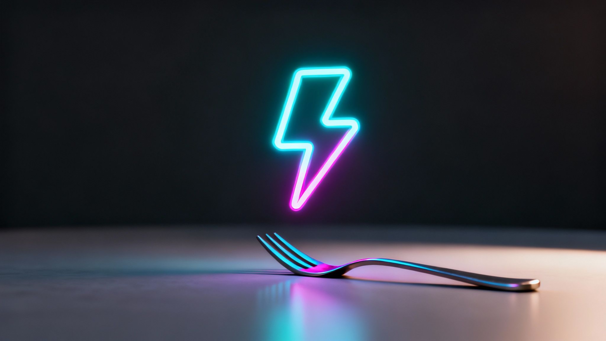
While aiming for realism is a great exercise, it's not always the right fit. For creative projects like game development and animation, a stylized drawing of lightning is often a much more powerful tool for getting your point across, whether you're trying to communicate an emotion, a gameplay mechanic, or just a really cool aesthetic.
Stylization is your license to bend the rules of physics for the sake of art. You can push the shapes, crank up the colours, and give your lightning a personality all its own. This is where you graduate from simply drawing energy to actually defining its character.
When you're trying to figure out the best way to draw lightning for your project, it really helps to break down the differences between a realistic approach and a stylized one. Each has its own goals, techniques, and ideal use cases.
Realistic vs Stylized Lightning Approaches
| Attribute | Realistic Lightning | Stylized Lightning |
|---|---|---|
| Primary Goal | To accurately replicate the natural appearance of lightning. | To convey an idea, emotion, or gameplay function clearly. |
| Shape Language | Follows natural physics: chaotic, fractal, unpredictable branches. | Simplified and exaggerated forms; can be jagged, smooth, or geometric. |
| Colour Palette | Primarily white, pale blue, or violet with subtle variations. | Can be any colour; chosen for symbolic or aesthetic reasons. |
| Common Use Cases | Matte paintings, environmental effects, film VFX, scientific illustration. | Game abilities, UI icons, animated effects, logos, character design. |
| Key Technique | Observation, study of reference, complex shading, and light simulation. | Deliberate design choices, bold lines, strong silhouettes, vibrant colour. |
Ultimately, neither approach is "better"—they just serve different purposes. Your choice depends entirely on what you're trying to achieve with your artwork.
Defining Character Through Shape And Colour
The soul of stylized lightning is its shape language. Before you even draw a line, ask yourself: what’s the vibe? Is this energy aggressive and chaotic, or is it clean and futuristic? Your lines will answer that question for the viewer instantly.
A sorcerer's dark spell, for instance, might be all sharp, jagged forks and wild, unpredictable offshoots. On the other hand, the energy blast from a sci-fi weapon could be a single, smooth bolt with clean, almost geometric lines. Colour is just as crucial for setting the mood.
- Arcane Magic: Deep purples, electric blues, and even sickly greens are classic choices for suggesting supernatural or otherworldly power.
- Technological Energy: Think clean whites, cyans, and sharp oranges. These often imply controlled, advanced power, like a plasma rifle or a futuristic logo.
- Divine Power: Brilliant golds and pure, glowing whites can signify holy or celestial energy, a staple for healing spells or a god's wrath in games.
If there’s one thing to take away from great game design, it's that visual clarity is king. A player has to know in a split second whether an electrical effect is a threat, a buff, or just window dressing. Deliberate, consistent use of shape and colour is how you make that happen.
The goal here is to get an immediate emotional and informational read. Your stylized lightning should tell a story on its own, setting the scene before anything else even happens.
Practical Techniques For Stylization
Creating stylized lightning often calls for a different toolkit than you'd use for realism. Vector art, for example, is a fantastic choice for the clean, scalable lines you need for things like UI elements, logos, or 2D animated effects.
Working in a vector-based program gives you perfect curves and sharp angles that stay crisp no matter how much you resize them. This is perfect for designing in-game ability icons or creating animated effects that have to work at multiple resolutions. To make these vector shapes feel alive, you can apply effects like outer glows, inner glows, and colour gradients to give them that vibrant, luminous core.
For the more painterly, hand-drawn styles common in animation, the process is a bit different. Animators will often break a lightning strike down into just a few keyframes, focusing on creating dynamic, impactful shapes that are easy to read in motion. You can even explore bringing these drawings to life by checking out our guide on using an AI picture animator. It's a great way to quickly prototype how your stylized effects will look once they're moving.
Whether you're making a tiny spark or a screen-clearing ultimate attack, the principles are the same. Simplify the form, exaggerate what matters most, and stick to a purposeful colour palette. That’s how you ensure your stylized drawing of lightning not only looks good but also does its job for the story or gameplay.
Speeding Up Your Workflow With VirtuallPRO
Knowing the traditional techniques is one thing, but today's creative pipelines are all about speed, flexibility, and iterating fast. This is where Virtuall's Creative AI OS really comes into its own for any artist creating a drawing of lightning. Instead of sinking hours into one single idea, you can suddenly explore dozens of them in just a few minutes.
Think about it. You can kick off a project with a detailed text prompt and watch as a whole spread of initial concepts appear, each with a completely different mood and composition. That whole initial exploration phase—the part that used to eat up days of sketching—can now be done in a single sitting. It frees you up to put your real artistic energy into polishing the best ideas, not just running with the first one that comes to mind.
From Prompt to Polished Asset
Let's walk through what this looks like in practice. Imagine you have a client brief. You could start with a very specific prompt like: 'Photorealistic drawing of lightning striking a wind turbine off the Danish coast, dark storm clouds, dramatic lighting, 8k'.
This prompt is particularly relevant for projects based in Denmark. If you're an art director or concept artist there, you'll know that modern storm references often come from short, intense bursts. A single summer storm might be responsible for most of the year's visible lightning, and Danish visual culture often ties this imagery to west-coast horizons and offshore wind farms.
Once the AI generates a base image you really like, the real work begins inside VirtuallPRO. This is where you can use annotation tools to drop precise feedback for your team right on the image, maybe circling an area that needs a tweak or adding a note about the colour intensity.
The real magic is moving seamlessly from text-to-image to image-to-image generation. This creates a powerful iterative loop where you can keep refining the composition, the intensity, and the environmental lighting until the asset is absolutely perfect.
This whole process respects your skill as an artist while dramatically cutting down the revision cycle. It’s not about replacing creativity; it’s about giving it a serious boost with better tools.
Expanding into 3D Environments
And if you're on a team working in game development or VFX, the workflow doesn't stop at 2D. A really strong 2D drawing of lightning can become the direct foundation for your 3D assets.
Using that refined 2D concept as your reference, you can generate immersive 3D storm effects or dynamic skyboxes for your game engine. This creates a fantastic visual consistency, all the way from the first piece of concept art to the final in-game environment.
This unified approach gives you a massive advantage:
- Concept Exploration: Generate and compare dozens of visual directions in a fraction of the time.
- Collaborative Refinement: Use built-in tools to give clear, actionable feedback to your team.
- Iterative Design: Fine-tune the smallest details using image-to-image generation loops.
- 2D to 3D Pipeline: Turn your 2D assets into 3D effects, all within the same workspace.
By keeping every stage of creation—from the initial prompt to the final 3D model—organised in one place, VirtuallPRO helps teams stay on the same page and work efficiently. You can learn more about how AI is shifting creative fields by reading our guide on artificial intelligence drawing. An integrated approach like this ensures your final work is not only top-quality but also delivered on time.
Common Mistakes To Avoid When Drawing Lightning
Even artists who've been at this for years can stumble into a few common traps when trying to capture lightning. Knowing what these pitfalls are is half the battle won, helping you create storm scenes that feel truly alive and believable.
One of the biggest tells? A lightning bolt that's too neat and tidy.
That classic, cartoonish zigzag is a dead giveaway that you haven't spent enough time looking at the real thing. Nature isn't that clean. Real lightning is chaotic, a fractal pattern full of sharp, jarring angles and lines that vary in thickness. Ditch the symmetry. Make every fork and every tiny offshoot completely unique, as if the bolt is ripping its own violent path through the air.
A Bolt Disconnected From Its World
Another mistake I see all the time is lightning drawn in a vacuum. A bolt with that much energy doesn't just hang in the sky; it tears into the environment around it. If you forget to add that powerful ambient glow, the sharp, hard-edged shadows it casts, or the brilliant reflections on wet streets and puddles, your image will fall flat. The lightning should feel like it's lighting up the clouds from the inside out and blasting highlights across the landscape.
Colour is another area where things can go wrong. Just using pure white for the core is a missed opportunity. Lightning superheats the air around it, creating a corona that can glow with hints of violet, blue, or even pink. A stark white line without that surrounding atmospheric glow just won't have the same energy or depth.
Here's a critical one: getting the scale wrong. A bolt that looks too tiny or comically large for the scene instantly shatters the illusion. Make sure its thickness and length feel right in proportion to other elements like trees, buildings, or mountains.
Finally, think about the story you're telling, especially if you're grounding it in a specific place. For my fellow motion designers and game devs creating scenes set in Denmark, for example, it's good to know lightning is more of a dramatic flourish than a constant, destructive threat. The World Bank’s Climate Knowledge Portal shows that while Denmark gets storms, lightning isn't a primary cause of large-scale disasters.
This means you can use it for more focused, believable storytelling—maybe it knocks out the power to a farmhouse or ignites a single tree. It's the perfect trigger for a localised event. To really nail this, it's worth a look into Denmark's historical storm data to base your creative choices in a bit of reality.
Frequently Asked Questions About Drawing Lightning
Got a few more questions rattling around? Let's tackle some of the common hurdles creatives face when trying to capture the raw energy of a storm.
What Are The Best Digital Brushes For Lightning?
Honestly, there’s no magic bullet here—it really boils down to the look you're after.
For a more realistic feel, I find a multi-brush approach works wonders. Start with a hard, thin brush to define the core of the bolt itself. Then, grab a soft airbrush to build up that atmospheric glow around it. Finally, for those chaotic little offshoots, a good "crackle" or "electric" textured brush can add that perfect touch of energetic detail.
If you’re going for something more stylised, you can keep it simple. Often, a clean, round brush or a crisp vector path is all you need to get the job done.
How Do I Make My Lightning Drawing Look Powerful?
Making lightning feel powerful is all about contrast and its interaction with the world around it. It's not just about drawing a bright line.
You need to push your values. Place the absolute brightest part of your image—the core of the bolt—right up against some of your darkest darks, like the deep shadows it casts on clouds or the landscape. Show the light from the flash bleeding into the clouds and lighting up the ground below.
Interestingly, a pan-European study found that lightning fatalities average 64 per year across Europe, with a staggering 77.8% of victims being male. For Danish creatives, this data often reinforces that the true sense of power comes from personal, close-up encounters with nature's force, rather than just massive, city-scale destruction. You can read more about these findings over on Vaisala.com.
The key takeaway: A bolt of lightning that feels truly part of its environment will always have more impact than one that just looks pasted on top.
Ready to create your own electrifying visuals? VirtuallPRO provides a complete Creative AI OS to generate, manage, and collaborate on stunning 2D and 3D assets. Try it for free and accelerate your workflow at https://virtuall.pro.