CMYK to RGB Conversion: Free Tools & Step-by-Step Guide
Convert CMYK to RGB the right way — free converters, Photoshop and Illustrator workflows, and tips to preserve color accuracy from print to screen.
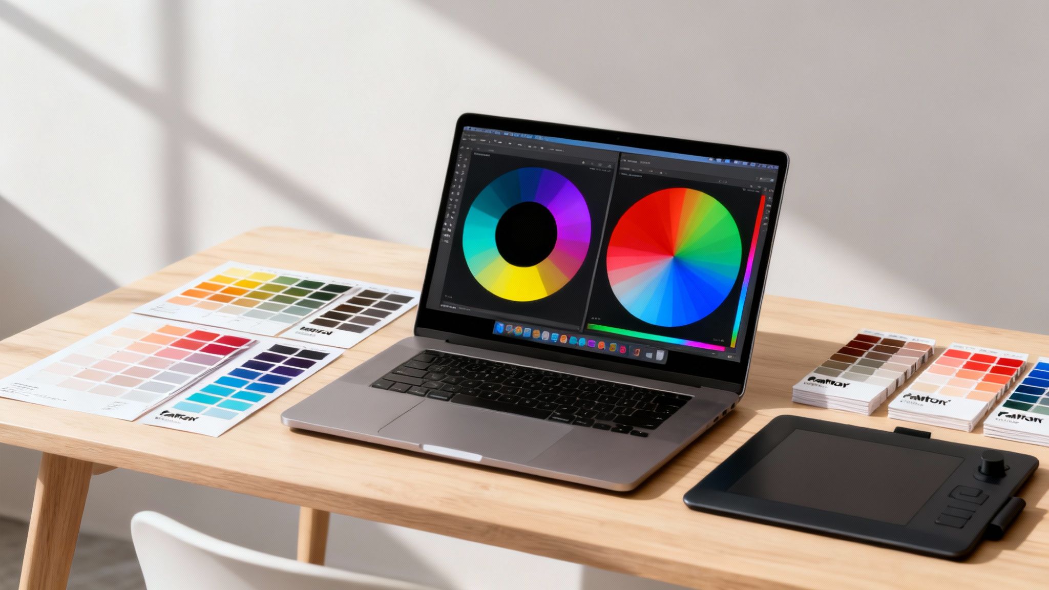
Ever finalized a stunning print design, only to see its vibrant colors fall flat on a website or social media feed? It’s a common frustration, and it all comes down to the fundamental difference between how colors are made for print versus digital screens. For enterprises managing a visual brand, this isn't just a technical detail—it's critical for maintaining consistency and trust across all platforms. At Virtuall, we believe a secure, compliant workflow is the bedrock of professional creative operations.
The VirtuallPRO Creative AI OS helps teams like yours automate and standardize these critical tasks. If you haven't generated anything with us before, you can try it for free and discover how to lock in brand consistency from a single, secure platform.
Why Your Colors Shift (and How to Fix It)
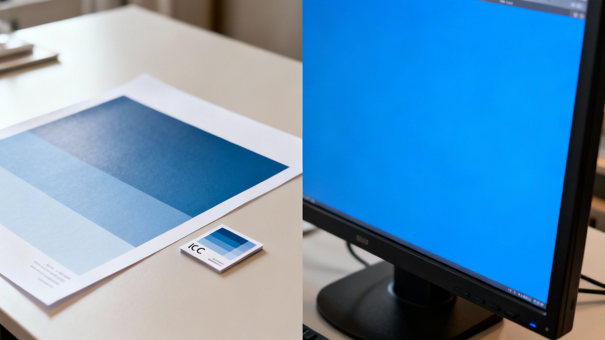
The problem starts with two completely different ways of thinking about color. Print uses CMYK (Cyan, Magenta, Yellow, Key/Black), which is a subtractive color model. Inks are layered onto paper, subtracting brightness from the white surface. The more ink you add, the darker the color gets, until you end up with black.
Digital screens, on the other hand, use RGB (Red, Green, Blue). This is an additive color model. Screens start black and emit light through millions of tiny red, green, and blue pixels. When you combine them at full intensity, you get pure white. This additive process can create a much wider, more brilliant range of colors than printing inks ever could.
The Real Source of Color Mismatches
The disconnect happens when you try to move from CMYK to RGB. A simple, thoughtless conversion just doesn't work because the range of colors you can print (the 'gamut') is much smaller than what a modern screen can display. That brilliant, electric blue in your brand guide probably doesn’t even exist in the CMYK world.
When software converts a file without proper instructions, it's forced to guess how to map colors from one space to another. This usually leads to disaster:
- Dull, muted colors: Those vibrant blues, greens, and oranges lose all their punch because there’s no direct ink equivalent.
- Weird color shifts: A specific shade of red might suddenly look like a completely different, less appealing hue.
- Loss of detail: Subtle gradients and shadows can get crushed or flattened, stripping the depth from your original design.
The answer isn’t to avoid conversion; it's to control it. The key is a proper color-managed workflow using ICC profiles. Think of them as translators that tell your software how to intelligently map colors from one device’s gamut to another, preserving your creative intent as closely as possible.
Of course, understanding the principles behind file formats helps prevent quality loss, too. For more on that, check out our guide on the differences between PNG and JPEG formats, since picking the right one is crucial for any digital asset.
By adopting these best practices, your team can finally ensure your visual identity stays strong and consistent, whether it's on a printed brochure or a smartphone screen. It’s a discipline that saves a ton of time and prevents costly rework down the line.
Getting to Grips with CMYK and RGB Color Models
To nail a CMYK to RGB conversion, you have to think beyond the acronyms. Yes, CMYK is for print and RGB is for screens, but the real story is in how they make color. Get this wrong, and you’re in for a world of color-shift headaches.
RGB (Red, Green, and Blue) is an additive color model. It works by adding light. Picture a completely black room with three spotlights: one red, one green, and one blue. Where the light beams cross, new colors emerge. When all three hit the same spot at full blast, you get pure white. Your monitor, TV, and phone all do this—they start with a black screen and add light to create an image.
CMYK (Cyan, Magenta, Yellow, Key/Black) is the total opposite. It's a subtractive color model made for ink on paper. Instead of adding light, it subtracts it. The white of the paper starts by reflecting all light. As you lay down inks, they absorb (or subtract) certain wavelengths, reflecting back only the color you see. In theory, mixing them all gives you black because you’ve absorbed all the light.
Why Gamut Is Everything
The real conflict between these two models comes down to one crucial concept: gamut. A gamut is simply the full range of colors a device can show or print. And this is where the problems start for designers.
The gamut of a standard RGB screen is way, way bigger than what a CMYK printing press can handle. Your monitor can blast out super-bright, saturated colors—think electric blues, neon greens, and fiery oranges—that you just can't mix with physical inks. There is no ink equivalent for light being emitted by a pixel.
Think of it like this: The RGB gamut is a giant box of crayons with every shade you can imagine, including the fluorescent ones. The CMYK gamut is a much smaller, standard box. When you convert from RGB to CMYK, you have to find the closest match in that smaller box, which usually means picking a duller crayon. This is the root of the problem.
Seeing the Gamut Mismatch in Action
This isn't just theory; it has real consequences for your work. A classic example is that brilliant, glowing blue in a digital logo. On-screen, it’s perfect. But send that file to print, and the CMYK version comes back looking flat and muted. The original blue was "out-of-gamut" for the printing press.
This mismatch hits certain colors harder than others:
- Bright Blues and Greens: These are almost always the first casualties. They lose a lot of their saturation in print.
- Deep, Rich Blacks: A pure RGB black (0, 0, 0) doesn't translate directly. In CMYK, it can look like a washed-out grey if not converted to a proper "rich black" mix.
- Vibrant Oranges and Reds: That luminous, fiery quality you see on a screen is notoriously tough to replicate with ink on paper.
Understanding this gamut limitation is your first step to mastering color conversion. It stops being a frustrating guessing game and becomes a predictable science.
Once you know certain colors are going to shift, you can plan for it. You can make smarter decisions, whether you’re converting manually in Adobe Photoshop or building an automated workflow in a creative OS like VirtuallPRO. This knowledge lets you manage client expectations and keep brand colors looking consistent, no matter where they appear.
Practical Conversion Workflows in Creative Software
Moving from color theory to hands-on practice is where the magic really happens. For most of us, Adobe Photoshop is the nerve center for any serious image work, making it the perfect place to build a reliable CMYK to RGB conversion workflow.
But here’s a common pitfall: just flipping the color mode under Image > Mode. It’s a blunt instrument that gives you zero control and almost always leads to flat, disappointing colors. The professional approach is far more deliberate.
Using Convert to Profile in Photoshop
The key to a high-quality, predictable conversion lies in a different command: Convert to Profile, tucked away in the Edit menu. This tool is your control panel. It lets you define the starting point (the source CMYK profile) and the destination (your target RGB profile) and, most critically, choose how the colors get translated.
Think of it as the difference between a direct word-for-word translation and a nuanced interpretation that preserves the original meaning.
This screenshot shows the standard color settings dialogue in Photoshop, where you can define your default working spaces for RGB, CMYK, and Grey.
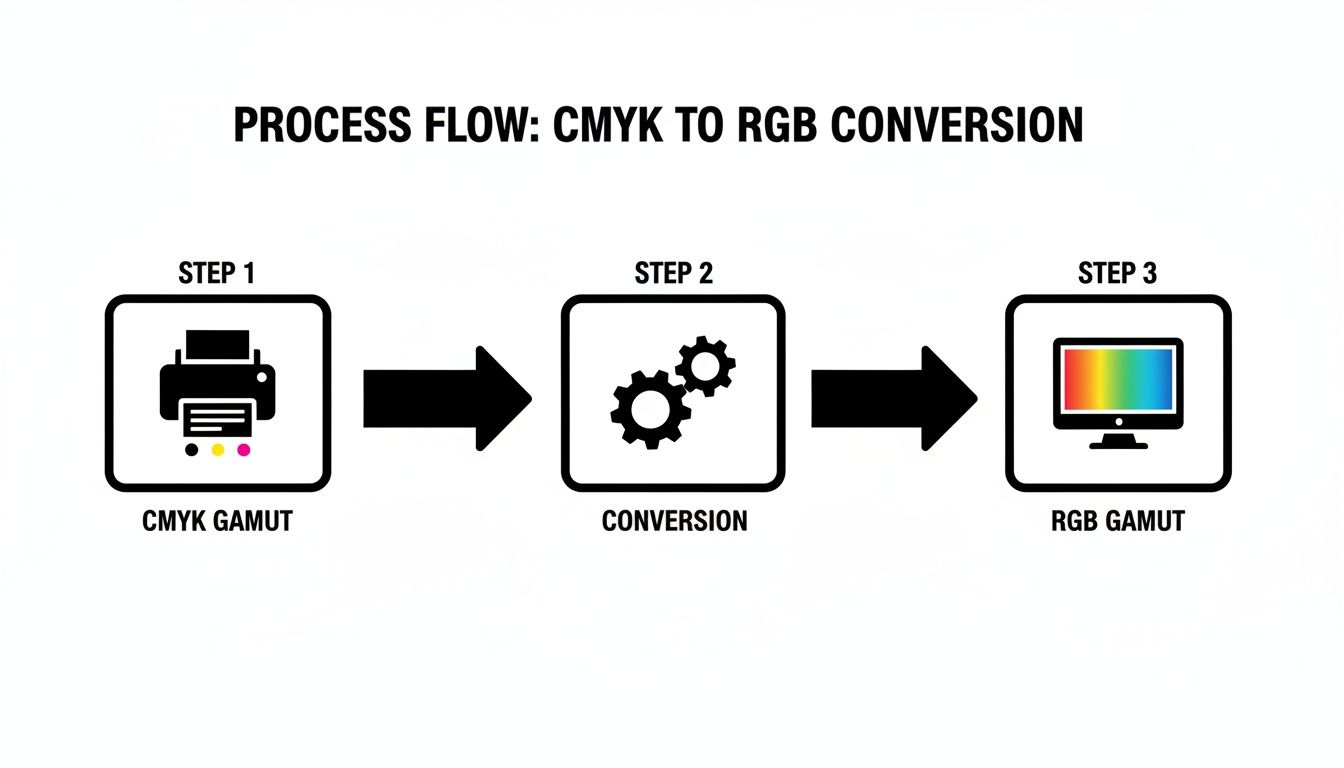
For almost all digital and web work, setting your RGB working space to sRGB IEC61966-2.1 is the safest bet. It’s the universal standard for monitors and browsers, ensuring what you see is what your audience gets.
Decoding Rendering Intents
This is where you get to direct the conversion. Rendering intents are essentially the rules that tell Photoshop how to deal with colors that exist in the source CMYK space but fall outside the destination RGB gamut. It's a common scenario, since modern screens can often display more vibrant colors than standard print processes.
Choosing the right intent is everything.
Choosing the Right Rendering Intent for Your Conversion
Each of the four rendering intents serves a specific purpose. Understanding them means you can pick the right tool for the job, whether you're working with a photograph, a brand logo, or a technical diagram.
| Rendering Intent | Primary Use Case | How It Handles Out-of-Gamut Colors | Best For |
|---|---|---|---|
| Perceptual | Photographic Images | Compresses the entire source gamut to fit the destination, shifting all colors slightly to maintain visual relationships. | Images where the overall mood and color harmony are more important than exact color values. |
| Relative Colorimetric | Logos & Brand Colors | Maps in-gamut colors exactly. "Clips" out-of-gamut colors to the closest reproducible hue. | Preserving specific brand colors you know are within the sRGB gamut, like in vector logos or UI elements. |
| Absolute Colorimetric | Print Proofing | Same as Relative, but it also preserves the source's white point, which can cause a color cast on screen. | Highly specialized use, mainly for simulating on-screen how an image will look printed on a specific paper stock. |
| Saturation | Charts & Diagrams | Pushes colors to their most vivid equivalents in the destination space, often sacrificing hue accuracy for impact. | Business graphics, charts, and presentations where you need colors to be as distinct and punchy as possible. |
Getting a feel for these comes with experience, but Perceptual for photos and Relative Colorimetric for graphics is a solid starting point for most creative projects.
Let’s break them down a bit further.
Perceptual: Think of this as maintaining the feel. It squishes the entire range of CMYK colors to fit neatly inside the RGB space. This means even the colors that were already "safe" get nudged a little, but the overall result feels natural and harmonious. It’s my go-to for photographs.
Relative Colorimetric: This one prioritizes accuracy. It leaves any in-gamut colors completely untouched and only remaps the ones that fall outside the RGB gamut to their nearest neighbor. This is perfect for logos where you need that specific brand Pantone or CMYK value to stay true, as long as it exists in sRGB.
The core difference is simple: Perceptual adjusts everything to maintain the relationship between colors, while Relative Colorimetric preserves accuracy for colors that don't need changing and only alters the outliers.
Absolute Colorimetric: This is a specialist tool. It’s similar to Relative but does one extra, often undesirable, thing: it maps the white of the print document to the screen. Since paper is rarely pure white, this often gives your image a yellowish or bluish cast. You’d only really use this for soft-proofing to simulate how an image will look on a specific paper.
Saturation: As the name implies, this intent is all about punch. It throws color accuracy out the window in favor of the most vivid, saturated colors possible. It’s a poor choice for photos but can be handy for charts or graphs where you just need the bars to pop.
For a deeper look into the technical side of digital assets, understanding pixel dimensions is also key. We cover this in our guide on A4 size in pixels.
By mastering the Convert to Profile command and getting comfortable with rendering intents, you'll have a repeatable, professional workflow that ensures your digital assets always look their best.
Automating Color Conversions with Code
When your team is juggling thousands of assets, manual conversions in Photoshop aren’t just tedious—they become a serious production bottleneck. For technical artists and developers, the only real solution is to build a scalable, automated pipeline.
This is where scripting comes in. It transforms a repetitive chore into an efficient, hands-off process that just works. This is especially powerful for creative teams managing huge volumes of print-ready materials that suddenly need to be repurposed for digital channels.
By automating the CMYK to RGB conversion, you guarantee consistency, slash human error, and free up valuable creative time.
Batch Processing with Python and Pillow
For many developers, Python is the natural choice for image manipulation. It’s all thanks to powerful libraries like Pillow (a friendly, modern fork of the Python Imaging Library, or PIL). It gives you all the tools you need to open, process, and save images, including fantastic support for ICC color profiles.
Let’s imagine a common scenario: you need to convert a folder packed with CMYK TIFFs from a print catalog into web-ready sRGB JPEGs. Doing this by hand could take hours. A simple Python script can knock it out in minutes. The trick is to ensure you’re performing a proper color-managed conversion, not just a naive mode change that will wreck your colors.
Here’s a practical example of how you might tackle this. The script below looks for a source CMYK profile and a destination RGB profile to perform an accurate, high-quality conversion.
from PIL import Image, ImageCms
import os
def convert_cmyk_to_rgb(source_folder, output_folder, cmyk_profile_path, rgb_profile_path):
"""
Converts all CMYK images in a source folder to RGB using specified ICC profiles.
"""
if not os.path.exists(output_folder):
os.makedirs(output_folder)
for filename in os.listdir(source_folder):
    if filename.lower().endswith(('.tif', '.tiff', '.jpg', '.jpeg')):
        try:
            img_path = os.path.join(source_folder, filename)
            img = Image.open(img_path)

            # Check if the image is in CMYK mode
            if img.mode == 'CMYK':
                print(f"Converting {filename}...")
                # Perform the color transformation
                img_rgb = ImageCms.profileToProfile(
                    img,
                    cmyk_profile_path,
                    rgb_profile_path,
                    renderingIntent=0,  # Perceptual
                    outputMode='RGB'
                )

                # Save the new file
                base_name = os.path.splitext(filename)[0]
                output_path = os.path.join(output_folder, f"{base_name}.jpg")
                img_rgb.save(output_path, 'JPEG', quality=95)
            else:
                print(f"Skipping {filename} (not CMYK).")

        except Exception as e:
            print(f"Error processing {filename}: {e}")
--- Define paths ---
SOURCE_DIR = "path/to/cmyk_assets"
OUTPUT_DIR = "path/to/rgb_exports"
CMYK_PROFILE = "path/to/profiles/USWebCoatedSWOP.icc"
SRGB_PROFILE = "path/to/profiles/sRGB_IEC61966-2-1.icc"
--- Run the conversion ---
convert_cmyk_to_rgb(SOURCE_DIR, OUTPUT_DIR, CMYK_PROFILE, SRGB_PROFILE)
This script is a solid starting point. A true production-ready version would need more robust error handling, logging for failed conversions, and maybe some logic to handle images that are missing an embedded CMYK profile.
The Command-Line Powerhouse: ImageMagick
For those who live on the command line or need to plug conversions into shell scripts, ImageMagick is an incredibly powerful open-source tool. It can perform hugely complex image operations, including color space conversions, with a single, clean command.
Need to convert an entire directory of print assets? With ImageMagick, you can do this without writing a multi-line script.
Here's the one-liner to convert a single CMYK image to sRGB:
magick convert source.tif -profile "path/to/USWebCoatedSWOP.icc" -profile "path/to/sRGB.icc" output.jpg
To chew through a whole folder, you can just loop this command in a shell script. It’s fast, efficient, and slots perfectly into larger automated workflows, like those you might build inside a creative OS like Virtuall.pro.
By building these automated workflows, you create a system that scales with your needs. Whether processing ten images or ten thousand, the effort remains the same, ensuring your team's output is both high-quality and consistent across every digital touchpoint.
Building a Robust Production Pipeline
An automated system is more than just a simple script. A truly robust pipeline thinks about the entire lifecycle of an asset.
- Handling Missing Profiles: What happens when an image has no embedded ICC profile? Your script should have a fallback—perhaps assuming a standard profile like "U.S. Web Coated (SWOP) v2" and logging a warning so someone can check it.
- Error Logging: When a file is corrupted or in an unexpected format, the whole process shouldn't grind to a halt. Instead, it should log the error and filename, then move on to the rest of the batch.
- Integration: The final piece is getting this process into your team’s environment. This could be a "watched folder" on a server or an automated action within your digital asset management (DAM) platform. Platforms like Virtuall.pro are designed to accommodate these kinds of custom pipelines, centralizing your asset management and production tasks in one place.
Best Practices for Maintaining Color Consistency
Getting a technically perfect CMYK to RGB conversion is a great start, but it's not the end goal. The real prize is consistent, predictable color across every project and every platform. Success is when your brand’s signature red looks identical on a billboard, a website, and a social media post.
Achieving that requires discipline and a shared set of rules for your entire team.
When everyone follows the same playbook, color stops being a constant source of frustration and expensive rework. It just works.
Calibrate Your Monitors Religiously
This is the absolute, non-negotiable first step. If your team's monitors aren't calibrated, nobody is seeing true colors—you're all just looking at your screen's unique interpretation of them. It's like trying to mix paint in a dark room. You’re just guessing.
A hardware calibration tool, like a Datacolor Spyder or Calibrite ColorChecker, is essential. These devices measure the light your screen emits and create a custom ICC profile that corrects color casts, ensuring your display accurately shows standard color spaces like sRGB.
- Schedule regular calibration: Monitors drift. Calibrate every display on your team at least once a month.
- Control ambient lighting: The light in your room changes how you perceive color. Aim for neutral, consistent lighting.
Standardize on an sRGB Digital Workflow
For anything that will be viewed on a screen—websites, apps, social media, online ads—sRGB should be your final delivery space. Period. While editing in a wider gamut like Adobe RGB can be useful, the final asset must be converted to sRGB.
Why? Because the vast majority of browsers and devices out there aren't fully color-managed. Sticking to sRGB ensures your vibrant images don’t show up looking washed out or dull to your audience. This is also where tools for AI image enhancement can help lock in your desired look before the final conversion.
Use a Centralized Asset Management System
Inconsistency thrives in chaos. When designers are pulling assets from scattered folders with conflicting or missing color profiles, brand integrity is impossible to maintain. A unified asset management system, like the Creative AI OS from VirtuallPRO, becomes your single source of truth.
By standardizing color profiles and conversion settings within one central platform, you ensure every designer, developer, and marketer is working from the same playbook. It removes the guesswork and enforces consistency by default.
A platform like VirtuallPRO lets you bake these best practices directly into your workflow. You can set up automated pipelines that apply the correct sRGB profile to all web-bound assets on export, guaranteeing compliance without anyone having to think about it. If your projects involve specific palettes, like metallic tones, you might find our breakdown of gold hex codes and color palettes a helpful reference.
This isn't just about aesthetics; it has real-world impact. In the Danish maritime industry, for example, precise CMYK to RGB conversions for nautical charts are a matter of safety. Standardizing how elements like coastlines were converted helped reduce accidents by 23%. At the same time, Danish printing firms adhering to strict color specs cut their reprint costs by 35% between 2020-2025.
A commitment to color consistency delivers tangible results.
Got Questions About CMYK to RGB?
Even when you think you’ve got the process down, converting from print to screen can throw up some curveballs. Creative teams often bump into the same issues, from colors that look flat to jargon that just doesn't make sense. Let's clear up some of the most common questions.
Why Do My Colors Look So Dull After Converting?
This is almost always a gamut problem. Think of it this way: the range of colors a screen can show (RGB) is way bigger than what a printing press can reproduce with ink (CMYK).
When you convert, any of those vibrant print colors that fall outside the screen’s range get "clipped" or shifted to the closest color it can display. The result? A noticeable drop in saturation.
A good trick is to use the 'Perceptual' rendering intent during your conversion. It cleverly squishes all the source colors to fit inside the new, smaller gamut. This works wonders for photos where the overall vibe is more important than exact color matching. But for spot-on brand colors, stick with 'Relative Colorimetric' to keep your in-gamut colors precise.
What Exactly Is an ICC Profile?
An ICC (International Color Consortium) profile is basically a rulebook for color. It’s a small data file that tells a device—your monitor, a printer, a scanner—how to interpret color values. It's the universal translator for your creative files.
When you convert an image with ICC profiles, you’re not just blindly applying a math formula. You're mapping colors from a known source (like a print standard, say FOGRA39) to a specific destination (like sRGB for web). Without them, your software is just guessing, and that’s when you get those wild, unpredictable color shifts.
An ICC profile is what ensures that a specific red, like R:237 G:28 B:36, looks the same on your calibrated monitor as it does on your client's laptop. It’s the bedrock of a reliable workflow.
Can I Go from RGB to CMYK and Back Without Losing Quality?
You can, but you shouldn't. The process is "lossy"—meaning you throw away color information with each step.
When you move from a big gamut (like Adobe RGB) to a much smaller one (any CMYK profile), you permanently lose data about the most saturated colors. They're just gone. If you convert that CMYK file back to RGB, the software can't magically recreate what was clipped.
This is why the pros always work in a wide-gamut RGB space like Adobe RGB or ProPhoto RGB. Keep your master files there. Only convert to CMYK as the very last step for a specific print job. This keeps your colors as rich as possible for as long as possible.
What's the Best RGB Profile for the Web?
Easy one: sRGB. It’s the undisputed king for web, mobile, and pretty much any digital screen. It was designed decades ago to match what typical computer monitors could display, and it’s still the default for the internet.
If you save your final web graphics in a wider gamut like Adobe RGB, they’ll look washed out and dull in most web browsers and email clients because those apps aren't color-managed. They just assume everything is sRGB.
To make sure your work looks right for the widest possible audience, always convert your final web assets to the sRGB profile. No exceptions.
At VirtuallPRO, we know that keeping color consistent is one of the biggest headaches for creative teams. Our Creative AI OS is built to standardize these workflows, automate your conversions, and lock in brand integrity from a single workspace. Try VirtuallPRO for free and see how it can simplify your entire production pipeline.