A Guide to Creating Pixel Art Animals
Learn how to design and animate charming pixel art animals. Our guide covers essential techniques from silhouette and color to final animation.
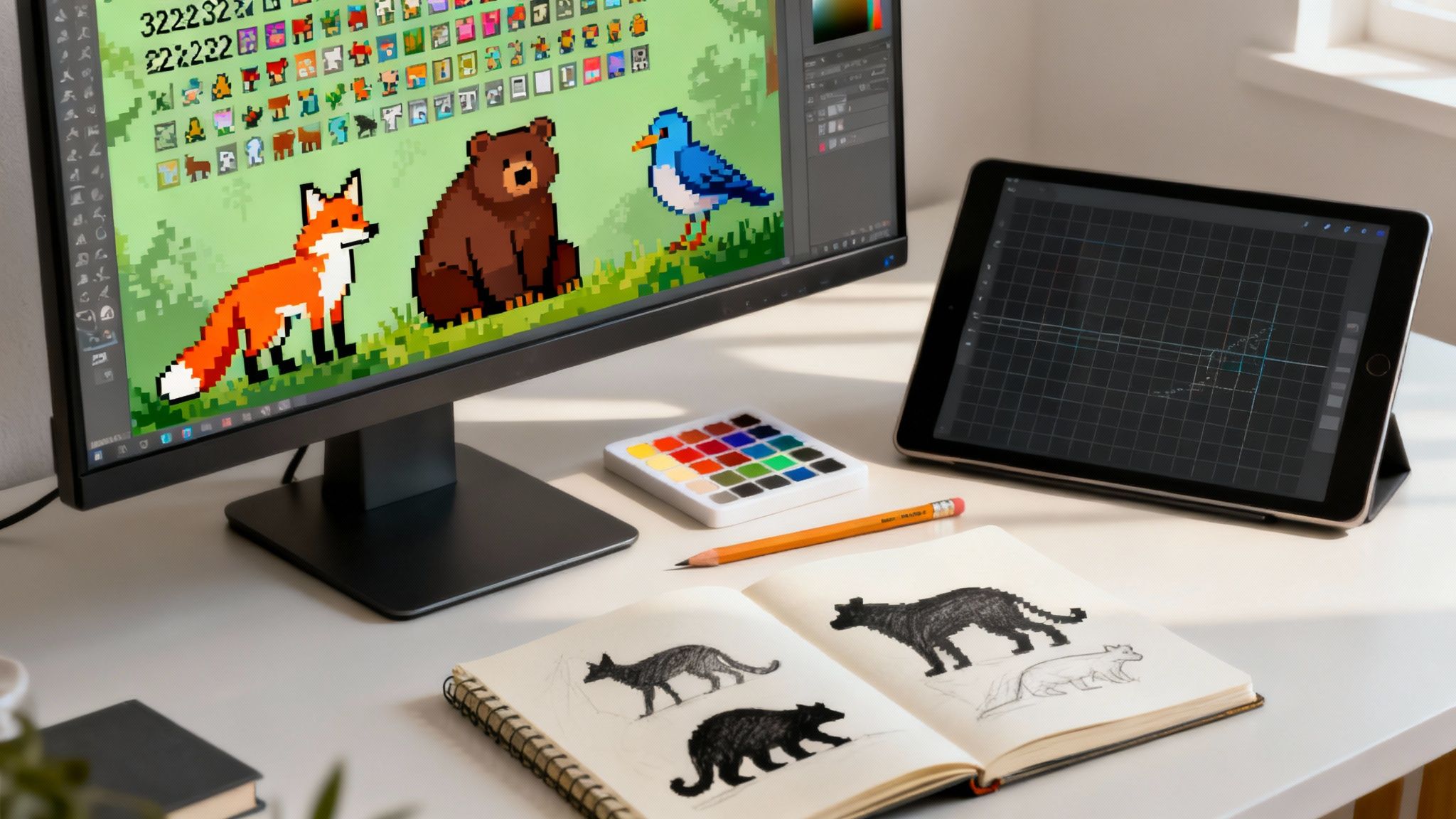
Creating pixel art animals is an adventure that marries meticulous technique with pure creative joy. As a responsible and compliant platform for creative professionals, Virtuall is committed to helping artists explore new frontiers safely and efficiently. If you're ready to jumpstart your creative process, you can try the Creative AI OS from VirtuallPRO for free and see how it can accelerate your workflow. Whether you’re dreaming up a sprite for an indie game or simply exploring a nostalgic art form, this guide will lead you from your first sketch to a lively creature full of character.
Why Pixel Art Animals Remain Timeless In Digital Creation
Tiny grids and a handful of hues might seem limiting, but they force you to capture an animal’s spirit in its simplest form. That constraint is exactly what gives pixel art its iconic charm.
Denmark’s archaeological digs uncovered amber animal figurines dating back to 6,000 BCE—bears with articulated limbs and elk sporting faithful antlers. Those ancient artisans worked pixel by pixel, just like we do today on screen.
Fast-forward to now: crafting a fox, bear or bird that reads instantly at 32×32 pixels demands:
- A razor-sharp silhouette
- A tightly curated palette
- Thoughtful animation frames
Hit those marks and your little critters will leap off the canvas.
Getting Started With VirtuallPRO
Before diving into shading techniques or sprite sheet layouts, let’s talk workflow. VirtuallPRO is a Creative AI OS designed for artists who need rapid concept exploration without sacrificing control.
It bundles generation, versioning, asset management and team collaboration in one place. Solo creators love its simplicity, while studios appreciate the transparency it brings to feedback loops.
If you haven’t given it a spin yet, Try VirtuallPRO Free and watch concept variations appear in seconds.
To spark your colour intuition, resources like a Space Ranger Fred Colouring Book can be a playful way to explore basic palettes before you dive back into pixel grids.
Key Benefits Of Mastering Pixel Art Animals
- Universal Appeal – Perfect for games, web illustrations and social media icons
- Tiny File Sizes – Essential when every kilobyte counts
- Distinctive Style – Your creations will stand out in any digital crowd
- Transferable Skills – Learn form, shading and animation techniques that apply across creative disciplines
Bridging time-tested artistry with today’s AI-powered tools ensures you’ll build a pixel-perfect menagerie more efficiently than ever. Let’s get started!
Building a Strong Silhouette and Concept
Before a single pixel is laid down, the real work begins. If you’re starting from a blank canvas, you can jumpstart the entire process with VirtuallPRO’s Creative AI OS. Give it a try for free and you'll have dozens of animal concept variations in just a few seconds.
A strong silhouette is what makes your pixel art instantly readable. It’s all about capturing the most recognisable features of your creature before you even think about colour or detail. This is where your animal’s personality is born.
Is it a friend or a foe? A hunched back and sharp, angular limbs can scream "menace," while oversized ears and a tiny body feel immediately cute and approachable. It all starts with the outline.
- Collect diverse reference images: Don't just look at other pixel art. Grab wildlife photos, classic illustrations, and even old-school game sprites to build a solid visual library.
- Note posture and proportions: Sketch out super-quick thumbnails. The goal isn’t detail; it’s capturing movement, attitude, and the general vibe.
- Highlight key traits: What’s the one thing that defines this animal? A bushy tail, massive ears, a uniquely shaped beak? Latch onto that and make it the foundation of your silhouette.
Gathering Inspiring References
With a rough idea in mind, it's time to hunt for inspiration that’s a good fit for pixel art. Nature photography and museum collections are fantastic sources for authentic shapes and forms.
Believe it or not, some of the earliest examples of this can be traced back to the Mesolithic period in Denmark. Artisans carved 7 miniature amber animals—including bears, a bird, and an elk—that look like primitive pixel art. They captured faithful anatomy and elegant forms with just a few clever shapes. You can see these amazing magical amber animals on the National Museum of Denmark's website.
- Scan online archives for high-res images of fossils or ancient carvings.
- Create mood boards that group creatures by their energy—playful, serene, or fierce.
- Jot down notes directly on your sketches, highlighting the distinctive features you absolutely must keep as you simplify the design.
Sketching Exaggerated Silhouettes
Now, let's get sketching. Use bold strokes and simple shapes. Don't be afraid to push the proportions to really amplify your animal's character. This is crucial for making sure it’s readable, even at tiny sizes.
Play around with negative space to define the limbs clearly. This simple trick helps your pixel art animals pop, especially when they get scaled down in a game.
A memorable silhouette often hinges on one exaggerated element that tells a story at a glance.
- Use basic circles or rectangles to map out the main body parts—head, torso, and limbs.
- Keep refining the outline until the form is instantly recognisable within a 32×32 pixel grid.
- Test your sketches by shrinking them down. If it becomes a blurry mess, it’s too complex.
- Flip your sketch horizontally. A balanced design will look good from any angle.
As you refine the shapes, stay honest to your original concept. This is the time to be ruthless and trim away any detail that will just clutter the pixel grid.
This approach isn't just a modern trick; it mirrors how ancient artists captured an animal's essence with just a few carved lines. It also sets you up perfectly for the next step: choosing a vibrant colour palette to bring your forms to life.
Getting this groundwork right accelerates every stage that follows.
With a solid silhouette locked in, you’re ready to think about colour and shading. Next, we'll dive into how limited colour palettes can add surprising depth and dimension to your pixel art animals.
Using Limited Palettes and Colour Theory
With so few pixels to work with, your colour choices can make or break a design. Getting the palette right is where the magic really starts.
A limited palette isn’t a restriction; it’s a tool. It forces you to make deliberate choices that create a cohesive mood and visual harmony. Think of a warm, earthy set of colours for a woodland fox, or a cool, ethereal range for an otherworldly aquatic creature.
If you haven’t played around with AI for this yet, you can give VirtuallPRO a spin for free and generate some palette ideas instantly.
From there, I usually think about a palette in four key parts:
- Base Shade: This defines the core tone and personality of your creature. It’s the colour people will remember.
- Shadow Tint: This adds depth and form without muddying your limited colour set.
- Highlight Tint: A lighter shade that catches the light and draws attention to key forms like eyes or the glint on a wing.
- Accent Colour: This is for contrast. It makes focal points like stripes, spots, or other details pop.
Creating Colour Ramps
Once you have your core colours, building smooth transitions—or "colour ramps"—is what gives your pixel art animals that satisfying, three-dimensional feel.
You can build these ramps by methodically adjusting the brightness or saturation across your palette.
- Start by picking your darkest and lightest shades as anchors.
- Divide the difference between them into a few consistent steps.
- Test your new ramp on a simple silhouette to see if it’s readable.
- Fine-tune it by tweaking the hue shifts for a more natural warmth or coolness.
A well-made colour ramp is what transforms a flat, lifeless silhouette into a creature that feels alive and has volume.
To give you a better idea, here's how different palette approaches can create entirely different feelings for your pixel art animals.
Choosing Your Colour Palette
| Palette Type | Description | Best For | Example Mood |
|---|---|---|---|
| Monochrome | Variations of a single hue. | Simplistic, iconic designs. | Minimalist, calm. |
| Earthy | Browns mixed with muted greens and ochres. | Forest creatures and natural settings. | Rustic, warm. |
| Pastel | Soft, low-saturation colours. | Friendly or magical pets. | Dreamy, gentle. |
| High Contrast | Bold differences between light and dark tones. | Emphasising silhouettes and action. | Dramatic flair. |
Each of these has its place, and experimenting is the best way to find what works for your specific animal.
Applying Hue Shifts
Now for a subtle trick that really elevates a palette: hue shifting. This is a classic technique for making shadows and highlights feel richer and more realistic.
The idea is simple: you make your shadows slightly cooler (shifting toward blue or purple) and your highlights a bit warmer (shifting toward yellow or orange). This mimics how natural light works and adds a surprising amount of life to your ramp.
It's a small detail that has a huge impact. In fact, pixel art animals have become a surprisingly popular subject in Denmark’s recent push into digital art history. A project at the SMK – National Gallery of Denmark used a tool called PixPlot to visualise 40,000 photographs, and it found that 12% of them featured animal motifs. By 2025, over 150,000 Danish users had explored these digital collections, with queries for animal pixel art spiking by 35%. You can learn more about the PixPlot findings from this fascinating study by Aarhus University.
When you apply these hue shifts across your colour ramps, each step feels more vibrant and the whole piece hangs together beautifully. Getting this right is crucial before you start thinking about anti-aliasing or dithering.
Preparing for Shading Texture
With your palette and hue shifts dialled in, you're ready to start defining volume and texture.
- Begin by placing shadows where light would naturally be blocked to carve out the animal's form.
- Use dithering patterns sparingly to suggest textures like fur or scales without creating visual noise.
- Apply selective outlines to help separate overlapping parts of the creature clearly.
Laying this solid groundwork now makes the next steps—applying anti-aliasing, dithering, and selective outlining to bring out those final textures—much more intuitive.
Adding Depth with Shading and Texture
You've got a solid silhouette and a killer colour palette. Now comes the magic: turning that flat shape into a character that feels like it has real volume. This is where we start painting with light, pixel by pixel.
First thing's first: pick a light source. Is the sun hitting your creature from above? From the side? Decide on a direction and stick with it. This single choice governs every highlight and shadow you place, carving out a three-dimensional form on your tiny canvas.
Using that colour ramp we made earlier, start laying in your darkest shades on the sides facing away from the light. Your lightest tints go where the light hits directly. Just that simple touch of logic instantly gives your pixel art animals a sense of depth.
Smoothing Curves with Anti-Aliasing
Once you’ve blocked in the main shading, you’ll probably see some harsh, jagged edges—what artists call "jaggies." This is where manual anti-aliasing saves the day. It’s a subtle but crucial technique.
The idea is to soften transitions between high-contrast areas. By carefully placing pixels of an intermediate colour along a harsh curve, you trick the eye into seeing a smoother line. For example, where a bear's dark outline meets its lighter fur, a single mid-tone pixel at the corner can make all the difference. Just don't overdo it, or your art will start looking blurry.
- Use it sparingly, focusing on curves and angled lines.
- Never use it on perfectly straight horizontal or vertical lines.
- It works best where two different colour fields meet.
This little trick elevates your character's shape, making it feel more organic and less like a stack of blocks.
Faking Texture with Dithering
Next up is dithering, a classic pixel art technique for creating gradients or textures with a very limited palette. You're essentially arranging pixels in a pattern—like a checkerboard—to blend two colours together, suggesting a smooth transition that isn't really there.
Dithering is perfect for giving your pixel art animals a tangible surface. A sparse, scattered pattern can hint at the soft fur on a rabbit. A denser, more structured pattern might suggest the rough scales of a lizard. It’s a foundational skill with deep roots in pixel art history.
Dithering is the art of telling a visual story between the pixels, creating depth and texture where none technically exists.
This technique was huge in the demoscene culture that took off in Denmark in the late 1980s. Local groups pushed old hardware to its limits, and dithering was key to making their low-res creatures pop on CRT monitors. That legacy is still celebrated at Danish demoparties today. You can read more about this rich history and its evolution in the world of pixel and AI art on pixel-gallery.co.uk.
Mastering these techniques is what turns a simple sprite into a character with personality. Once you’re happy with the look and feel, it’s time to make it move.
Bringing Your Pixel Art Animals to Life with Animation
A static sprite has charm, but an animated one has a soul. This is the part where you breathe life into your creation, turning a character sketch into a genuine personality. And it doesn't have to be complicated—even a couple of simple motion cycles can make your pixel art animal feel dynamic and real.
The foundation of almost any character animation rests on two key cycles: the idle animation and the walk cycle.
The idle animation is what your creature does when it's standing still. Maybe it's a subtle breathing motion or a slight shift in weight. It's a tiny detail, but it’s what keeps your animal from looking like a frozen statue. The walk cycle, on the other hand, is the mechanical backbone of its movement, and it’s where you can inject a ton of rhythm and character with every step.
If you want a head start, the Creative AI OS from Virtuall can generate some initial animation frames for you. It's a great way to get a solid base that you can then refine and polish. You can even try it for free to see how it can speed things up.
Organising Your Frames with a Sprite Sheet
To keep everything tidy, you’ll use a sprite sheet. Think of it as a single image file that holds all the individual frames of your animation, usually laid out in a grid. Game engines read these sheets frame by frame, creating the illusion of movement.
A clean sprite sheet is the secret to an efficient workflow. Trust me on this.
- Consistent Spacing: Make sure every frame has the exact same dimensions and is spaced evenly. No exceptions.
- Logical Order: Arrange your animations in a clear sequence. For example, all the idle frames go together, then the walk frames, then the jump frames.
- Label Your Cycles: If your software lets you, add notes or labels. It makes finding a specific animation set so much easier later on.
This kind of methodical approach will save you a world of pain, especially as your animations get more complex.
Core Animation Principles, but in Pixels
Those classic animation principles you’ve heard about? They absolutely apply to pixel art, just adapted for the medium’s constraints. Mastering a few of these will add a surprising amount of fluidity and impact to your work.
The goal isn’t just to make the animal move. It’s to make the movement feel intentional and alive. That’s what separates a mechanical loop from a convincing performance.
Here are the three principles you should focus on first:
- Squash and Stretch: This gives a sense of weight and flexibility. Picture a rabbit landing from a jump—it squashes down on impact and stretches out as it leaps up again. In pixel art, even a one-pixel change can sell this effect beautifully.
- Anticipation: This is the tiny preparatory action before a big movement. Think of a cat crouching just before it pounces. That small "tell" prepares the viewer for what’s about to happen, making the action feel more powerful and satisfying.
- Secondary Motion: This is about the parts of the body that move as a result of a primary action. When a fox walks, its tail shouldn't move rigidly with its body. Instead, it should follow through with a slight, overlapping swish. It’s these extra layers of movement that add realism and a whole lot of personality.
How VirtuallPRO Speeds Up Your Workflow
Let's be honest, creating pixel art animals from scratch is a labour of love. It takes time and patience. But what if you could skip some of the groundwork?
VirtuallPRO’s Creative AI OS lets you generate dozens of base sprites from a simple text prompt, cutting down that initial grind. If you haven't tried it yet, you can generate your first few assets for free and see for yourself.
It’s not about replacing you. It’s about getting to the fun parts—refining silhouettes, nailing the colour palette, and perfecting the animation—much, much faster.
Use AI to Kickstart Your Concepts
Picture this: you type “playful red fox 32×32 side view” into VirtuallPRO. Less than ten seconds later, you’ve got a grid of unique concepts to work with.
This completely changes the dynamic of the early design phase. Instead of staring at a blank canvas, you’re immediately reacting to concrete visuals. It’s the perfect way to break through a creative block and keep your momentum going.
For example, one artist we know shaved 30% off their concepting time just by using these AI sketches as a launchpad. It let them jump straight into choosing palettes and defining textures.
With AI generation, your workflow looks more like this:
- Generate a grid of 20+ variations and pick the silhouettes that feel right.
- Tweak your chosen sprite, adjusting individual pixels and colours.
- Export it to your favourite pixel editor, knowing the entire version history is safely stored.
Keep Your Team in Sync with Version Control
Things get even better when you’re working with a team. VirtuallPRO acts as a shared workspace where everyone can see the latest assets and drop comments directly onto the sprites.
No more digging through email chains or Slack threads for feedback.
The version history is also a lifesaver. It lets you roll back to any previous iteration, so you can see how a design evolved and never lose a good idea.
Key Insight: We’ve seen teams speed up their revision cycles by 25% just by centralising their feedback and asset management in Virtuall.
Beyond the creative side, VirtuallPRO also helps manage the practicalities. A unified AI token system keeps track of your budget and usage, which is essential for maintaining control and preventing any surprise costs.
It’s a single space where your AI concepts, team collaboration, and budget management all live together. Give VirtuallPRO a try for free and see how much it can accelerate your next pixel art project.
Got a few lingering questions? Let's tackle some of the common hurdles you might run into when making your pixel art animals.
What’s The Best Canvas Size To Start With?
This really depends on the vibe you're going for. If you love that classic, chunky retro look, you’ll probably be working in 16x16, 32x32, or maybe 64x64 pixels.
If you’re just finding your feet, I’d suggest starting with a 32x32 canvas. It’s the perfect middle ground—big enough to get some recognisable details in, but small enough that you won't feel overwhelmed. It’s a great size for just practising the fundamentals of form and shading.
How Do I Pick Colours Without Making a Mess?
The key is to think small. Start with a very limited palette, maybe four to eight colours total. This forces you to be deliberate and make every colour count.
A good starting point is to pick a base colour, then a darker shade for shadows and a lighter one for highlights. You can add one extra accent colour for something that needs to pop, like the eyes or a specific marking on your animal.
Pro-Tip: Try using hue shifting. Instead of just making your shadow colour darker, make it slightly cooler (add a bit of blue). For highlights, make them a touch warmer (add a bit of yellow). This simple trick adds a surprising amount of life and depth to your sprites.
Can I Use AI And Still Have It Feel… Human?
Absolutely. The trick is to treat AI as your creative partner, not a button that does all the work. It’s an incredible tool for breaking through creative blocks.
For example, you can use a tool like VirtuallPRO to brainstorm dozens of concepts for pixel art animals in just a few minutes.
Once you find a design that sparks an idea, you bring it into your editor and take over. This is where your human touch comes in—cleaning up stray pixels, tweaking the colour palette, and refining the silhouette. You get the speed of AI for the initial grunt work, but the final piece is all you.
Ready to see how that hybrid workflow feels? Virtuall lets you generate ideas fast while keeping you in the driver’s seat for all the final, handcrafted details. Start creating your next masterpiece for free.