Find Farvekode På Billede A Guide for Creative Professionals
Learn how to find farvekode på billede using pro tools and techniques. Master color code extraction for your digital design projects with this ultimate guide.
Getting the right colour is everything. For creative professionals, the difference between almost the right shade and the perfect shade can make or break a design. To find a farvekode på billede (the Danish term for a colour code on an image), you have several reliable options: the eyedropper in professional software like Photoshop, browser developer tools for web assets, or a quick online colour picker. Each method lets you pinpoint the exact HEX or RGB values you need to maintain visual consistency.
Your Essential Toolkit for Finding Colour Codes on Any Image
This guide will walk you through the practical, secure ways to find a farvekode på billede, a fundamental skill for any designer, marketer, or developer. Before diving in, if you're looking to streamline your entire creative workflow, consider trying the Creative AI OS. VirtuallPRO is a responsible enterprise platform designed to help teams generate, manage, and collaborate on visual content while ensuring brand compliance. It’s built to keep your creative assets, including colour palettes, consistent and secure. If you haven't generated anything yet, you can try it for free.
Digital vs. Physical Colour Sources: Where to Begin?
First, determine the source of your colour. Are you trying to match a shade from a digital screen, or are you digitising a colour from a physical object like a fabric swatch or printed material? Your starting point dictates the tools and methods you'll use.
This decision tree illustrates that initial choice.
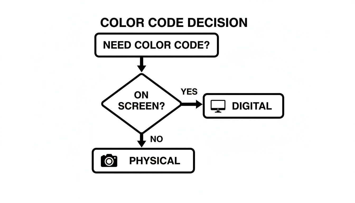
As the flowchart shows, screen-based colours are straightforward and can be sampled directly with digital tools. Physical objects, however, must first be captured with a camera or scanner. This initial step is critical, as real-world factors like lighting, shadows, and surface texture can significantly alter how a colour appears once digitised.
Why Your Image Format Is Crucial for Colour Accuracy
The file type you're working with plays a significant role in the accuracy of your colour sampling. Different formats handle colour information differently, which directly impacts the codes you extract.
Here’s what you need to keep in mind:
- Lossy vs. Lossless: A format like JPEG uses lossy compression, discarding some data to reduce file size. This can introduce minor colour imperfections or "artefacts," particularly around sharp edges. In contrast, PNG is a lossless format that preserves the exact colour data for every pixel, ensuring maximum fidelity.
- Colour Profiles: Images can have embedded colour profiles (like sRGB or Adobe RGB) that instruct devices on how to display their colours. An incorrect or missing profile can cause colours to appear differently across various screens, which in turn affects the HEX or RGB values you extract.
If you want to get into the nitty-gritty of how compression impacts your images, our guide on the differences between PNG vs JPEG is a great read. It really breaks down why choosing the right format is so important for maintaining colour integrity.
Mastering Colour Picking in Professional Design Software
For professionals using tools like Adobe Photoshop or GIMP, the eyedropper tool is an essential instrument. When you need to find farvekode på billede, these professional-grade applications provide a level of control that simpler tools cannot match. However, obtaining a truly accurate colour often requires more than a single click.
A common mistake is to simply point and click, which risks sampling a stray pixel—a tiny speck of digital noise or a compression artefact that doesn't represent the intended colour. This single incorrect pixel can compromise an entire brand palette. A more strategic approach to sampling is necessary.
Beyond the Single Pixel
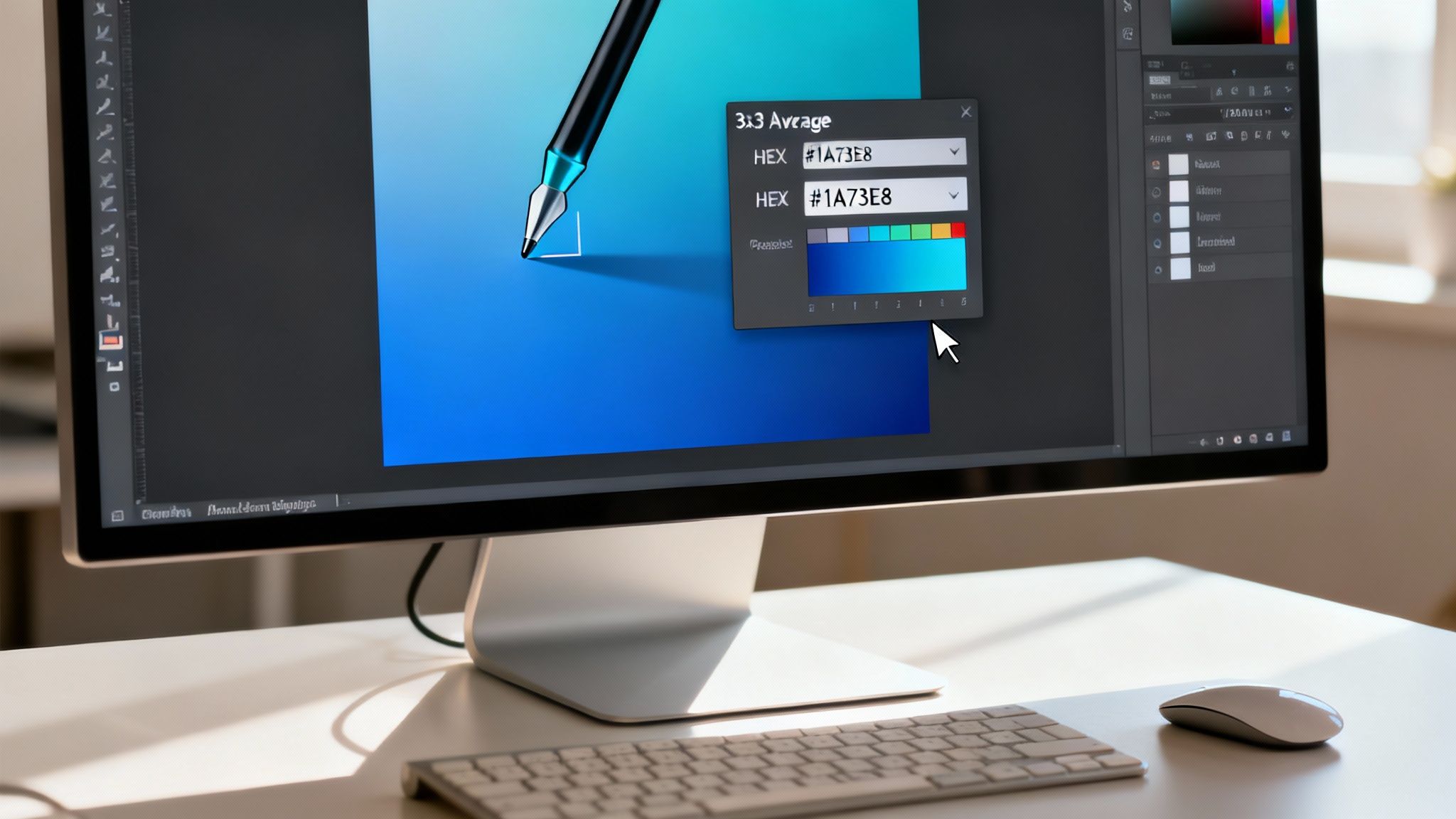
By default, most design software sets the eyedropper to "Point Sample," which reads the colour of the single pixel under your cursor. A more reliable method is to switch this setting to an average reading, such as 3 by 3 Average or 5 by 5 Average.
This small adjustment instructs the tool to analyse the colours of a small grid of surrounding pixels and calculate the average. The result is a much more faithful representation of the intended colour, effectively smoothing out minor imperfections from the image file. This technique is particularly valuable when working with detailed photos or compressed JPEGs.
Pro Tip: In Photoshop, hitting the Caps Lock key toggles the eyedropper cursor to a precision crosshair. It's a simple keyboard shortcut, but it makes targeting the exact spot you want to sample so much easier, especially when you're deep in detailed work.
Understanding Colour Spaces
The colour codes you extract from an image are heavily influenced by its colour space. The two you’ll encounter most frequently are sRGB and Adobe RGB.
- sRGB: This is the universal standard for the web. It has a slightly smaller range of colours (gamut) but ensures that your colours look consistent across different browsers and monitors.
- Adobe RGB: This profile features a wider gamut, especially in the cyan-green hues, making it a preferred choice for high-quality print work.
Here’s where it gets tricky: if you sample a colour from an Adobe RGB image but your project is set to sRGB, the HEX or RGB values will not appear the same when applied. Always verify your document's colour profile (typically found under Edit > Colour Settings in Photoshop) to ensure your sampled codes will translate accurately to your final medium, whether it's a screen or a printed page. Getting this right is fundamental, and exploring some solid UI Design Tips will show you just how crucial precise colour is in professional design.
Getting comfortable with these settings gives you complete command over your colour workflow. This precision is also vital for other design tasks. For example, accurate colour selections can make isolating an object from its background much cleaner. If you want to dive deeper into that, our guide on how to delete a background in Photoshop walks through techniques where colour accuracy is key.
Using Browser Developer Tools for Web Colour Extraction
If you need to extract a colour code from an image on a live website, you don't need specialised software. Your web browser has a powerful tool built right in. Whether you're using Chrome, Firefox, or Safari, the developer tools include an excellent colour picker that is a daily utility for web designers and marketers. It is the most precise method for matching colours from web pages.
Consider this scenario: you are developing a new landing page and need to match the exact shade of blue from a client's logo on their homepage. Instead of taking a screenshot and approximating the colour in Photoshop, you can extract the colour directly from the source. This technique avoids the colour shifts that screenshots can introduce, providing the exact HEX or RGB value the browser is rendering.
Finding the Inspector and Colour Picker
Accessing this tool is straightforward. The quickest way is to right-click anywhere on the webpage and select "Inspect". You can also use a keyboard shortcut:
- Chrome & Firefox (Windows):
Ctrl + Shift + I - Chrome & Firefox (Mac):
Cmd + Opt + I - Safari (Mac): First, you'll need to enable the Develop menu. Head to Preferences > Advanced and tick the box. After that, you can use
Cmd + Opt + I.
Once the developer panel appears, locate the "Styles" or "Computed" tab. Here, you'll see the CSS for the selected element. Find any CSS property with a colour, such as background-color or color, and click the small coloured square next to the value. This action activates the eyedropper tool.
You can now move your cursor anywhere over the webpage, including the image of interest. A small magnified loupe provides a pixel-perfect view, allowing you to select the exact spot. A single click captures the colour, and its HEX, RGB, and sometimes HSL values will be displayed in the developer panel.
For anyone working on web projects, this browser-based method is a huge time-saver. It takes all the guesswork out of the equation and guarantees a 1-to-1 match with the live site, which is crucial for maintaining brand consistency.
Dealing with Overlays and Filters
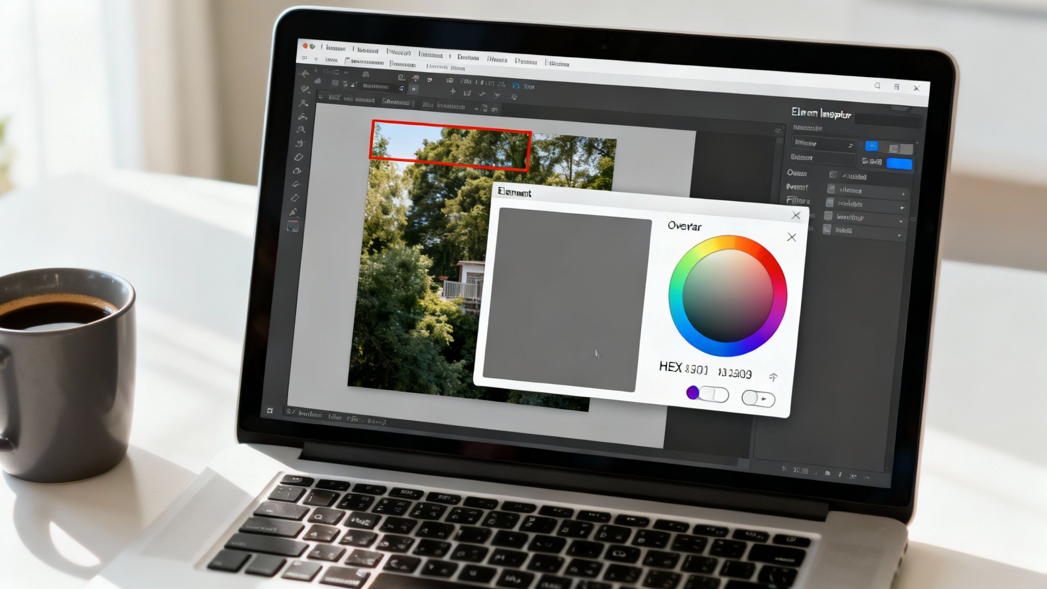
A common challenge arises when an image has a transparent overlay or a CSS filter applied. Many hero images use a semi-transparent dark overlay to enhance text readability. If you sample this, you will get the modified colour, not the original.
The solution is simple. Use the inspector to locate the overlay element in the HTML. You can then temporarily disable it by unchecking its background property in the CSS or setting its display property to none. With the overlay removed, you can sample the true, unaltered colour from the underlying image. This is a useful technique to ensure you always capture the authentic colour code.
Grabbing Colours with Online Pickers and Mobile Apps
Sometimes you are away from your primary workstation or simply need to find a colour code quickly. In these situations, online tools and mobile apps are highly effective. They provide a quick, accessible way to find farvekode på billede without launching comprehensive design software. They are ideal for moments of inspiration or for simple tasks where a full professional suite would be unnecessary.
Many of these web-based tools do more than just identify a single pixel. They can scan an entire image you've uploaded or linked to and extract a complete, complementary colour palette. This is a significant advantage during the initial brainstorming phase of a project, providing a ready-to-use set of harmonious colours from the start.
Web-Based Tools for Instant Palettes
If you've found a reference image online with an ideal aesthetic, online colour pickers are an excellent resource. The process is typically very simple: you paste the image URL or upload the file, and the tool performs the analysis.
Consider this real-world scenario:
- You're browsing a stock photo library and find an image with a colour scheme that would be perfect for a new social media campaign.
- Instead of guessing, you use a web-based extractor.
- The tool instantly provides the dominant colours, complete with their HEX, RGB, and sometimes even CMYK values.
Furthermore, tools like an online color scheme generator can take one of the colours you've just found and help you build out a full, harmonious palette. This is a game-changer for developing a cohesive brand look and feel.
The ability to turn a single inspirational image into a practical, working palette is a huge time-saver for any creative. It closes the gap between a visual concept and the actual colour codes you need to start designing.
Mobile Apps for Capturing Colours in the Wild
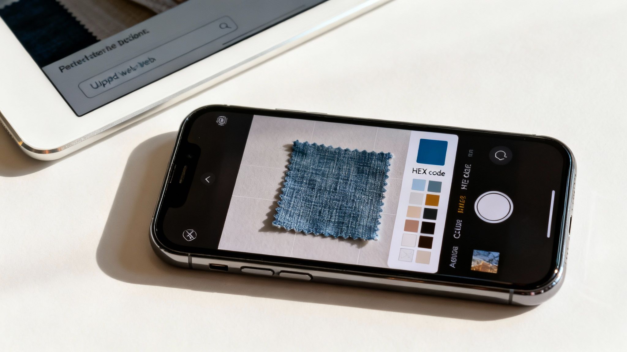
Mobile apps extend this capability into the physical world. Using your phone's camera, they allow you to identify colours from objects around you. For example, if you see a bolt of fabric with a beautiful shade of ochre at a local market, a mobile app can capture its digital equivalent on the spot.
These apps are designed for spontaneity, allowing you to:
- Capture on the Fly: Simply point your camera at an object to get a live reading of its colour.
- Save Your Finds: Most apps let you save captured colours into palettes that can be exported for your projects.
- Adjust for Light: Some advanced apps attempt to compensate for ambient lighting to provide a more accurate reading.
While incredibly convenient, be aware that the accuracy depends heavily on your phone's camera and the lighting conditions. A colour captured under warm indoor lighting will look different from the same colour in bright, natural sunlight. For critical brand work, it is always advisable to verify these captured colours on a properly calibrated monitor.
When creating visuals for the Danish market, colour accuracy is not just about aesthetics—it's about cultural respect. Certain colours have deep historical and national significance, and using the exact shades demonstrates diligence and awareness.
The most prominent example is the Danish flag, the Dannebrog. As one of the oldest national flags in the world, dating back to 1219, its red and white are instantly recognisable. For any project with a Danish national theme, using the official colour codes is essential. For digital work, the specific red is #C60C30, and the white is #FFFFFF.
The Danish Approach to Colour and Design
This emphasis on precision is a cornerstone of the Danish design philosophy, which values simplicity, functionality, and consistency. Every colour choice is deliberate, a principle that creative teams should adopt.
This is where a platform like VirtuallPRO, offered by our company Virtuall, becomes invaluable for enterprises. It helps ensure that every AI-generated asset is not only on-brand but also culturally sensitive. It's about making sure your visuals resonate correctly, every single time.
Getting a brand’s signature colour right is just as important as using the correct flag red. A tiny shift in the hue can throw off brand recognition. This need for precision applies to all sorts of shades, even complex ones like metallics. We actually dive deeper into this in our guide to finding the right colour gold HEX code.
A Quick Reference for Danish National Colours
For any project touching on Danish identity, having the official colour codes for the Dannebrog on hand is a smart move. It eliminates guesswork and ensures authenticity.
| Colour Name | HEX Code | RGB Value | Pantone (PMS) |
|---|---|---|---|
| Dannebrog Red | #C60C30 | 204, 9, 47 | 186 C |
| White | #FFFFFF | 255, 255, 255 | N/A |
Using these standardised values ensures your designs are accurate, whether they're for print or screen.
Practical Tips for Hitting the Mark
To ensure your work connects with a Danish audience, diligence is key. When you find farvekode på billede for a project with cultural significance, always verify your sources.
- Check Official Guides: Always refer to official brand or national style guides first. They are the definitive source for exact colour specifications.
- Compare to Physical Samples: If possible, compare your on-screen colours to a physical reference under good, neutral lighting. On-screen colours can be deceptive.
- Keep Your Team Aligned: Use a shared, compliant system, like the one in VirtuallPRO, to save and distribute approved colour palettes. This guarantees that everyone on the team is working with the same correct codes.
Following these practices demonstrates a deeper understanding of the market. Your work will not only look good; it will feel right, which is key to building trust.
Common Questions About Finding Colour Codes
Navigating the world of digital colour can be challenging, especially when precision is required. Whether you’re an experienced designer or just starting, certain questions frequently arise. Addressing these can save considerable time and prevent frustration.
Here, we'll answer some of the most common queries that come up when you need to find farvekode på billede. The goal is to provide you with the confidence to handle any colour-picking task, ensuring your creative work remains sharp and consistent.
Why Do Colours Look Different on Various Screens?
This is a major and common frustration in digital design. You select the perfect shade on your monitor, only to find it looks completely different on your phone or a colleague’s screen. The primary cause is a lack of colour calibration.
Every display interprets colour data uniquely. Think of it as different musicians interpreting the same piece of sheet music—each adds a slightly different nuance. Key factors include:
- Manufacturing Differences: No two screens are identical. Panels have slight variations in brightness, contrast, and colour gamut.
- Display Settings: User adjustments like brightness, contrast, or "night mode" can dramatically alter colour appearance.
- Ambient Lighting: The lighting in your environment plays a significant role. A colour viewed in a bright office will look different in a dimly lit room.
To mitigate this, professional designers use screen calibration tools to ensure their displays render colours as accurately as possible. For teams, this is a critical step for maintaining consistency across all work.
How Accurate Are Online Colour Pickers?
Online colour pickers offer great convenience, but their accuracy can vary. When you upload an image, the tool analyses the colour data within that file. If you use a high-quality, lossless PNG with a standard sRGB colour profile, the results will be quite accurate.
However, complications can arise. If you're extracting a colour from a heavily compressed JPEG, the tool might sample a compression artefact instead of the true colour. Similarly, if an image has an unusual or missing colour profile, the online tool may make an incorrect assumption, leading to a misinterpretation of the colours.
For quick mock-ups and inspiration gathering, online pickers are excellent. But for final, brand-critical work, always verify the colour code in professional software like Photoshop or by inspecting the source directly on a website.
What Is the Difference Between HEX, RGB, and CMYK?
Understanding the different colour models is fundamental for anyone in a creative field. Each model is designed for a specific purpose, and using the wrong one can lead to disappointing results.
Here’s a quick breakdown:
| Colour Model | Primary Use | Description | Example |
|---|---|---|---|
| HEX | Web Design | A six-character code representing RGB values, mainly used in HTML and CSS. | #C60C30 |
| RGB | Digital Screens | An additive model using Red, Green, and Blue light to create colours. | rgb(204, 9, 47) |
| CMYK | Print Production | A subtractive model using Cyan, Magenta, Yellow, and Black ink. | Varies based on printer and paper type. |
In simple terms: HEX and RGB are for on-screen applications. CMYK is exclusively for print. While conversions between them are possible, be aware that vibrant RGB colours often lack a direct equivalent in the smaller CMYK gamut and may appear duller when printed.
Can I Get a Colour Code from a Physical Object?
Yes, but it is an indirect process that requires care. You cannot directly "scan" a physical object to get a code. Instead, you must first capture it digitally, typically by taking a high-quality photograph.
For the best results, photograph the object in bright, neutral, and indirect light to avoid harsh shadows or colour casts from ambient lighting. Once you have a clean photograph, you can use any of the digital tools we’ve discussed to find farvekode på billede. Remember that the resulting code is an approximation, influenced by your camera's sensor and the lighting. It is a good starting point, but you will likely need to fine-tune it on a calibrated monitor for perfect accuracy.
Ready to unify your entire creative workflow, from picking colours to generating the final assets? With VirtuallPRO, your team can generate, manage, and collaborate on stunning visuals while maintaining perfect brand consistency. Eliminate the guesswork and centralise your creative production. Start creating with Virtuall for free.