Scarlet Red Color: A Guide for Modern Creative Workflows
Explore the scarlet red color, from its HEX and RGB codes to its history and strategic use in design, branding, and digital art.
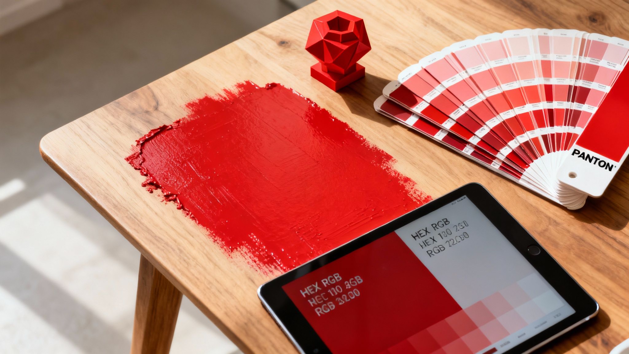
To execute visual creative work with precision, it's essential to understand the tools at your disposal, and color is one of the most powerful. At Virtuall, we develop responsible and compliant enterprise solutions for creative teams. Our Creative AI OS, VirtuallPRO, enables teams to generate, manage, and collaborate on visual assets with complete control. If you have not generated anything with our platform, you can try it for free.
Scarlet red is a brilliant, warm red with a distinct orange undertone, giving it a vibrant, energetic quality. It is more vivid than a primary red but less orange than vermilion. In visual communication, it often signifies passion, power, and importance.
Mastering the Impact of Scarlet Red
This guide explores the scarlet red color—a hue with a rich history and a specific digital identity. For designers, artists, and marketers, a deep understanding of scarlet is key to wielding its psychological power effectively and responsibly. This shade is a tool for evoking strong emotions, and its message can shift dramatically based on its application.
- Passion and Excitement: It can create a palpable sense of energy and urgency.
- Authority and Power: It is effective for projecting confidence and leadership.
- Celebration and Importance: Use it to mark significant moments or draw the eye to a focal point.
Achieving color accuracy ensures you are in complete control of its message, whether you're working on a detailed 3D model or rolling out a global marketing campaign.
What Makes Scarlet Red So Powerful?
What is it about scarlet red that commands attention? This is not just another shade on the color wheel; it's a hue steeped in history and meaning. For centuries, scarlet has been associated with power and status, worn by figures of authority. Today, it still commands the spotlight in branding, whether it’s used to signal a celebration, ignite passion, or convey a critical warning.
When you understand these deep-rooted connections, you can use scarlet with clear purpose. It’s not just about selecting an attractive color. For example, local perceptions are highly relevant. In Denmark, consumers might be wary of overly bright, synthetic scarlets on food packaging, associating them with artificial additives. This is where cultural context becomes just as important as the color code itself.
Considering the psychological dimension is crucial for any designer. This is similar to understanding what the colour blue means to evoke trust or calm. Gaining a feel for scarlet's complex personality is the first step to using it effectively, ensuring your message is communicated clearly and appropriately, regardless of the audience.
Scarlet Red Colour Codes for Digital and Print
When you’re working with a color as specific as scarlet red, achieving accuracy across different media is critical. What looks correct on your screen can appear completely different in print if you’re not using the right color codes. Consistency is fundamental to brand integrity.
To ensure your scarlet red remains true to your vision, you need the exact values for every system, from the hex code for a website to the Pantone reference for a physical product.
For designers working across both digital and print, translating between screen and paper can be a significant challenge. If you have ever experienced colors looking dull or inaccurate when printed, you understand the problem. A valuable resource for this is mastering RGB to CMYK conversion for accurate and vibrant prints, which breaks down the process.
As you can see, this isn't just a random shade of red. It’s a colour packed with meaning and psychological weight, touching on everything from cultural symbolism to raw emotion.
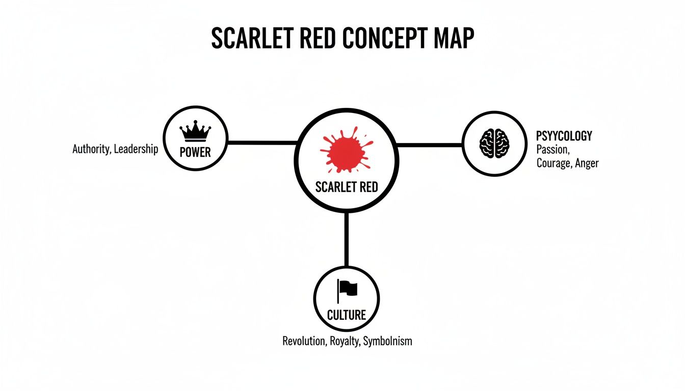
This map reinforces how much this specific hue can influence the way people perceive and feel about your work. Getting the color right isn't just a technical detail; it's about making sure your intended message lands with the right impact.
Scarlet Red Colour Values Across Different Systems
To help you keep your scarlet red consistent no matter where it appears, here’s a quick reference table. It’s a useful cheat sheet for grabbing the correct code for the job.
| Color System | Value | Primary Use Case |
|---|---|---|
| Hex | #FF2400 | Web design, HTML/CSS, and digital applications |
| RGB | R: 255, G: 36, B: 0 | Digital screens (monitors, TVs, phones) |
| CMYK | C: 0, M: 86, Y: 100, K: 0 | Four-colour printing (magazines, brochures) |
| Pantone | PMS 2028 C | Spot colour printing for brand consistency |
Having these codes at your fingertips ensures that the vibrant, powerful scarlet red you chose in your design software is the same one your audience sees, whether it's on a screen or in their hands.
Building Palettes and Ensuring Accessibility with Scarlet Red
A color rarely stands alone; its true power is unlocked by the colors that accompany it. When you start building a palette around scarlet red, you’re not just selecting colors—you’re setting a mood and serving the practical needs of your audience. The right combinations can make scarlet feel authoritative, luxurious, or energetic.
Consider the context: pair scarlet with a deep, serious navy, and you create a feeling of confidence and stability. Combine it with a touch of gold, and it can feel exclusive and premium. However, a beautiful design is ineffective if people cannot use it. This is where accessibility becomes a critical, non-negotiable component of safe and responsible design.
Following the Web Content Accessibility Guidelines (WCAG) isn't just a compliance exercise. It’s about creating inclusive designs that everyone can experience. A visually stunning palette fails its primary mission if a significant portion of your audience cannot read the content.
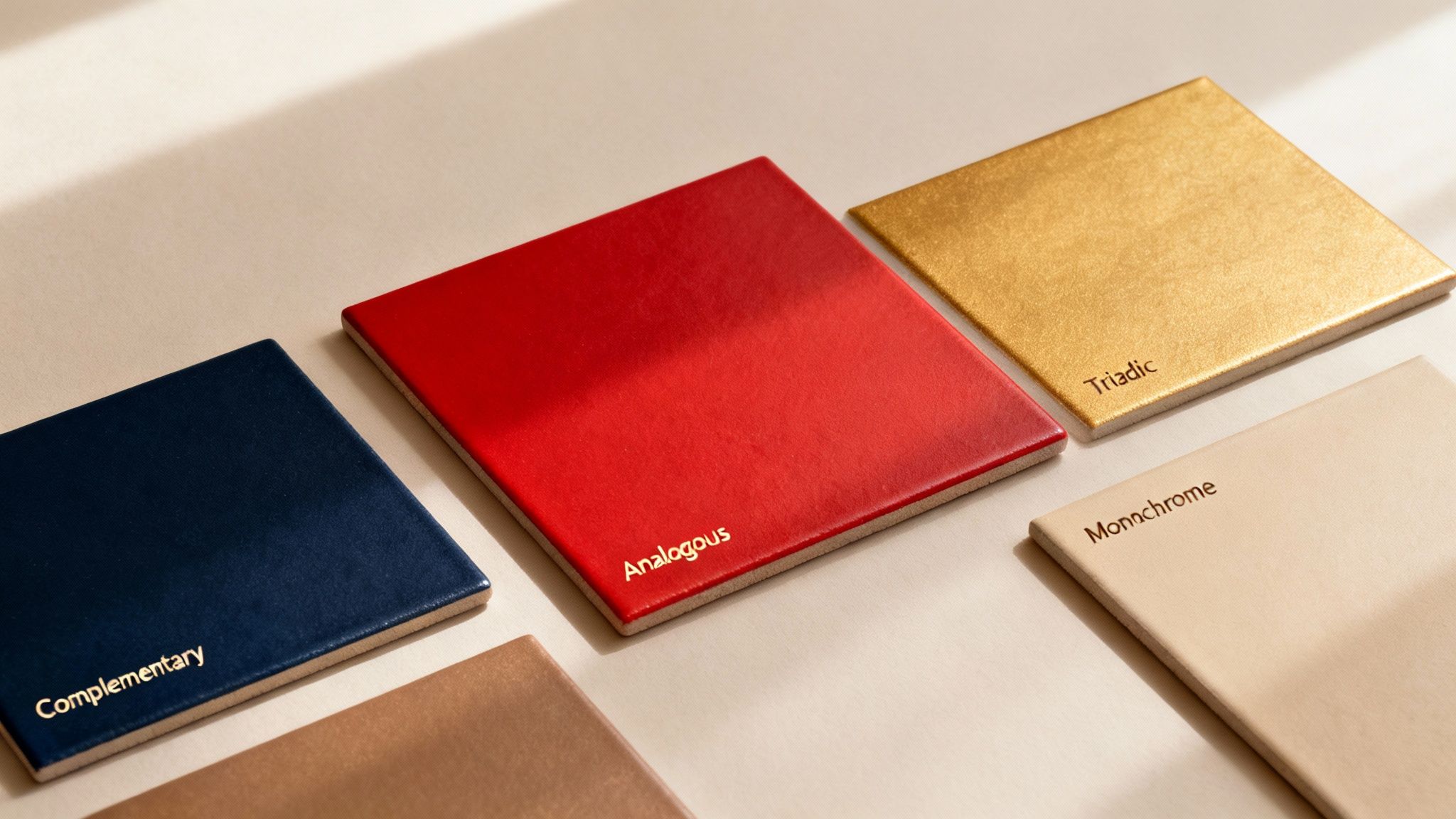
For scarlet red, this means paying close attention to contrast. Ensuring a strong difference between scarlet elements and their background is absolutely essential for legibility, especially for users with visual impairments.
Applying Scarlet Red in Creative Production Workflows
Bringing a color like scarlet red into your creative work is one thing; maintaining its consistency across every project is another challenge entirely. From the initial 3D model to the final marketing campaign, that specific, vibrant shade must be perfect every time.
A centralized system, like VirtuallPRO, is the key to this. It allows your team to define a single, official brand scarlet and then apply it consistently across all your images, videos, and 3D generations. This is a necessity for brand compliance. Think about brands in Denmark, for instance, where the exact scarlet hue from the national flag is often a core part of their identity, appearing everywhere from logos to product renders.
This unified approach doesn't just make asset creation faster; it ensures every single piece of content is perfectly on-brand. When you're ready to bring those designs into the physical world, you'll want techniques that do justice to the colour's depth. Methods like Sublimation Fabric Printing for vibrant results are excellent for achieving rich, lasting hues on textiles.
Ultimately, getting your colour right is a cornerstone of a well-managed creative process. If you want to dive deeper into aligning your team's output, our guide to creative workflow management software is a great next step. It's all about making sure every scarlet asset is flawlessly aligned with your vision.
Generating Scarlet Red Assets with AI

Taking the concept of scarlet red from a simple color code to a finished asset is where creative execution happens, and a platform like VirtuallPRO makes that process incredibly straightforward. It all comes down to crafting the right kind of prompt for the AI.
Writing Effective Prompts for Scarlet Red
When you’re looking to generate images, specificity is your best friend. Vague requests lead to generic results.
Instead of just asking for a "red car," you need to provide the AI with more detail. A prompt like, ‘Photorealistic 3D render of a luxury sports car, scarlet red metallic paint, studio lighting, reflecting on a glossy black floor,’ gives the generator a much clearer picture to work with.
The same principle applies when you're texturing 3D models. You can define specific materials with prompts like, ‘scarlet red silk fabric texture, seamless.’ Getting this right from the start saves considerable rework, and exploring the best AI for image generation will help you understand what's possible.
From Prompt to Production Pipeline
Inside a tool like VirtuallPRO, your team doesn't have to reinvent the wheel every time. Successful prompts can be saved as reusable blueprints.
This simple feature builds a repeatable workflow, making it easy to generate high-quality, on-brand scarlet red assets at scale. It ensures consistency across all your projects and dramatically speeds up production, turning a color idea into a final asset faster than ever before.
Frequently Asked Questions About Scarlet Red
Is scarlet red a good choice for UI design?
Absolutely, but it comes with a caveat: use it wisely. Scarlet red is a powerful tool for grabbing attention, making it perfect for crucial elements you can't afford for users to miss, like call-to-action buttons, error messages, or urgent notifications.
The key is to use it as a strategic accent. Think of it as a spotlight, not a floodlight. Overusing scarlet in an interface would be overwhelming and could reduce clarity. Instead, allow it to stand out against a more neutral background to guide the user's eye and create a clean, effective experience.