How to design t shirt: From Concept to Final Print
Master design t shirt creation—from concept and briefs to AI art, print-ready files, and production steps that sell.
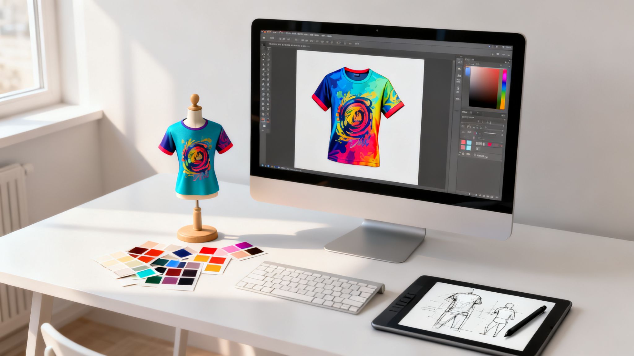
Designing a t-shirt isn't just about coming up with a cool idea. It’s about translating that creative spark into a technically sound, print-ready file that’s perfectly matched to a specific production method. This journey—from concept brief and artwork creation to file prep and QA—demands both artistic skill and deep production knowledge. As a responsible, compliant, and safe studio-grade platform, VirtuallPRO is built to manage every step of this complex visual creative work.
Ready to bring your own t-shirt ideas to life? Before we get into the nitty-gritty, you can try the Creative AI OS from Virtuall for free if you haven't generated anything yet. It’s the perfect way to follow along and see firsthand how a professional, studio-grade platform can orchestrate the entire design process.
The Modern T-Shirt Design Workflow
Creating a standout t-shirt is a world away from just sketching an idea and firing it off to a printer. For professional creative teams, the process is a carefully managed workflow that balances artistic vision with technical precision and brand consistency. It’s all about building a repeatable system that minimises errors, cuts down on endless revision cycles, and guarantees the final product looks exactly like the initial concept.
This structured approach is what separates amateur designs from high-quality, market-ready apparel.
The modern workflow pulls everything—from the initial creative brief to the final production approval—into a single, cohesive pipeline. Here are the key components I see in every successful project:
- Airtight Briefing: It all starts with a detailed document. This defines the target audience, theme, brand voice, and all the technical specs. No ambiguity allowed.
- AI-Powered Ideation: We're now using artificial intelligence to rapidly generate and iterate on visual concepts, artwork, and even realistic 3D mockups. It's a game-changer for speed.
- Technical Precision: This is where the pros shine. It means mastering the creation of print-ready files with correct colour profiles, resolutions, and vector formats for flawless production.
- Informed Production Choices: You have to strategically select the right printing method—like screen printing, DTG, or sublimation—based on design complexity, order volume, and fabric type.
- Centralised Collaboration: All assets, feedback, and approvals live in one governed workspace. This maintains a single source of truth and stops the chaos of scattered files and conflicting feedback.
Visualising the Design Journey
This process flow shows you exactly what that modern, streamlined approach to t-shirt design looks like—moving from the initial brief, through AI-powered creation, all the way to final production.
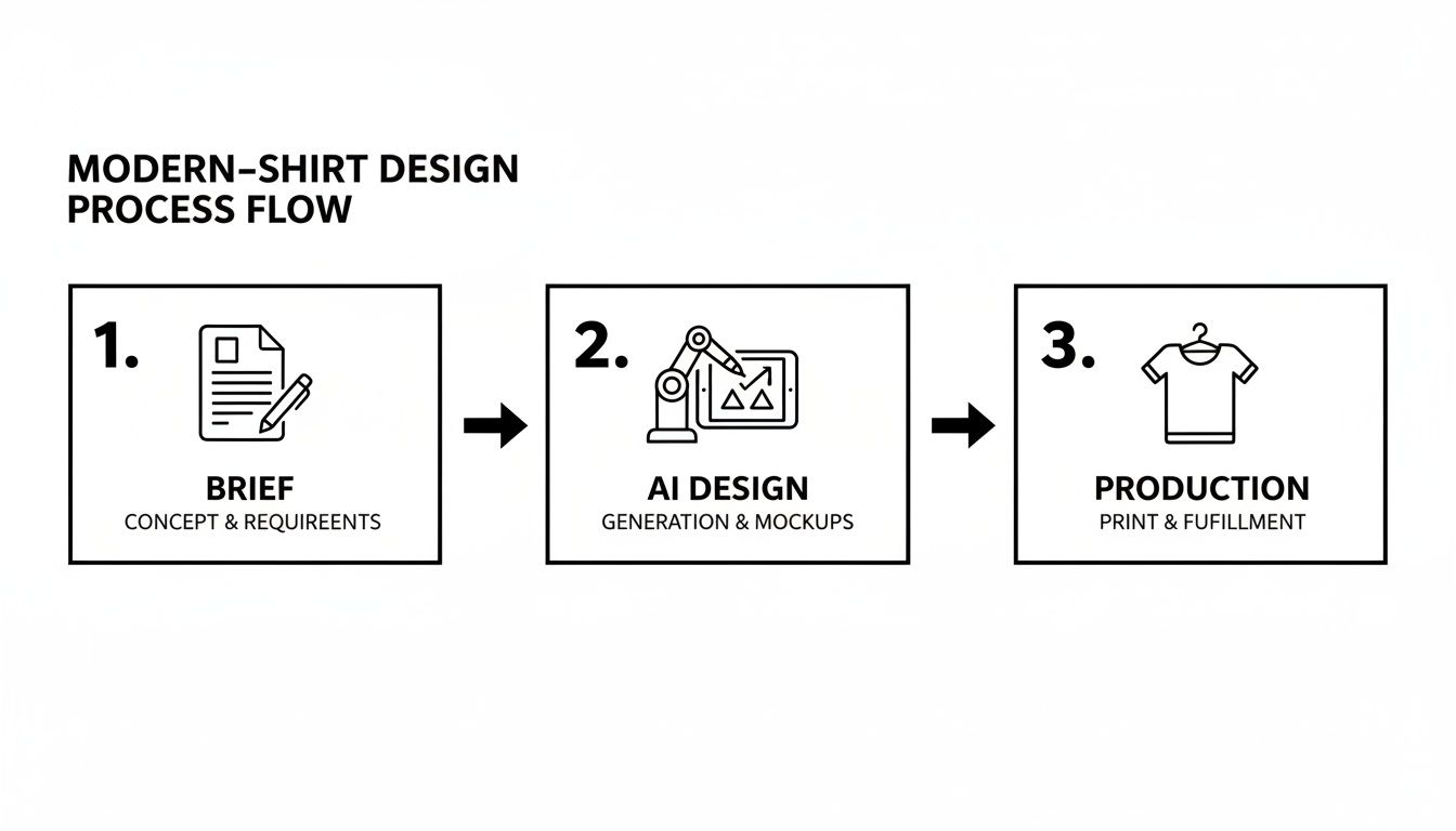
This visual really hammers home how a unified system connects strategy, creativity, and execution. It’s the key to preventing the communication breakdowns that so often derail apparel projects.
The demand for fresh, well-designed apparel has never been stronger. In 2025, Denmark's T-shirt market is projected to hit a revenue of US$91.31 million, reflecting a steady annual growth rate of 3.41% as consumers constantly hunt for new styles. With consumption reaching 44 million units back in 2022, studios that adopt efficient, AI-driven workflows are perfectly positioned to meet this rising demand. You can find more insights on the Danish apparel market from Statista.
To learn more about how the right platform can handle these challenges, check out our guide on creative workflow management software.
Crafting an Airtight Creative Brief
Every great t-shirt design starts long before anyone opens up a design tool. It begins with a rock-solid creative brief.
This isn’t just paperwork. Think of it as the single source of truth that gets your whole team—from marketing to design to production—aiming at the same target. A great brief kills the ambiguity that leads to endless revisions and creative chaos.
Skipping this step is like building a house without a blueprint. You’re guaranteeing the final product will miss the mark, wasting everyone’s time and money. A little effort upfront here saves a world of pain later.
First, Nail Your Target Audience
Before you even think about colours or fonts, you have to know who you’re designing for. A tee that hits with Gen Z streetwear heads will almost certainly bomb with eco-conscious millennials.
Your brief needs to dig deeper than basic demographics. You need to paint a clear picture of the person you want to wear this shirt.
Think about their psychographics:
- Values and Beliefs: What do they stand for? Sustainability? Humour? Nostalgia?
- Lifestyle and Interests: Where do they spend their time, both online and off? Are they into gaming, hiking, or minimalist art?
- Aspirations: What statement are they trying to make with their clothing?
A weak brief might say, "design for young people." A strong brief gets specific: "Targeting eco-conscious millennials (ages 28-35) who shop at farmers' markets, follow sustainable fashion influencers, and prefer understated, nature-inspired aesthetics." That one sentence gives a designer a real direction to run with.
From Vague Ideas to Concrete Concepts
This is the most critical part of the brief: turning a fuzzy idea into an actionable design concept. This is where you shut down misinterpretations before they start. A request for a "cool summer tee" is a recipe for disaster. Why? Because "cool" means something different to everyone.
Your brief is a contract. It aligns the creative team with the stakeholders, ensuring the final t-shirt isn't just a piece of art, but a strategic asset designed to hit a specific goal.
Instead of being vague, get concrete. A fuzzy idea like "a summer tee" becomes a focused vision: "Create a minimalist, Nordic-inspired line art design for a sustainable, organic cotton tee." Suddenly, the designer has clarity on style, theme, and even materials.
Here’s a quick comparison of vague vs. specific instructions:
| Brief Component | Vague Example | Specific Example |
|---|---|---|
| Theme & Concept | A fun beach shirt. | A retro-inspired design with a VW van and a surfboard, using a faded, sun-bleached colour palette. |
| Brand Voice | Make it modern. | Witty and slightly irreverent, using a clean, sans-serif font. |
| Colour Palette | Use bright colours. | A specific palette of Pantone 13-0947 (Anemone), Pantone 19-4052 (Classic Blue), and Pantone 11-0601 (Bright White). |
| Mandatories | Include our logo. | The brand logo must be on the left sleeve, no wider than 5cm. |
When you build this brief inside a platform like VirtuallPRO, it stops being a static document. It becomes a living, central hub linked directly to assets, feedback, and approvals. This ensures every single person—from the 3D artist making mockups to the producer sourcing fabric—is always working from the same page.
Using AI for Ideation and Artwork Generation
Once your brief is locked in, the real creative exploration begins. In the past, this meant hours of sketching, endless mood boarding, and slow, painstaking iteration. Today, artificial intelligence has completely changed the game. Think of it as a powerful creative co-pilot, helping you blast past creative blocks and turn hours of concepting into minutes.
The trick is to move beyond simple text prompts and learn to direct the AI with precision. It's less of a magic wand and more like a highly skilled junior designer that needs clear art direction. Inside a governed workspace like our platform, VirtuallPRO, you can feed the AI your creative brief, style guides, and reference images. The result? A flood of high-quality visual concepts that are already aligned with your brand from the get-go.
This isn't about replacing designers; it's about augmenting their creativity. An AI can explore dozens of stylistic avenues at once, freeing up your team to focus on what humans do best: curation, refinement, and strategic thinking.
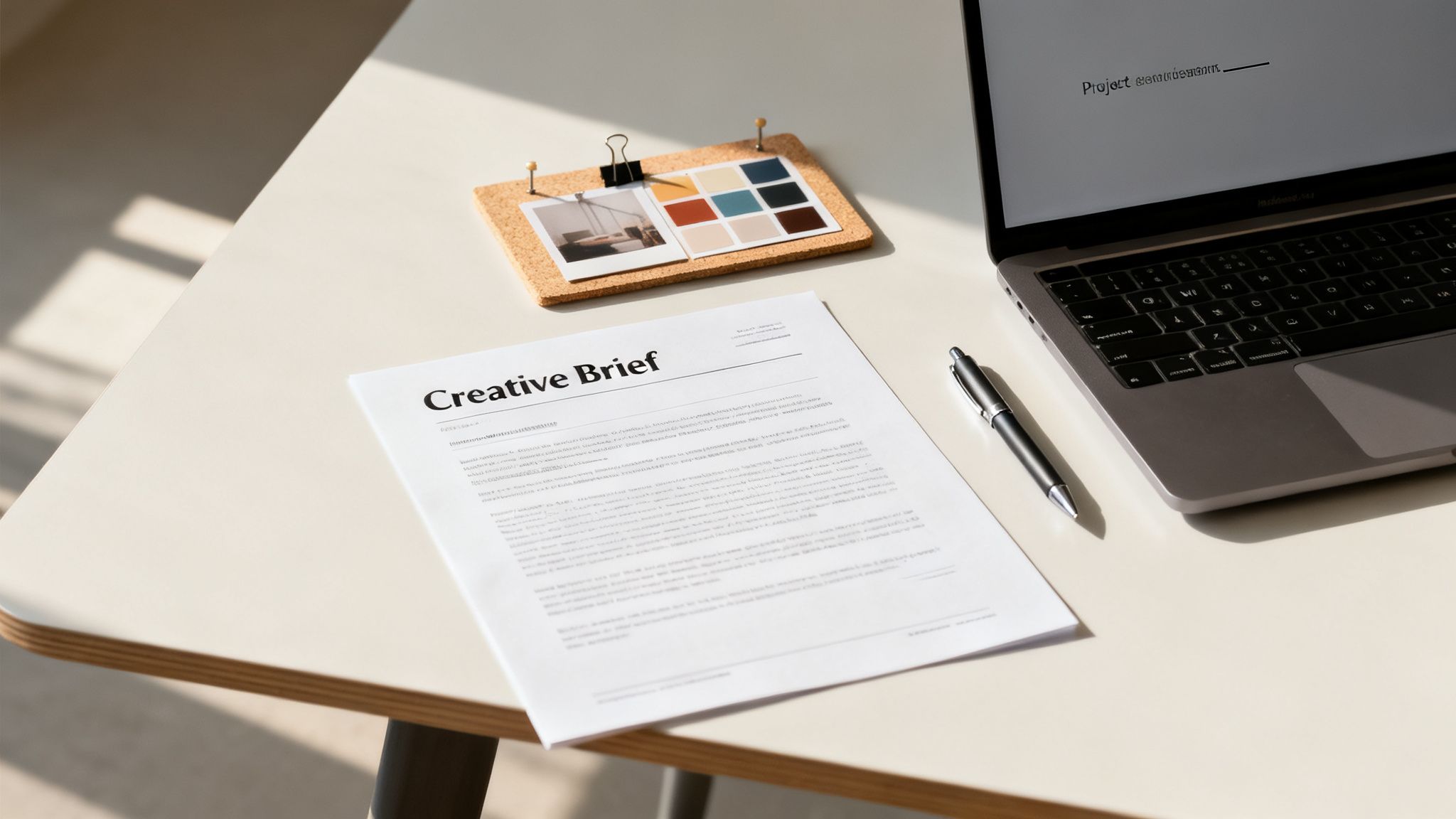
Translating Briefs into Visual Concepts
A powerful AI system doesn’t just spit out random images; it interprets creative intent. That detailed brief you wrote becomes the direct input for the AI's entire process. By providing specific constraints, you guide the output to ensure it’s not just beautiful, but also commercially viable and perfectly on-brand.
Let's say your brief calls for a "minimalist, Nordic-inspired line art design." You can instruct the AI to:
- Generate concepts using a monochromatic palette with a single accent colour.
- Explore motifs related to Scandinavian folklore, like runes or forest animals.
- Stick to a clean, vector-like aesthetic that’s perfect for screen printing.
- Produce variations in composition and scale for different t-shirt placements.
This approach transforms ideation into a rapid, iterative dialogue between the creative director and the AI, generating a wide array of viable options in a fraction of the time. For a deeper dive, check out our guide on the best AI for image generation and how to get the most out of it.
Generating Diverse Artwork Styles
Modern AI models are incredibly versatile. They can produce artwork across a massive spectrum of styles, allowing your team to experiment with different aesthetics without having to manually create each one from scratch. Whether you need intricate illustrations or bold, type-driven graphics, AI can deliver.
Just think about the possibilities:
- Intricate Illustrations: For a boutique clothing line, you might generate detailed botanical illustrations in the style of vintage scientific drawings.
- Bold Typography: For a streetwear brand, you could create custom typographic treatments that blend graffiti art with brutalist design principles.
- Abstract Patterns: For an all-over print, an AI can generate seamless patterns based on concepts like "liquid metal" or "digital glitch."
The real power of AI in the t-shirt design process isn’t just generating one-off images. It’s the ability to create consistent, versioned assets that adhere to a predefined style guide, ensuring brand cohesion across an entire collection.
Creating Lifelike 3D Mockups
One of the most valuable uses of AI in apparel design is generating realistic 3D mockups. Instead of slapping a flat 2D graphic onto a generic t-shirt template, you can now create dynamic visuals of your design on virtual models.
This gives stakeholders a true-to-life preview of the final product. You can see exactly how the fabric drapes, how the print scales on different body types, and how the design looks from every angle. This step is absolutely crucial for getting early buy-in and avoiding costly surprises during the physical sampling phase.
Inside VirtuallPRO, these 3D mockups can be shared, annotated, and approved in the same workspace where the 2D artwork was created, keeping the entire project pipeline connected.
This level of visualisation is becoming essential in a competitive market. Take the Danish T-shirt market, for instance. Consumption hit 44 million units in 2022—an 11% rise—pushing the market value to $201 million. This resurgence, as reported by IndexBox.io, shows just how critical standout designs are for capturing market share.
Ultimately, integrating AI for ideation and artwork gives creative teams a huge advantage. It collapses timelines, expands creative possibilities, and provides a much clearer vision of the final product long before anything ever goes to print.
Mastering Print-Ready Files and Colour Profiles
After pouring all that creative energy into the concept and artwork, the next step is purely technical—and it's a big one. A brilliant t-shirt design can be completely undone by sloppy file prep. This is where so many projects hit a wall, leading to production delays, surprise costs, and a final product that looks nothing like the mockup everyone signed off on.
Translating a digital design into a physical garment is an art and a science. It's the unglamorous but essential bridge between what's on your screen and the final printed shirt, requiring a solid grasp of file formats, resolution, and colour science. Get this right, and your creative vision survives the journey to production intact.
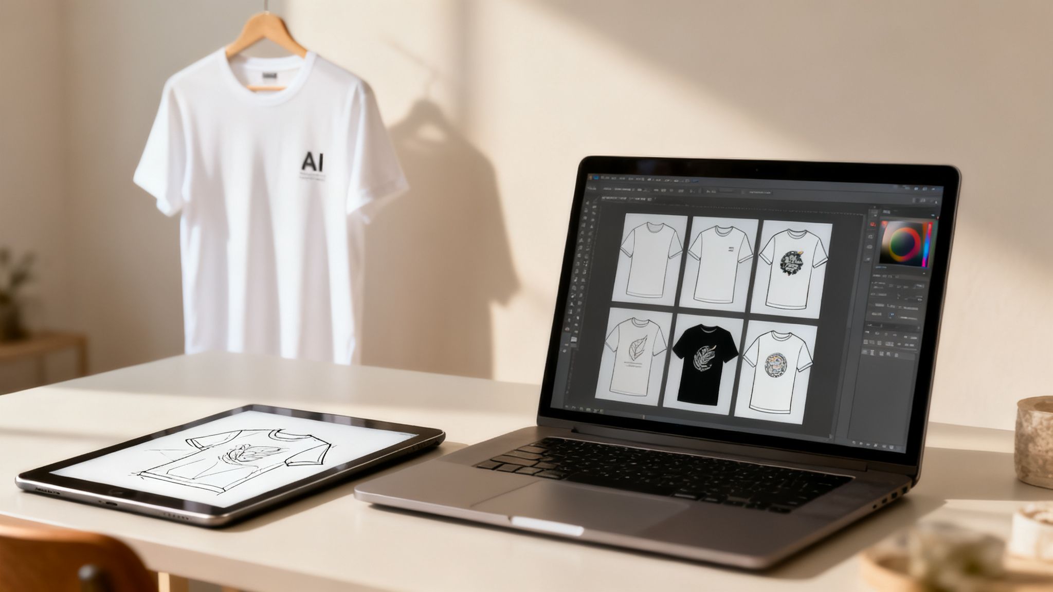
Vectors Versus Rasters: The Foundation of Quality
First things first, you need to choose the right file format. This decision hinges entirely on your design’s complexity and the printing method you’re using. You'll be working with two main types: vector and raster.
Vector Files (.AI, .EPS, .SVG): These are the gold standard for most t-shirt graphics. Vectors are built from mathematical equations, not pixels, which means you can scale a design to any size—from a tiny sleeve logo to a massive back print—with zero loss of quality. They’re non-negotiable for screen printing, where clean lines and solid colours are king.
Raster Files (.PSD, .PNG, .TIFF): These are your classic pixel-based images, perfect for photorealistic designs or artwork with complex colour gradients. Think Direct-to-Garment (DTG) printing. The magic word here is resolution, measured in Dots Per Inch (DPI). For a crisp, professional print, your file must be at least 300 DPI at its final print size. Anything less will look blurry and pixelated on the final shirt.
When in doubt, go vector. It’s the safest bet for maintaining design integrity. Trying to blow up a low-resolution raster file is a recipe for a fuzzy, low-quality print.
Getting Colour Right from Screen to Fabric
Here's a hard truth: what you see on your monitor is not what you’ll get on a t-shirt unless you manage your colours properly. This is one of the most common and frustrating pitfalls in apparel design. Screens use the RGB (Red, Green, Blue) light model, while printers use subtractive colour models.
To get vibrant, accurate prints, understanding ICC Profiles for perfect color in DTF printing is a must. These profiles help standardise colour across different devices, from your screen to the printer.
For printing, you’ll primarily deal with two systems:
CMYK (Cyan, Magenta, Yellow, Black): This is the standard for full-colour printing methods like DTG. Before sending anything to your printer, you have to convert your files from RGB to CMYK to get a realistic preview of the final colours. If you want to dive deeper, we have a whole article on the nuances of CMYK conversion from RGB.
Pantone (PMS): The Pantone Matching System is the language of screen printing. It's a universal standard that uses specific ink formulas for exact colours. If your brand guide demands a very specific shade of blue, using a Pantone colour ensures it’s identical every single time, on every shirt.
A classic rookie mistake is designing in RGB and sending the file straight to a CMYK printer. The result is almost always dull, muddy colours, because the CMYK colour range is smaller than RGB's and can't reproduce those same bright tones.
Avoiding Common Production Nightmares
Beyond formats and colours, a few small technical details can create major headaches down the line. A pre-flight checklist is your best defence against issues that can halt production.
Make sure your checklist covers these basics:
- Outlining Fonts: Always, always convert text to shapes or outlines. If you don't, and the printer doesn’t have your specific font installed, their system will swap it for a default one, completely wrecking your design.
- Embedding Images: If your design includes any linked raster images (like a photo inside a vector file), make sure they are embedded directly. Otherwise, the link will break, and the image simply won't print.
- Checking Minimum Line Thickness: Every print method has a limit on how thin a line it can reproduce accurately. Check the specs with your printer to avoid parts of your design vanishing into thin air.
This is where a governed workspace like VirtuallPRO becomes invaluable. You can create and enforce production templates, making sure every asset your team creates is automatically compliant. It eliminates the guesswork and streamlines the handover to production.
Choosing Production Methods and Ensuring Quality
Okay, your design files are polished and ready. Now for the fun part: deciding how to actually make the t-shirt. This is where your digital concept becomes a real, tangible product, and the production method you pick will define its final look, feel, and cost.
It’s a choice that hinges on your design’s complexity, how many shirts you need, and the fabric you're printing on. Getting this right is the key to seeing your creative vision come to life without any nasty surprises.
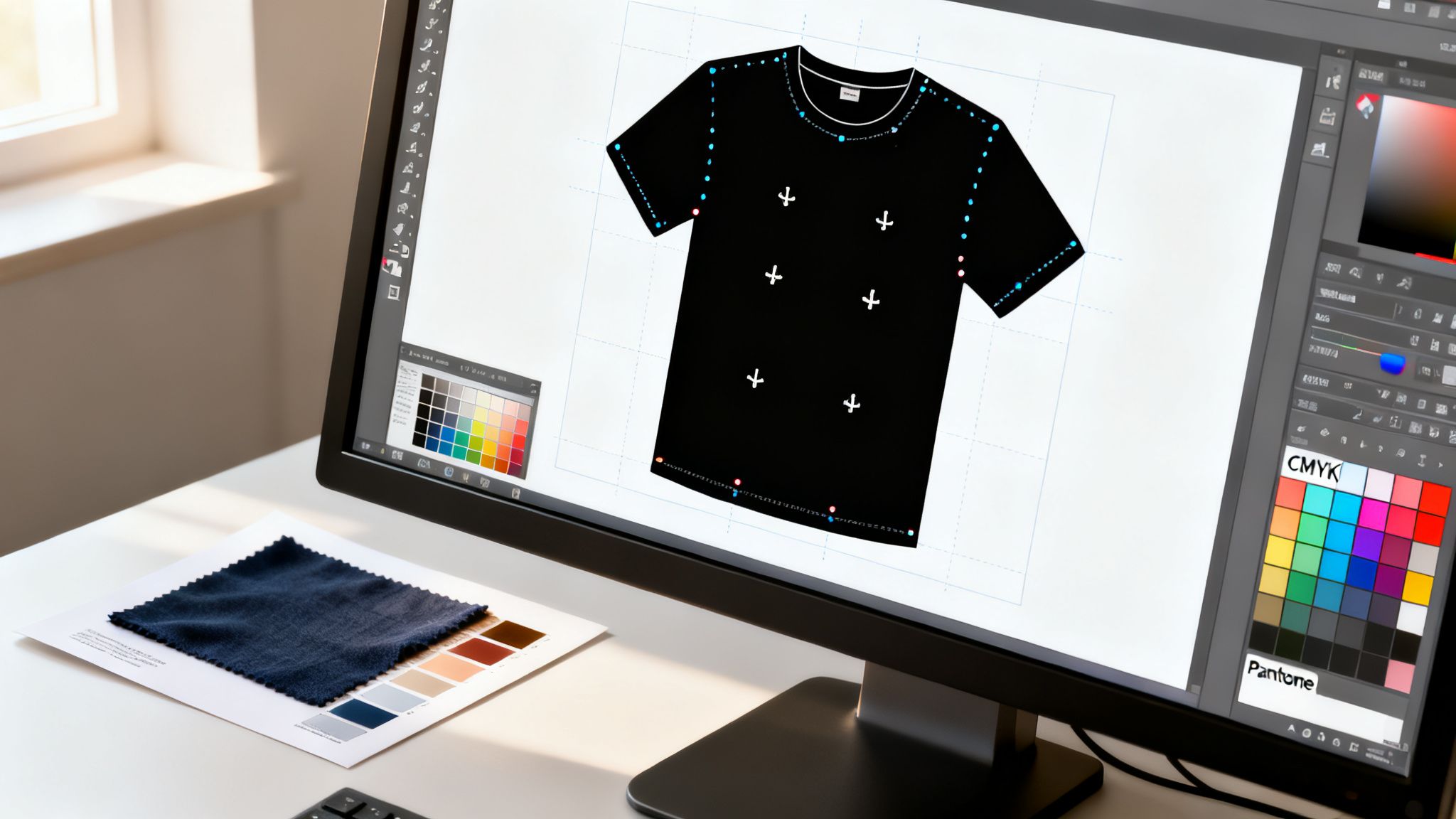
Comparing the Core Printing Techniques
Let's break down the three big players in professional t-shirt printing. Think of them as different tools in your workshop, each perfect for a specific job.
Screen Printing: This is the industry workhorse for a reason. Ideal for big batches with just a few colours, screen printing pushes ink through a stencil onto the fabric. The result is a super vibrant, durable print with that classic, slightly raised feel. It's incredibly cost-effective for orders of 100 units or more but gets pricey for small runs or designs with lots of colours, since each colour needs its own screen.
Direct-to-Garment (DTG): Imagine an inkjet printer, but for t-shirts. DTG is your go-to for highly detailed, photorealistic designs with unlimited colours, especially on smaller runs. It works best on 100% cotton and leaves a soft, breathable print. The downside? It's not as economical for large batches, and colours might not pop as much on dark fabrics compared to a screen print.
Sublimation: This is the magic behind those incredible all-over prints on synthetic fabrics like polyester. Here, the ink becomes a gas that bonds permanently with the fabric fibres, creating a print you literally can't feel. For vivid, full-coverage designs, it’s unbeatable. When you dig into the specifics of sublimation heat transfer techniques, you can see why it's so effective for certain textiles. Just remember, it won’t work on cotton.
The Critical Role of Quality Assurance
Picking a printer is only half the job. I don't care how great their reviews are—never, ever skip the Quality Assurance (QA) phase. Going straight to a full production run without getting your hands on a physical sample first is probably the single most expensive mistake a creative team can make.
That sample is your only real guarantee of quality. It's your chance to check:
- Colour Accuracy: Does that printed blue actually match your Pantone spec, or is it a shade off?
- Print Quality: Are the lines sharp? Is the ink application smooth? Is it positioned exactly where you wanted it?
- Garment Feel: Does the shirt and the print feel the way you imagined?
This isn't just about nitpicking. This tangible feedback loop is non-negotiable for protecting your brand and delivering a product people will love. With Denmark's clothing manufacturing sector including 357 businesses in 2025 and growing at 4.0% annually since 2020, the demand for quality is only getting higher. Robust QA is what separates the pros from the amateurs.
QA isn't just about catching mistakes. It's about creating a clear, auditable trail of approvals that protects your team and your supplier. Everyone knows what was signed off on before the big money gets spent.
Streamlining QA with Centralised Feedback
Managing feedback on samples can turn into a nightmare of confusing email threads and attachments. A professional workflow needs to be more organised than that.
This is where a platform like VirtuallPRO becomes your command centre. Instead of sending vague notes, you can upload high-res photos of the sample directly into your project. From there, your whole team can jump in and use annotation tools to leave precise, visual feedback.
Imagine circling a slight colour issue on the photo and pinning a comment right there: "This blue needs to match Pantone 286 C exactly." This creates a crystal-clear, unambiguous record of every required change and approval. Nothing gets lost in translation, and you can give the final green light for production with total confidence.
Got Questions About T-Shirt Design? We've Got Answers
Getting into the nitty-gritty of apparel production can feel like a minefield, even for experienced creative teams. It’s those small technical details that make the difference between a design that just looks good on screen and one that looks incredible on a finished t-shirt.
To help you sidestep the common traps, we’ve pulled together answers to the questions we hear most often.
What’s the Best File Format for a T-Shirt Design?
There’s no single "best" file, but there is always a right file for the job. The perfect format really hinges on your artwork and how you plan to print it.
Vector formats (.AI, .EPS, .SVG) are your go-to for most designs. They're built with maths, not pixels, so you can scale them up to the size of a bus with zero quality loss. This is non-negotiable for screen printing, where you need those super crisp lines and solid blocks of colour.
Raster formats (.PNG, .PSD, .TIFF) come into play for anything with photographic detail, complex textures, or subtle gradients. Since these are pixel-based, resolution is everything. You absolutely must create these files at 300 DPI (Dots Per Inch) at the final print size. Anything less will look blurry and unprofessional, especially with Direct-to-Garment (DTG) printing.
A classic rookie mistake is grabbing a low-res JPEG from a website. It will always print as a pixelated mess. When in doubt, start with a vector file—it gives you the most flexibility and the highest quality ceiling.
How Do I Get the Colours on the Shirt to Match My Screen?
This is the big one. Colour matching is notoriously tricky because what you see on a glowing monitor (using an RGB light model) is fundamentally different from ink on fabric.
First things first: convert your design files to the right colour profile. For full-colour printing like DTG, that means switching from RGB to CMYK. This simple step gives you a much more realistic preview on your screen of what the final print will look like.
For screen printing, you'll be working with a spot colour system like the Pantone Matching System (PMS). You'll pick specific, pre-mixed ink colours from a physical Pantone swatch book. This is the only way to guarantee an exact colour match—vital for keeping brand colours consistent.
Pro tip: Always, always request a physical pre-production sample from your printer. It's the only real way to see how the ink and colours behave on the actual fabric before you commit to a full run.
Which Printing Method Should I Go With?
Choosing the right printing technique is a strategic call. It depends on your design’s complexity, how many shirts you need, and your budget.
Screen Printing: The undisputed king for larger orders (think 50+ units) with a limited colour palette. It delivers bold, vibrant, and incredibly durable prints. Plus, it gets cheaper per shirt the more you order.
Direct-to-Garment (DTG): Ideal for small batches or one-off prints featuring complex, full-colour artwork like photos or detailed illustrations. The print has a soft feel on the fabric, but it works best on 100% cotton.
Sublimation: This is your only option for those wild, all-over, edge-to-edge prints on polyester fabrics. The ink literally becomes part of the fabric, so the print is undetectable by touch and will never crack, peel, or fade.
Think about your end goal. Launching a limited-edition artist collab with a painterly design? Go with DTG. Need 500 shirts for a company event with a simple two-colour logo? Screen printing is your most efficient and cost-effective bet.
What Are the Most Common T-Shirt Design Mistakes?
Even the pros slip up sometimes. Knowing what to watch out for can save you a world of headaches, reprints, and wasted budget.
Here are the top errors we see time and again:
- Ignoring Minimum Line Thickness: Every print method has a physical limit on how fine a line it can print. Go too thin, and your delicate details will either vanish or look broken on the final shirt. Your printer should have tech specs—read them.
- Forgetting to Outline Fonts: Never send a file with live, editable text. If your printer doesn't have the exact font you used, their computer will swap it for a default, completely wrecking your typography. Always convert your text to vector shapes (outlines) before you export.
- Designing Over Seams and Zips: Ink can’t print cleanly over uneven surfaces like seams, collars, or zips. It creates gaps and ugly imperfections. Pay close attention to your design placement and steer clear of these problem areas.
- Using Low-Resolution Artwork: This is hands-down the most common problem. An image that looks sharp on your screen at 72 DPI will look like a blurry disaster on a shirt. Let's say it one more time: all raster files must be 300 DPI at the intended print size. No exceptions.
Nailing these technical details early on is what ensures your creative vision translates perfectly from the screen to the fabric. A great t-shirt is where artistry meets production know-how.
Orchestrate your entire creative production with VirtuallPRO. Move from concept to final, production-ready assets faster than ever by bringing your teams, tools, and AI models into one governed workspace. Discover a smarter way to create at scale by visiting https://virtuall.pro.