Illustrator Image Trace: Step-by-Step Guide & Best Settings
Master Illustrator's Image Trace tool — turn any raster into clean vector art. Best settings, presets, and pro tips for logos, sketches, and photos.
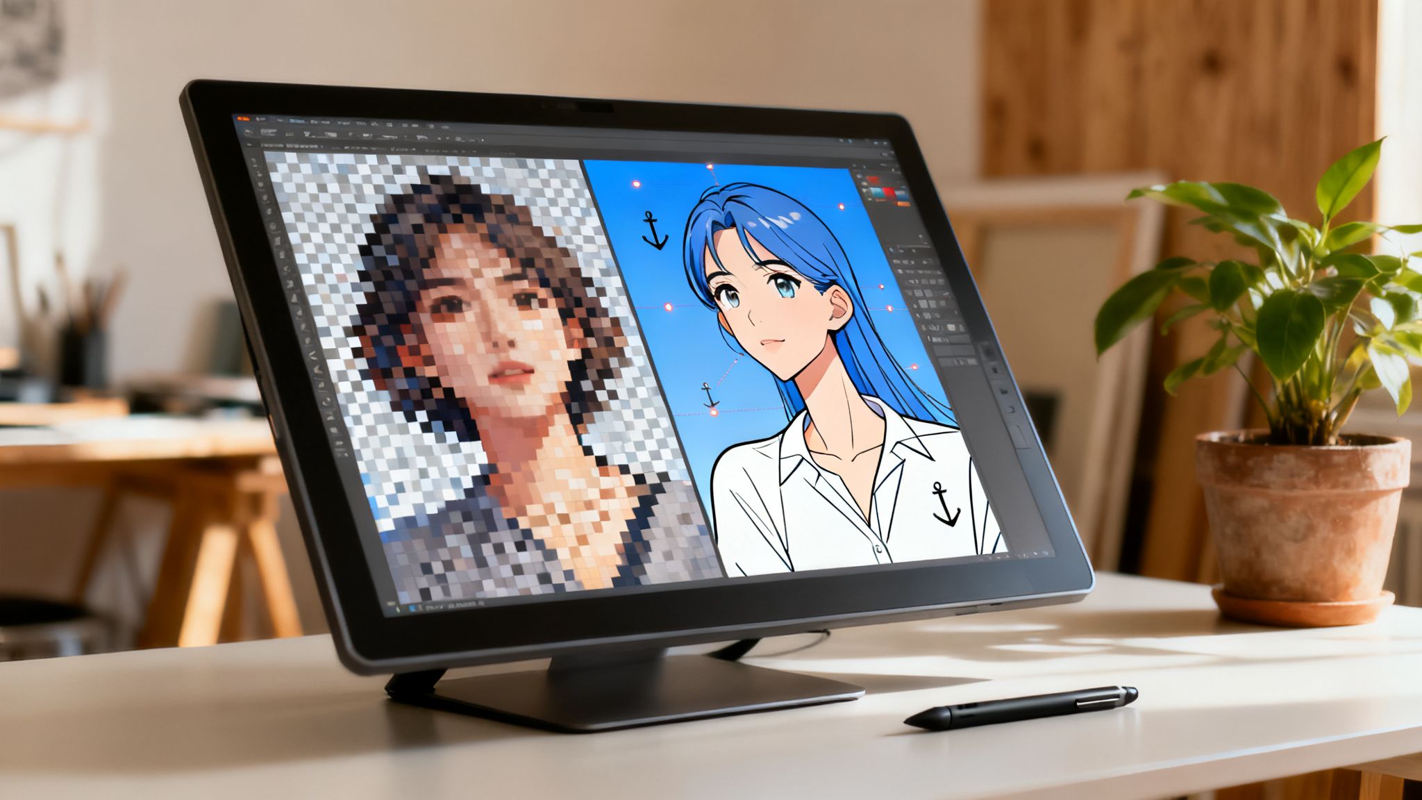
Manually tracing a raster image is a meticulous, slow, and often frustrating roadblock in any creative workflow. This is exactly where Adobe Illustrator’s Image Trace feature becomes an essential tool, turning pixel-based graphics into clean, editable vector paths in just a few clicks. It’s not just about saving time; it’s about making non-scalable assets—like AI-generated visuals, photos, or sketches—fully adaptable for professional use in logos, icons, and brand campaigns, all within a responsible and compliant workflow.
Ready to see how this fits into a modern asset pipeline? At Virtuall, we're building a responsible, compliant, and safe studio-grade option for creative production. You can start exploring advanced creative workflows in VirtuallPRO, our Creative AI OS designed for professional teams. If you haven't generated anything yet, you can try it for free and see how intelligent tools can reshape your projects.
Turn Any Raster Image Into Scalable Vector Art
Converting raster images into vectors is a fundamental skill for any designer. It’s what bridges the gap between static, pixelated images and infinitely scalable art. This is a non-negotiable for professional branding and digital media, where assets have to maintain perfect clarity everywhere.
Think about it: from a logo that needs to look sharp on a massive billboard to an icon that must be crisp on a tiny mobile screen, vectorisation is the key. Modern workflows even rely on tools like an AI Generator for Text Logo Integration, and their raster outputs almost always need a solid vector conversion to be truly useful.
This guide goes beyond just clicking the "Trace" button. We’ll get into the nitty-gritty of the tool, ensuring your final outputs are clean, editable, and ready for production. Getting this right is crucial in a field that’s growing fast. In fact, the Creative Software Market is projected to hit USD 22.67 billion by 2029, a clear sign of the increasing demand for professional creative tools in Denmark and across the globe.
Here’s what we’ll cover:
- Prepping your source images for the best possible trace.
- Mastering both the quick presets and the powerful advanced controls.
- Cleaning up your vectors post-trace for polished, professional results.
By getting a real handle on Illustrator’s trace function, you can dramatically speed up your workflow and open up new creative avenues. If you need a refresher, check out our guide on what a vector file is for more background: https://virtuall.pro/blog/hvad-er-en-vektor.
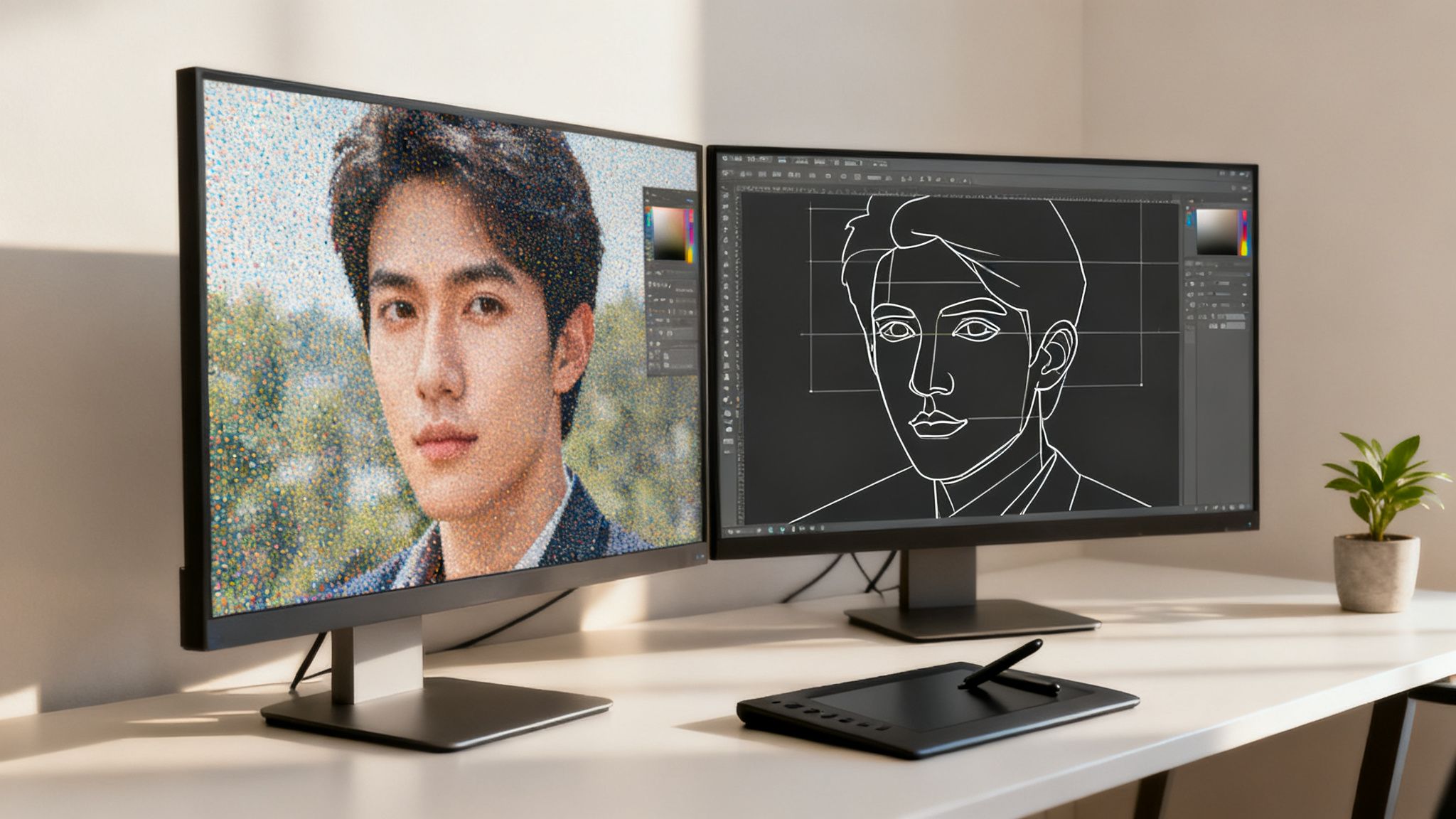
Skip the trace — generate clean, vectorizable artwork from a prompt inside Virtuall, the Creative AI OS for marketing visuals.
Prepare Your Image for a Perfect Trace
The secret to a brilliant vector trace has almost nothing to do with Illustrator’s settings. It starts way before that.
Dropping a low-quality, “busy” image into the tool is the fastest way to get a messy, unusable result. Think jagged lines, random anchor points, and hours of manual cleanup. The old saying holds true: a clean input is the only way to get a clean output.
When you try to trace a blurry, pixelated graphic, you’re forcing Illustrator’s algorithm to guess where the real edges are. It’s a recipe for lumpy curves and wonky shapes. A few minutes of prep work is non-negotiable if you want a professional result.
Start with High Resolution and Clear Contrast
Your first checkpoint is always image quality. A higher resolution gives the tracing engine more pixel data to work with, which translates directly into smoother, more accurate vector paths. It's that simple.
For the best results, aim for these benchmarks:
- Resolution: Start with an image that is at least 300 DPI (dots per inch). This is the standard for print-quality work and gives the algorithm plenty of detail to analyse.
- Contrast: Make sure there's a sharp distinction between your subject and its background. The same goes for different colours within the subject itself. High-contrast edges create crisp, well-defined paths.
If your image has a cluttered or complex background, get rid of it first. A clean separation helps Illustrator focus only on the object you want to convert. For a detailed walkthrough on isolating your subject, check out our guide on how to delete a background in Photoshop.
A common mistake is grabbing a small thumbnail from the web and hoping for the best. This will almost always fail. Always track down the largest, highest-quality version of an image you can find.
Choose the Right File Format
The file format you start with also plays a surprisingly big role. While JPEGs are everywhere, their lossy compression creates artifacts and fuzzy edges that confuse the tracing tool.
A PNG file with a transparent background is almost always the better choice. It uses lossless compression, which means it preserves sharp details and clean lines without adding compression noise.
By giving the illustrator trace image function an isolated subject on a clean, transparent background, you’re setting it up for success. This one simple step can save you a massive amount of cleanup time later and is a game-changer for creating studio-grade vector assets.
Navigate the Image Trace Panel Like an Expert
Once you’ve prepped and placed your image, the Image Trace panel becomes your creative command centre. At first glance, the wall of sliders and dropdowns can feel a bit much, but the real secret to getting great results fast is understanding the presets.
Think of them as expert-level starting points, each one tuned for a specific type of artwork.
Every preset interprets pixel data differently, knowing what details to prioritise and which to ignore. This is exactly why a preset that works wonders on a simple logo will absolutely butcher a detailed photograph. Getting a feel for these presets is the quickest way to speed up your workflow and dodge a lot of unnecessary frustration.
Honestly, getting the best trace often just comes down to picking the right preset for the job.
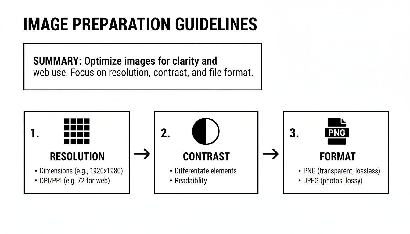
This guide reinforces a simple truth: a great trace starts with a great source image. Nailing the resolution, contrast, and format before you even open the Image Trace panel will make a world of difference to your final vector output.
Choosing the Right Preset for Your Project
So, where do you start? Thankfully, the preset names are pretty descriptive, giving you a strong hint about what they do best. Instead of just clicking randomly and hoping for the best, you can make a smart choice right from the get-go.
Here's a quick look at some of the most common presets and their ideal use cases to get you started.
| Illustrator Image Trace Preset Guide | ||
|---|---|---|
| Preset Name | Best For | Key Characteristics |
| High Fidelity Photo | Complex, multi-coloured photographs | Creates a massive number of paths and colours to capture maximum detail. Results in large files and often needs a lot of cleanup. |
| Low Fidelity Photo | Simpler photos or illustrations | A good middle-ground that simplifies details and colours. Creates a more stylised, less complex vector than its high-fidelity counterpart. |
| Black and White Logo | Simple, high-contrast graphics (e.g., logos, icons) | Excels at creating clean, sharp, solid black-and-white shapes. Ignores all colour and gradients. Your go-to for crisp linework. |
| Sketched Art | Hand-drawn pencil or ink sketches | Designed to interpret linework while ignoring things like paper texture or light shading. Perfect for digitising doodles. |
| Silhouettes | Images where only the main shape matters | Reduces the image to a simple, solid black silhouette. Incredibly useful for creating basic shapes and outlines quickly. |
The goal isn't to find a single preset that delivers a perfect result every time—that rarely happens.
My most effective workflow involves testing two or three logical presets to see which one gets me closest to my desired outcome. Starting with the right preset can easily cut my manual cleanup time by more than half.
For example, if you try to trace a pencil sketch using the 'High Fidelity Photo' preset, you'll end up with a messy vector full of paper texture and faint smudges. Flip that around, and using 'Sketched Art' on a photograph will just produce an abstract, unusable mess. It’s all about matching the tool to the task.
Fine-Tune Your Trace with Advanced Controls
Presets are a great starting point, but professional work demands precision. This is where you move beyond the one-click options and really take charge of Illustrator’s Image Trace feature, turning a decent result into a perfect, production-ready vector.
Mastering the advanced sliders is what separates a quick-and-dirty conversion from a refined, intentional piece of art. Think of it as switching from automatic to manual mode on a camera—you get total creative control over how Illustrator interprets pixels and translates them into paths.
The need for this kind of precision is growing fast. The market for AI-based image analysis is set to explode from USD 13.07 billion in 2025 to USD 36.36 billion by 2030. This shows just how essential AI-powered tools, like sophisticated image tracing, are becoming for creative teams who need granular control over their automated workflows. You can dig into more market insights on marketsandmarkets.com.
Mastering Paths, Corners, and Noise
Your three most important controls are Paths, Corners, and Noise. Getting the hang of how they interact is the key to getting the look you want. They work in tandem to define the final shape and complexity of your vector.
Paths: This slider dictates how tightly the vector paths hug the original pixels. Crank it up for a highly detailed trace that captures every little bump and curve. This is great for complex illustrations but can also make things look jagged. A lower setting smooths everything out, creating simpler, more stylised shapes with fewer anchor points.
Corners: This one’s straightforward—it controls how sharp your corners are. A high value gives you crisp, pointed corners, perfect for geometric designs or sharp logos. Dialling it down rounds them out, which works much better for organic, hand-drawn styles where you’re after a softer feel.
Noise: This slider tells Illustrator what to ignore. Bumping this value up is a fantastic trick for cleaning up "digital noise" from a grainy source image or ditching tiny imperfections from a scanned sketch. Just be careful not to set it too high, or you might lose important small details along with the junk.
Here’s a solid technique to start with: set Paths to a middle value, then play with the Noise slider to get rid of any clutter. Once the main shapes look clean, you can go back and fine-tune the result with the Paths and Corners sliders until it’s perfect.
Choosing the Right Tracing Method
Beyond those main sliders, the Method option is a critical choice. It fundamentally changes how your final vector shapes are built, which has a huge impact on how you can edit and colour the artwork later.
You’ve got two main options here.
The first is Abutting, which creates paths that fit together edge-to-edge like puzzle pieces. There are no overlaps; every colour shape is its own distinct, separate object. This method is non-negotiable for things like screen printing or vinyl cutting, where overlapping colours would be a production nightmare.
Your second choice is Overlapping, which stacks paths on top of each other. In this mode, shapes are layered, with the top ones covering parts of those underneath. This is generally a more forgiving approach for digital-only work and often makes it easier to recolour or edit individual elements down the line.
Finally, whatever you do, don't forget the Ignore White checkbox. This simple but powerful tool automatically deletes all white areas from your trace, leaving you with a clean graphic on a transparent background. It’s an absolute lifesaver for creating logos, icons, or any other asset you need to place over different backgrounds.
Refine Your Vector with Post-Trace Cleanup
Clicking 'Expand' on your trace is a great first step, but don't close the file just yet. The real magic happens now, turning a rough, automated trace into a polished, production-ready asset. This post-trace cleanup is what separates an amateur graphic from professional work.
Think of it as the hands-on refinement where your design skills really come into play. An automated trace almost always leaves behind little imperfections—a wobbly curve, a stray anchor point, or a colour that’s just a bit off. Taking the time to manually fix these is essential for creating clean, high-quality vector art.
Smoothing Curves and Simplifying Paths
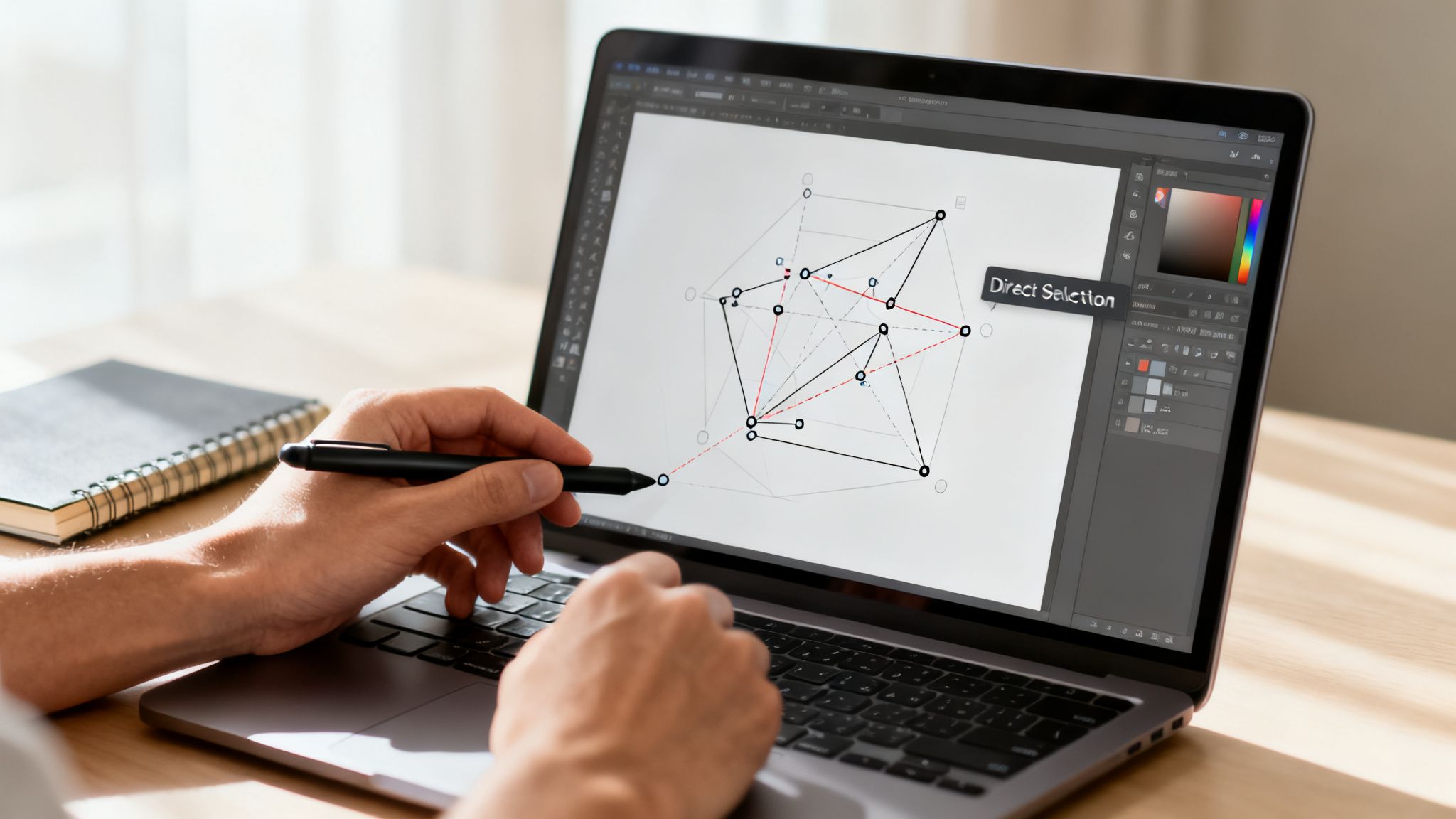
First up, you need to hunt down and fix any awkward curves or jagged lines left by the trace. The Direct Selection Tool (the white arrow) is your best friend for this job. Zoom right in and start tweaking the handles on individual anchor points to smooth out any bumps.
While you're at it, you'll probably notice that some paths have far too many anchor points. This doesn't just make editing a headache; it also inflates your file size. Illustrator has the perfect tool for this: the 'Simplify' command.
- Select your vector shape.
- Head to Object > Path > Simplify.
- Play with the slider to reduce the number of points without wrecking the shape's integrity.
A cleaner path with fewer anchor points is always the goal. It leads to smaller files, renders faster on the web, and makes life much easier for anyone who has to edit the file later—including your future self.
These kinds of digital skills are becoming increasingly vital in Denmark's creative economy. A recent study from Statistics Denmark revealed that a huge chunk of the country's artistic workforce is involved in digital and illustration-based work, generating significant income. You can dive deeper into the stats in the full report from the Danish Arts Council.
Managing Colours and Final Touches
Even a perfect trace can leave you with a messy palette, filled with dozens of nearly identical shades. This is where the Recolor Artwork tool becomes your secret weapon for maintaining brand consistency.
This powerful feature lets you map all the colours in your traced image to a specific, pre-approved brand palette. You can instantly merge ten slightly different shades of blue into a single, on-brand hue, dramatically simplifying your artwork. It’s a crucial step to ensure every asset you create with the illustrator trace image function is on-brand and ready for any professional use case.
Integrate Traced Assets into Your Studio Workflow
A single vector asset is rarely the end of the story—it’s just the beginning. The real magic happens when you plug that traced graphic into a larger creative pipeline, turning a simple conversion into a production-ready component for your biggest projects. This means getting it off your local machine and into a managed, collaborative environment.
The first, and most critical, hand-off point is choosing the right export format. Get this wrong, and you create headaches for the rest of the team down the line. Each format has a specific job to do.
- SVG (Scalable Vector Graphics): This is the undisputed king for web use. SVGs are lightweight, look sharp on any screen, and can even be tweaked with code. They're perfect for interactive elements, logos, and crisp website icons.
- AI (Adobe Illustrator): This is your master file. Saving as a native .ai file keeps all your layers, effects, and paths fully editable. It’s non-negotiable for handoffs to other designers or for any future updates.
- PDF (Portable Document Format): When it’s time to print, PDF is your best friend. A high-quality PDF locks in all your vector data and fonts, ensuring what you see on screen is exactly what comes off the printer.
Scaling Production with Repeatable Blueprints
For any creative team, consistency is everything. Manually fiddling with trace settings for every single image is a recipe for inefficiency and errors. This is where a governed system like VirtuallPRO becomes a game-changer for scaling your illustrator trace image workflow.
Inside VirtuallPRO, you can set up repeatable ‘Blueprints’ for tracing different kinds of images. For instance, you could have a blueprint for product sketches with specific noise reduction and path complexity settings. Another for logos might enforce a strict, pre-approved colour palette.
This approach takes the guesswork out of the equation. Every team member, regardless of their Illustrator skill level, can produce consistent, on-brand assets every time, all while benefiting from version control and built-in feedback tools.
Standardising your tracing process is what makes it truly scalable. It empowers your entire team to turn raw images into polished, production-ready vectors, quickly and reliably.
Once you have a perfectly traced asset, you can see how these clean vectors elevate other parts of a project, like when you create compelling app icons that need to stay sharp at any size. And if you're curious about other key vector formats, you can dive deeper into the versatile EPS file type in our detailed guide.
Illustrator’s Image Trace: Your Questions Answered
Even when you do everything right, the Image Trace function can throw a curveball. It happens. This section is all about tackling those common frustrations head-on, giving you quick fixes to get your project moving again.
Think of it as the cheat sheet I wish I’d had when I first started wrangling pixels into paths.
Why Does My Trace Look Blurry Or Jagged?
This is almost always a classic case of “garbage in, garbage out.” If your source image is low-resolution, Illustrator’s tracing algorithm just doesn't have enough clean pixel data to work with. Always, always start with a high-resolution file. 300 DPI is a good rule of thumb for getting crisp, clean vectors.
If your source image is solid, it's time to check the advanced settings. A Paths slider set too low will give you those jagged, blocky edges. On the flip side, cranking up the Noise value too high can cause Illustrator to smooth over fine details you actually wanted to keep. It's a balancing act.
How Can I Cut Down The Number Of Colours?
You’ve got two great opportunities to get your colour palette under control. The first is right in the Image Trace panel itself—just use the Colours slider. This puts a hard limit on how many shades Illustrator will generate from the get-go.
Once you’ve expanded the trace, your secret weapon is the Recolor Artwork panel. Honestly, it’s one of the most powerful tools for this job. It lets you intelligently merge similar tones and map everything to your specific brand colours, which is a massive time-saver for keeping designs consistent.
What’s The Best Way To Trace A Pencil Sketch?
For anything hand-drawn, the real magic happens before you even get to Illustrator. I always pop the scanned sketch into Photoshop first. A quick Levels or Curves adjustment to make the background pure white and the lines a deep, rich black makes a world of difference.
When you do bring it into Illustrator, the 'Sketched Art' preset is your best starting point. Just know that you'll probably need to do some manual cleanup with the Direct Selection tool afterwards. A final pass with 'Object > Path > Simplify' is also great for smoothing out any lingering wobbles for that polished, hand-drawn feel.
Should I Use The Abutting Or Overlapping Method?
This one comes down entirely to what you’re doing with the final vector graphic. There's no single "right" answer, only what's right for your project.
- Abutting: This method creates perfectly fitted, puzzle-piece-like shapes with no overlap. It's an absolute must for things like screen printing or vinyl cutting, where each colour needs to be a separate, clean cutout.
- Overlapping: Here, Illustrator creates stacked paths, with shapes layered on top of each other. This is far more common for digital graphics (like web icons or illustrations) because it's often easier to edit and recolour down the line.
It's time to elevate your creative pipeline from a set of disconnected tasks to a governed, scalable production system. With VirtuallPRO, you can build repeatable Blueprints for tracing, manage your vector assets, and collaborate smoothly across your entire team. See what the future of AI-powered creative production looks like at https://virtuall.pro.